Appearing in IBM Visualization Data Explorer Communiqué
Newsletter, March 1995, pp. 6-8.
VISUALIZING PARALLEL PROGRAM AND PERFORMANCE DATA WITH IBM VISUALIZATION DATA EXPLORER
Steven T. Hackstadt and Allen D. Malony
Dept. of Computer and Information Science, University of Oregon, Eugene OR 97403
{hacks,malony}@cs.uoregon.edu
INTRODUCTION
Performance visualization is the use of graphical display techniques
for the visual analysis of performance data to improve the
understanding of complex performance phenomena. While the graphics of
current performance visualizations are predominantly confined to
two-dimensions, one of the primary goals of our work is the
development of new methods for rapidly prototyping next-generation,
multi-dimensional performance visualizations. By applying the tools of
scientific visualization to performance visualization, we have found
that next-generation displays for performance visualization can be
prototyped, if not implemented, in existing data visualization
software products like Data Explorer, using graphical techniques that
physicists, oceanographers, and meteorologists have used for several
years now.
PROBLEM
The importance of graphical visualization in parallel performance
evaluation has been established by the success of many research tools
(especially, ParaGraph [Heath 91, Heath92]). Such products offer the
parallel programmer access to information and insights that might
otherwise go unobserved. Whether a parallel program is executing on 4
or 4,000 processors, the ability to view performance data in an useful
way often enables the programmer to identify anomalous behavior within
a program. Subtle changes in the way a parallel program performs its
computation, for example, could offer substantial improvements in
performance. Without visualization techniques to aid in the discovery
of such problems, performance improvements might never be found [Heath
92].
But performance visualization is not a panacea to the performance
issues facing parallel programmers. Visualizations have to be "useful"
- in a way that elucidates performance behavior. But, "useful" is
certainly a subjective concept. For instance, in the domain of
scientific visualization, a display that is useful to the scientist in
a jet propulsion laboratory may be inappropriate to the researcher
analyzing ocean currents. The case is similar for performance
visualization.
Performance visualization tool developers typically decide beforehand
(i.e., prior to implementing a tool) what set of visualizations will
(hopefully) be useful to the most people. Determining the
effectiveness of visualizations is difficult enough, but to compound
this problem, most tools have little or no facility for creating
application-specific displays. While both theory and practice strongly
suggest the need for a wide range of application-specific
visualizations to augment a general-purpose set [Stasko 93], to date,
this need has been difficult to fulfill because of the considerable
overhead in creating, evaluating, and modifying performance
visualizations. Heath and Etheridge [Heath 91], creators of the
general-purpose ParaGraph displays, acknowledge the importance of
application-specific displays.
In general, this wide applicability is a virtue, but knowledge of the
application often lets you design a special-purpose display that
reveals greater detail or insight than generic displays would permit.
Unfortunately, such displays are not easily created in a tool like
ParaGraph since special programming skills are required [Heath
91]. Clearly, a development technology that requires little overhead
and programming, while simultaneously offering more sophisticated
graphical capabilities, would enable developers to generate
application-specific displays quickly in response to user needs, as
well as create and evaluate general-purpose visualizations.
IBM's Visualization Data Explorer (DX) offers a robust software
platform from which we have prototyped several new parallel program
and performance visualizations, demonstrating the effective use of
existing data visualization systems in the context of parallel
performance visualization. This new development process takes
advantage of several features of DX, including the flexible
self-describing data model, the wide variety of graphical techniques,
robust display interaction and manipulation, and customized
visualization control. Three-dimensional visualization plus advanced
graphical techniques applied in scientific fields has opened up
entirely new possibilities for researchers, and it stands to do the
same for performance visualization.
IMPLEMENTATION
In this work, we assume performance visualization starts with raw
trace data or statistics collected from a parallel program or
machine. The fundamental steps of the visualization process transform
the trace data into a DX data object file and a visual program. While
the transformation from trace data to DX object file manifests itself
as a real program or function operating upon the trace data, the
transformation from trace data to visual program is a mental process
by which analysts merge the capabilities of the visualization
environment, their knowledge of the performance data, and a
visualization concept to construct a visual program in DX that will
drive the creation of the desired display.
The trace transformation may perform several operations and reductions
on the data, but it ultimately creates a data object file that can be
interpreted by Data Explorer. From this specially formatted data file,
a visualization prototype is created by executing the corresponding
visual program. The resulting display can be manipulated in many ways,
including rotating, zooming, and traveling through or around the
objects in the image by capitalizing on the capabilities available in
DX. Future work will investigate automating the transformations
required to generate DX object files and visual programs.
EXAMPLES
This section discusses some sample displays that we have created. We
have identified three primary categories of visualizations created
with Data Explorer, and each offers insight into this approach for
creating parallel program and performance visualizations:
- Existing two-dimensional performance visualizations,
- Enhanced three-dimensional versions of existing visualizations, and
- New multi-dimensional performance visualizations that include
advanced graphical rendering techniques.
By prototyping existing displays, we establish that this approach can
accomplish many of the same tasks as existing visualization tools. As
an example of this, we consider the Kiviat diagram [Kolence 73]. The
traditional form of this two-dimensional display starts with several
spokes extending from a common center point. A spoke corresponds to a
single member of an object set over which a time-dependent scalar
parameter has been measured. As time passes, the lengths of these
spokes change as the parameter value does. As it has been applied in
ParaGraph [Heath 91], a spoke represents a processor in a parallel
computer, and the measured quantity is the percentage of time spent in
the "compute" state. When the ends of adjacent spokes are connected,
triangular regions result. If the quantity being represented by the
length of the spokes is, say, computation, then processor utilization
would be "good" when the spokes are longest. (Spoke-length is
typically mapped onto the interval [0,1]. Thus, with a large number of
spokes at maximum length, the Kiviat diagram approximates a unit
circle.)
Conceptually, a Kiviat diagram is easily represented within the Data
Explorer data model, and consequently, coding and debugging the trace
transformation took less than two hours. Similarly, the DX program
necessary to render and animate the display is very simple. Thus, in
roughly half a day, a fully animated Kiviat diagram prototype was
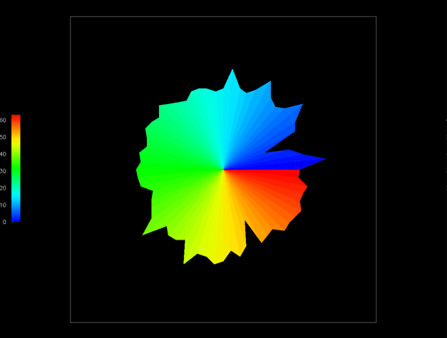
developed from a raw trace file. Figure 1 shows a single frame of the
animated visualization using 64 processors (denoted by color).
Figure 1:
The traditional two-dimensional Kiviat diagram is easily
reproduced in Data Explorer. Processors are represented as spokes
arranged in a circle. A spoke's length is controlled by a performance
metric such as the percentage of time spent computing.
Having successfully prototyped an existing display, the next step is
to see how Data Explorer and its data model allow us to extend or
enhance visualizations. For this, we continue to work with the Kiviat
display. One of the potential problems with a standard Kiviat
animation is that the viewer sees only one step at a time and can
easily lose track of how the performance at that step compares to the
performance during other parts of the animation. By removing the
animation of the display, letting time run along the third axis, and
rendering a "shell" around the individual slices, a Kiviat "tube", as
shown in Figure 2, is formed.
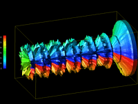
Figure 2:
A three-dimensional Kiviat tube generated by Data Explorer
gives the analyst a global view of the performance data, but at the
same time obscures detailed information about certain processors or
time steps.
Such a representation of the original Kiviat diagram is important
because it gives the viewer a global perspective of the performance
data, and for certain problems, such a view may be useful. However,
this three-dimensional representation tends to obscure more detailed
information about individual processors at specific times, whereas the
standard two-dimensional Kiviat display shows that information more
clearly.
The true power of Data Explorer is revealed in our last example. It is
possible that individually, neither of the Kiviat displays generated
thus far (Figures 1 and 2) totally fulfills the viewer's needs. The
two-dimensional display allows the viewer to assess how processors
relate to each other during a given time slice, but makes it difficult
to see how performance in one time step relates to other parts of the
animation. The three-dimensional display tends to do just the reverse;
that is, seeing trends over the life of the trace is easier, but it is
difficult to see how processors relate to each other during a given
time step. It may be that by combining the two displays both needs
could be met. Thus, the idea for an enhanced display is to let the
two-dimensional Kiviat "slice" pass through a partially transparent
Kiviat tube. The slice highlights the interprocessor relationships for
a given time step while the rest of the tube continues to reveal how a
particular step relates to the rest of the data. The display is
animated by letting the slice slide through the tube. Alternatively,
the viewer can directly specify the time step at which to place the
slice.
This is a complex visualization that combines several graphical
techniques. However, having previously created the two individual
components of the display, Data Explorer allows the developer to
combine the two effortlessly. In what literally took just minutes, the
composite visualization in Figure 3 was created.
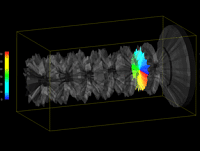
Figure 3:
Combining the Kiviat displays shown in Figures 1 and 2, this
visualization utilizes several advanced graphical techniques, but by
reusing the two simpler displays, Data Explorer allows the user to
combine them with little effort.
CONCLUSION
General data visualization software, like IBM's Data Explorer, is a
technology that improves the performance visualization development
process by increasing both the quality of the displays and the speed
with which they are created. The process lends itself to iterative
design and evaluation which is required to validate a display's
usability - techniques that up until now have not been widely applied
to the arena of performance visualization. Because Data Explorer has
many difficult-to-program features already established, it allows
performance visualization developers to focus on the quality of their
displays rather than the code needed to generate them.
ACKNOWLEDGEMENTS
This work was supported by an IBM Research and Development contract
(MHVU3704) from the IBM Highly Parallel Supercomputing Systems
Laboratory, and a grant (ASC9213500) from the National Science
Foundation Advanced Scientific Computing Program. Special thanks go to
Harold Hersey for generating the images used in this article. For more
information, see [Hackstadt 94a,94b] or URL
http://www.cs.uoregon.edu/~hacks/info-research.html.
REFERENCES
[Hackstadt 94a] - S. Hackstadt and A. Malony. Next-Generation Parallel
Performance Visualization: A Prototyping Environment for Visualization
Development. Proc. Parallel Architectures and Languages Europe (PARLE)
Conference, Athens, Greece, July, 1994. Also, University of Oregon,
Dept. of Computer and Information Science, Technical Report
CIS-TR-93-23, October, 1993.
[Hackstadt 94b] - S. Hackstadt. Prototyping Advanced Parallel Program
and Performance Visualizations. University of Oregon, Dept. of
Computer and Information Science, Master's Thesis, June, 1994.
[Heath 91] - M. Heath and J. Etheridge. Visualizing the Performance of
Parallel Programs. IEEE Software, September, 1991, pages 29-39.
[Heath 92] - M. Heath and J. Etheridge. Recent Developments and Case
Studies in Performance Visualization using ParaGraph. Proceedings from
the Workshop on Performance Measurement and Visualization of Parallel
Systems, Moravany, Czechoslovakia, October, 1992.
[Kolence 73] - K. Kolence and P. Kiviat. Software Unit Profiles and
Kiviat Figures. ACM SIGMETRICS, Performance Evaluation Review,
September, 1973, pages 2-12.
[Malony 92] - A. Malony and E. Tick, Parallel Performance
Visualization. Proposal to the National Science Foundation, CISE/ASC,
Grant No. ASC 9213500, February, 1992.
[Stasko 93] - J. Stasko and E. Kraemer. A Methodology for Building
Application-specific Visualizations of Parallel Programs. Journal of
Parallel and Distributed Computing, 18, 1, June, 1993, pages 258-264.
Last modified: Tue Dec 7 09:33:44 PST 1999
Steven Hackstadt /
hacks@cs.uoregon.edu