Visualization of parallel performance offers programmers insights that might otherwise go unobserved. For example, it can reveal changes in the way a program performs its computation that are subtle in themselves but substantial in their effect on performance. Visualization is not a panacea to the issues facing parallel programmers, though. Just as in scientific visualization, where a display that is useful in aerodynamics research may be inappropriate to the analysis of ocean currents, the "usefulness" of a visualization in performance visualization is relative to the particular performance problem under consideration.
To complicate matters more, performance visualization lacks a concrete, physical model on which to base displays. Rather, performance data represents abstract relationships between virtual objects such as data elements, processors, and computing system components. The absence of an obvious physical model can lead to more abstract representations. At the same time, it affords additional flexibility in visualization design.
Before implementing a tool, developers typically decide the set of performance visualizations they hope will be useful to the most people. Determining the effectiveness of visualizations is difficult enough, but this problem is compounded by most tools having little or no facility for creating application-specific displays. While both theory and practice strongly suggest the need for a wide range of application-specific visualizations to augment a general-purpose set, to date this need has been difficult to fulfill because of the considerable overhead in creating, evaluating, and modifying performance visualizations. Clearly, a development technology that requires little overhead and programming, while simultaneously offering more sophisticated graphical capabilities, would help developers generate application-specific displays quickly, as well as create and evaluate general-purpose visualizations.
General data-visualization software, such as IBM's Visualization Data Explorer (DX), offers a robust platform from which we have prototyped several new parallel program and performance visualizations. This new development process takes advantage of several capabilities of the visualization software, including self-describing data models, a variety of graphical techniques, robust display interaction and manipulation, and customized visualization control.
Processor utilization
The ParaGraph tool [1] uses a display called a Kiviat diagram
to portray processor utilization. The traditional form of this 2D
display starts with several spokes extending from a common center
point. A spoke corresponds to a single member of an object set over
which a time-dependent scalar parameter has been measured. As time
passes, the lengths of these spokes change as the parameter value
changes. As it has been applied in ParaGraph, a spoke represents a
processor in a parallel computer, and the measured quantity is the
percentage of time the processor spends in the "compute" state during
the previous time interval. The longer the spoke is, the greater the
processor utilization; and in a parallel computation, greater
processor utilization generally means better performance. Connecting
the ends of adjacent spokes produces triangular regions. With a large
number of spokes at maximum length (that is, processors at maximum
utilization), the Kiviat diagram approximates a circle. In this
manner, the shape of the Kiviat diagram is also a good indicator of
load balance among processors.
Conceptually, a Kiviat diagram is easily represented within a
visualization data model, such as the one DX supports. Similarly, the
DX program that renders and animates the display is very simple. Thus,
we can rapidly create a fully animated Kiviat diagram
prototype. Figure 1 shows a single frame of an animated visualization
for 64 processors (denoted by color).
Unfortunately, we do not gain anything over traditional performance
visualization tools by creating simple Kiviat diagrams in DX. In fact,
this approach incurs quite a bit of additional overhead. One of our
primary goals in using a visualization system is to take advantage of
more sophisticated graphical abilities.
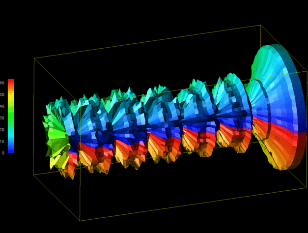
So the next step is to see how we can extend or enhance a
visualization like the Kiviat diagram. One potential problem with the
standard Kiviat animation is that the viewer sees only one step at a
time and can easily lose track of how the performance at that step
compares to the performance during other parts of the animation. By
removing the animation of the display, letting time run along the
third axis, and rendering a "shell" around the individual slices, we
can form Kiviat "tube," as shown in Figure 2.
Such a representation of the original Kiviat diagram is potentially
useful because it gives the viewer a global perspective of the
performance data. For certain performance problems (for example,
identifying periods of poor utilization across all processors), such a
view can be very helpful. However, this 3D representation tends to
obscure more detailed information about individual processors at
specific times -- information that the standard 2D Kiviat display
shows more clearly.
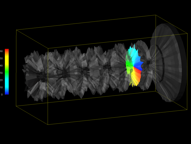
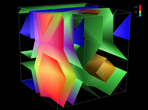
It is possible that individually, neither of the Kiviat displays
generated thus far (Figures 1 and 2) totally fulfills the viewer's
needs. Combining the two displays might. Thus, the idea for an
enhanced display is to let the 2D Kiviat "slice" slide through a
partially transparent Kiviat tube. The slice highlights the
interprocessor relationships for a given time step while the rest of
the tube continues to reveal how a particular step relates to the rest
of the data.
The new visualization design combines several sophisticated graphical
techniques (for example, composition and transparency). Programming
the visualization from scratch using a graphics library poses a
complicated task for the performance tool developer. However, having
previously created the two individual display components, we can
combine them effortlessly using DX. It took literally just a few
minutes to create the composite visualization in Figure 3.
The data-parallel programming model is a well-accepted approach to
developing scalable parallel programs. However, to achieve scalable
performance, users must address how the data distribution across
processors affects the load balance of the computation and the
overhead of processor interactions. Hence, the data-parallel
programming and execution models often provide a rich semantic context
for program and performance analysis tools. Visualizations can
effectively complement these tools if the problem of display
scalability can be overcome.
Our research has also focused on identifying and demonstrating methods
for achieving visual scalability [2]. Some of these methods are new to
performance visualization, while others are conceptual extensions to
the work of other researchers. In either case, our integration of
these methods with sophisticated graphics represents an advance in
parallel performance visualization.
One common approach to achieving visual scalability is reduction and
filtering. Traditional reduction methods perform statistical
operations at the raw data level, such as computing the sum, mean,
standard deviation, or frequency distribution. Filtering often
excludes certain data values (for example, outliers), while reduction
may cluster logical groups of values into a single value. Using
reduction and filtering, we can present a smaller data set containing
some essential, summarized, or less detailed information in place of
the original data. We have extended this notion to include graphical
reduction -- operations that help reduce the complexity of a
visualization at the level of graphical representation (as opposed to
raw data).
One operation we use in this capacity is the isosurface. As the 3D
analog of 2D contour lines, isosurfaces represent surfaces of constant
value (isovalue) within a volume. We instrumented a data-parallel
array computation and collected counts of local and remote data
element accesses. (Accesses are classified relative to the processor
that owns the data element accessed. A remote access often implies an
expensive interprocessor communication, which can impact performance.)
By arranging the block-distributed data elements in a cubic volume, we
can use isosurfaces to explore the performance data. Each data element
has an associated number of local and remote accesses made to it
during the last time interval. Isosurfaces reveal regions of data
experiencing similar levels of each access type. Animating the
visualization effectively reveals the evolution of data access
patterns during the program's execution, thus identifying regions and
periods of more intense accesses. Figure 4 contains two time steps
from a 4x4x4 (64-element) cube showing remote accesses. Figure 5 shows
local accesses within a scaled-up, 16x16x16 (4,096-element) structure.
These displays achieve scalability by filtering and reducing the
displayed data. Isosurfaces perform an effective graphical reduction
because several isovalues can be used (each figure contains five) to
create multiple surfaces that span the range of the performance metric
and represent all elements of the structure, yet do not cause
uninformative visual complexity.
Conclusion
For more information on this research, see Heath, Malony, and Rover [3] and visit our Web site at URL:http://www.cs.uoregon.edu/~hacks/info-research.html.
Acknowledgements
2. S. Hackstadt and A. Malony, "Scalable Performance Visualization
for Data-Parallel Programs." Proc. Scalable High Performance
Computing Conference, IEEE Computer Society Press, Los Alamitos,
Calif., 1994, pp. 342-349.
3. M. Heath, A. Malony, and D. Rover, "The Visual Display of Parallel
Performance Data," to be published in Computer, special issue
Parallel and Distributed Technology Tools, Nov. 1995.
Processor utilization is a common metric used to evaluate parallel
program performance. Information about how a program uses the
processors of a parallel machine often provides insights into task
decomposition and data distribution.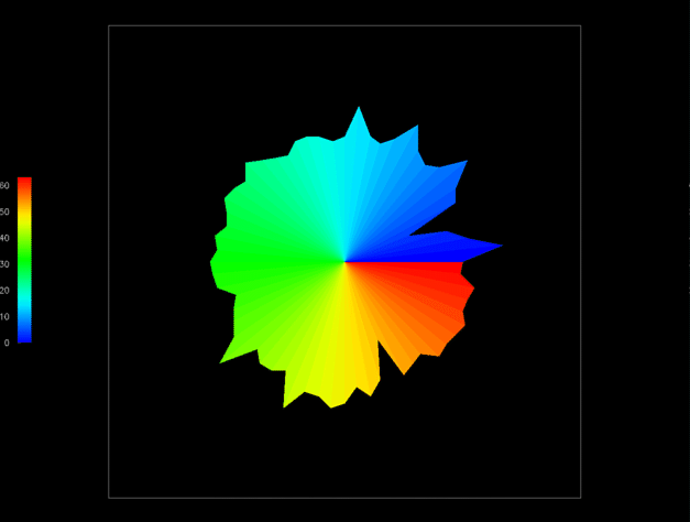
1
The traditional 2D Kiviat diagram represents
processors as spokes arranged in a circle. Spoke color indicates the
processor's ID, and length represents its utilization.
2
A 3D Kiviat tube gives the analyst a global
view of the performance data, but at the same time obscures detailed
information about certain processors or time steps.
3
This visualization combines the Kiviat
displays in Figures 1 and 2, thus using advanced graphical techniques,
but requiring minimal effort to create.
Scalable visualization
Scalability is another key consideration in evaluating parallel
programs. Programmers are typically concerned about how the number of
processors or the problem size affects performance. For example, we
hope that doubling the number of processors doubles performance for a
fixed problem size.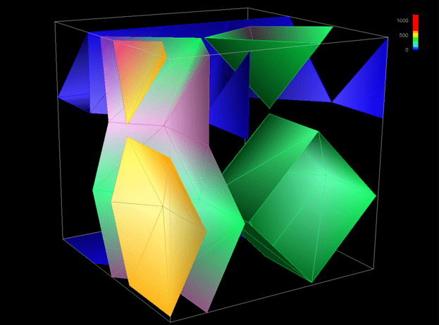
4
Isosurfaces at two time steps are used to
explore the regions and frequency of remote accesses to a distributed
data structure.
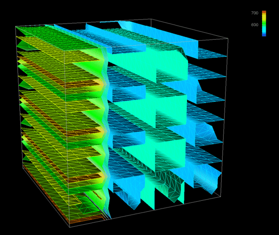
5
Isosurfaces reveal a regular pattern of
local accesses even after scaling the problem size by a factor of
64.
Performance visualization faces many challenges. We have touched on
just a few issues here. The Kiviat tubes illustrate how the lack of a
physical model can cause performance visualizations to take on rather
abstract appearances. There is also the challenge of finding new ways
to apply traditional scientific visualization techniques to
performance visualization problems. For instance, while isosurfaces
are often used to analyze real-world, volumetric data (e.g., wind
velocities in a thunderstorm), we rarely talk about "volumes" of
parallel performance data. Yet, we have demonstrated one way that
isosurfaces can be used to explore how data element distribution
impacts performance. These visualization techniques also assist us in
addressing other problems like visual scalability.
This work was supported by IBM Research and Development contract
MHVU3704 from the IBM Highly Parallel Supercomputing Systems
Laboratory, grant ASC9213500 from the National Science Foundation
Advanced Scientific Computing Program, and ARPA Rome Labs contract
AF-30602-92-C-0135.
References
1. M. Heath and J. Etheridge, "Visualizing the Performance of
Parallel Programs," IEEE Software, Vol. 8, No. 5, Sept. 1991,
pp. 29-39.
Last modified: Tue Dec 7 09:35:50 PST 1999
Steven Hackstadt /
hacks@cs.uoregon.edu