 Figure 1.1
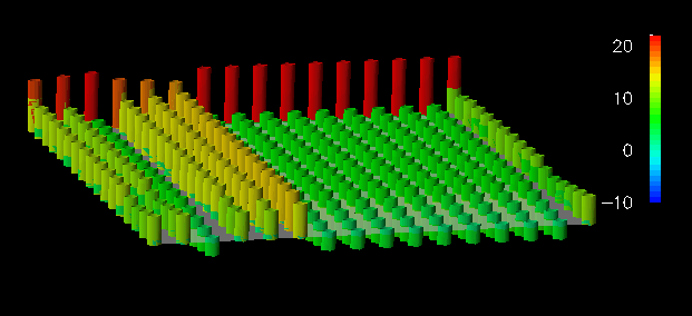 Figure 1.2
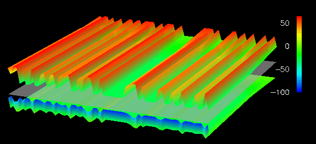 Figure 1.3
 Multiple views. To fully understand a parallel program's operation, data from the execution must be captured and analyzed across different levels of observation and from different perspectives [12,20,22]. A single visualization can incorporate only a subset of the data analysis results and show only one of several possible types of data displays. Different visualizations are possible depending on choice of analysis data and display: e.g., program [7], process [11], application [1,24], and machine [20]. Tools have provided alternatives via selectable sets of views [6] or through an environment for view construction [19].
Semantic context. It is generally believed that visualization interpretation is improved if the user is provided with a semantic context for understanding the parallel program data presented [2,11,24]. This context can be in the form of program control and data abstractions, programming model and system mapping, runtime execution and machine architecture, or computation behaviors. A visualization supports semantic context in how it is structured, its use of graphics, its interaction, its correlation to other displays, and its support for accessing the underlying raw information.
User interaction. For purposes of selecting alternative views, changing the level of detail or the type of data, and controlling display parameters, visualization tools should provide adequate support for user interaction. In general, the visualization environment should allow the user to find the best possible visualization scenario for data interpretation. Hence, user interaction can extend to the construction of visualizations indirectly by using a modular, data flow environment [19] or data spreadsheet model [21], or directly through a graphical object programming system [8,23].
Although the principles above provide constructive guidelines for visualization design, it is still a challenging undertaking to develop generally useful parallel program visualization tools. Several projects have tried to deliver general visualization solutions, leading to widely debated concerns over usability. Miller addressed some of these concerns in the essay What to Draw? When to Draw? An Essay on Parallel Program Visualization [17] where he provided criteria for a "good visualization." These criteria, like the principles above, help to define general requirements that will guide the visualization designer to create effective visual displays.
However, the focus in the parallel programming tool community on the quality of visualizations offered by end-user tools has been, in part, at the expense of research into developing improved visualization techniques that better target specific end-user requirements. With the importance of semantic context in enhancing visualization interpretation, it is good practice not to restrict visualization design creativity by requiring visualizations to have broad user appeal, particularly since a meaningful visualization for one user may not be especially meaningful for another. Rather, efforts are better directed at developing visualization techniques [4] that can be applied in building visualization tools to address specific problems that users encounter in parallel program evaluation, while following general principles and guidelines for good visualization design [10,17,25].
In this paper, we direct our visualization research towards the problem of designing visualizations of parallel performance information for scalable, data-parallel programs. In this context, we buld upon Couch's work in scalable execution visualization [2], and Rover's work in performance visualization of SPMD and data-parallel programs [20], to propose techniques that may be effectively applied in future parallel program analysis tools. We demonstrate these techniques through visualizations that have been produced for the Dataparallel C [5] and pC++ [16] language systems using the IBM Data Explorer scientific visualization environment [13]. Our intent (as was Rover's with the VISTA paradigm) is not to sell a general purpose tool, but rather to offer research results that help to advance the state of the art in parallel performance visualization. In Section 2, we discuss a categorization of four scalable visualization techniques for data-parallel programs. These techniques are demonstrated in Section 3.
2. Scalable Visualization Methods
Data-parallel programming is a well-accepted approach to develop programs that can scale in their performance. However, to achieve scalable performance, users must be concerned about how the data distribution across processors of a system affects the load balance of the computation and the overhead of processor interactions. The data-parallel programming model and its execution model instantiation on parallel machines provides a rich semantic context for program analysis tools. Visualizations can be an effective complement to program analysis if the problems of display scalability can be overcome.
Through our research, we have observed four general methods that can used to achieve visual scalability. Some have been introduced by other researchers, while others are new visualization techniques. In either case, our integration of these methods with sophisticated graphics represents a significant advance in parallel performance visualization, in particular as it applies to data-parallel program analysis. The following four categories represent a diverse set of visualization techniques that we have used to create scalable visualizations:
Thus, a visualization is developed around a concept that can be represented by several different graphical representations. An appropriate technique is chosen that is consistent with the visualization concept and the two properties above. It is important to note that these criteria oppose one another since level of detail and visual complexity are directly related in many displays. That is to say that the revelation of more detail generally leads to a higher degree of visual complexity, and less visual complexity usually implies that less detail can be shown. The balance between the two is subjective and dependent on many factors such as the visualization concept being used and the viewer's preference.
2.2. Reduction and filtering
Reduction and filtering are established techniques for achieving scalability. Traditional reduction methods perform statistical operations at the raw data level, such as computing the sum, mean, standard deviation, and frequency distribution. Using these methods, a smaller dataset containing some essential, summarized, or less detailed information is presented in place of the original data. We extend this notion to include graphical reduction, which includes operations that help to reduce the complexity of the visualization at the level of graphical representation.
2.3. Spatial arrangement
Spatial arrangement can be used to produce scalable visualizations by arranging graphical elements so that as a dataset scales, the display size and/or complexity increase at a much slower rate. In many instances, the spatial arrangement of data in a visualization simply provides a framework in which other graphical techniques (e.g., coloring, annotation) attempt to portray the characteristics of the performance data. A special type of spatial arrangement, which we call shape construction, is a technique in which one defines the properties of a three-dimensional structure by the characteristics of the performance data to be visualized. The shape of the resulting object captures the combined characteristics of the performance data. What makes shape construction a specialized type of spatial arrangement is as follows. In general, the spatial arrangement of a dataset is not the component of the display that conveys the characteristics of that dataset. Rather, as mentioned above, some additional graphical technique is employed within that organization to accomplish that task. In a visualization using shape construction, the spatial arrangement of the data does play a key role in conveying the characteristics of the performance data. Other features of the "shape" may assist in this function as well (e.g., color, surface properties).
2.4. Generalized scrolling
Finally, generalized scrolling refers to the use of a variety of methods to present a continuous, localized view of a much larger mass of information. Localization allows a greater level of detail to be presented, while continuity allows relationships between nearby representations to be observed. As an extension to the traditional notion of scrolling which depends on spatial continuity, we consider how temporal continuity can be used to perform scrolling. In this way, we classify display animation as a scrolling technique that utilizes temporal continuity.
3. Application
This section offers several examples of data-parallel program performance analysis that demonstrate the types of visualization scalability mentioned in the previous section. Some visualizations illustrate more than one technique. The Data Explorer environment in which these displays were created provides standard display interaction techniques such as panning, zooming, and fly-through. (The reader should note that the relatively small, greyscale figures in this paper do not do justice to the actual color renderings.)
3.1. Adaptive graphical representation
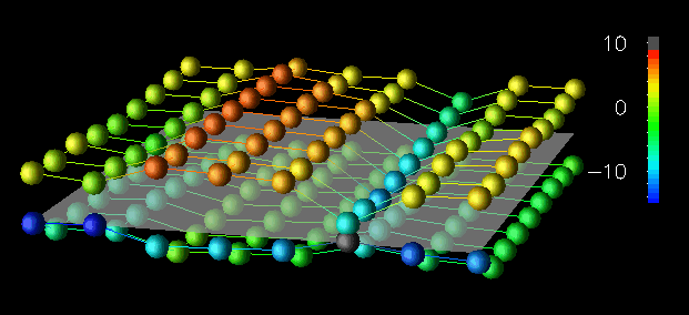
To illustrate how visual scalability is achieved by adapting the graphical techniques used, consider the visualizations in Figures 1.1, 1.2, and 1.3. The data for this sequence was generated by a Dataparallel C implementation of a Gaussian elimination algorithm running on a Sequent Symmetry multiprocessor. For these displays, we were interested in evaluating the interleaved data distribution as problem size scaled. To do this, we adopted a visualization concept that uses vertical displacement from a reference plane (representing the two-dimensional data structure), double-cued with color, to represent the differences in local and remote accesses to elements of the data structure. A processor performs a local access if it reads or writes data that resides in the memory of another processor, and it performs a remote memory access if it reads or writes data that resides in the memory of another processor. (Note that these examples view data accesses at the level of the virtual machine maintained by Dataparallel C.) In all visualizations, the structures above the reference plane represent the difference between local and remote read accesses, while the objects below the plane represent the difference between local and remote write accesses.
For the small 8x8 dataset in Figure 1.1, discrete, colored spheres floating above the reference plane minimize the obstruction of other objects in the view, while effectively representing the performance information because of the small size of the dataset. For example, elements in row 2 have encountered more remote read accesses than those in other rows. Figure 1.2 shows a 16x16 dataset. Glyphs lack "connection" to the reference plane, and when the number of elements increases sufficiently it becomes difficult to determine which glyph corresponds to which element. The towers used in Figure 1.2 provide such reference information by linking the vertically displaced top of the tower with the reference plane. Finally, for the larger 64x64 dataset (Figure 1.3), a continuous displacement grid minimizes the visual complexity that would be caused by 4,096 discrete glyphs or towers, but it does so at the expense of the quantity of detail that is visible from a given view. (That is, with the small dataset you could simultaneously see both sets of glyphs, whereas with large dataset this isn't possible.)
Figure 1.1
Figure 1.2
Figure 1.3
From these visualizations, the user can interpret the access frequency among local and remote reads and writes. However, detailed views are obscured as the dataset increases in size. The sequence illustrates one method of achieving scalability by adapting the graphical technique in relation to the size of the dataset. Such adaptation often manifests itself as a transition from a discrete, detail-revealing method to a continuous, complexity-reducing technique, echoing the two criteria set out in the premise for this technique. With respect to the data-parallel program, the discrete-to-continuous transition approximates the increasing detail of the parallel data structure.
3.2. Reduction and filtering
In many instances, we need not visualize all the detail present in a dataset to gain insight into what the dataset contains. To this end, filtration and reduction can be used to develop scalable visualizations.
The visualizations in Figures 2.1, 2.2, and 2.4 illustrate this technique by using isosurfaces within a three-dimensional structure. Isosurfaces, the three-dimensional analog of (two-dimensional) contour lines, represent surfaces of constant value (called the "isovalue") within the structure. In these visualizations, we portray local and remote access information from a pC++ implementation of the random sparse conjugate gradient computation in the NAS benchmark suite. We have arranged the elements of a BLOCK-distributed data structure in a three-dimensional cube. Each element has an associated number of remote data accesses made to it in the last time interval. The isosurfaces within the structure reveal areas of the data structure experiencing similar levels of remote accesses. By animating the visualization (Figure 2.3 contains a 31-frame animation), the evolution of data access patterns during the program's execution are effectively revealed, allowing regions of more intense access to be identified. Figures 2.1 and 2.2 represent two time slices from a 4x4x4 cube. Figure 2.4 is a scaled version of this display, using a 16x16x16 structure and showing local instead of remote accesses.
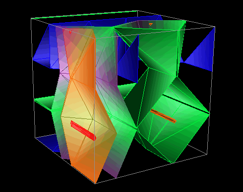 Figure 2.1
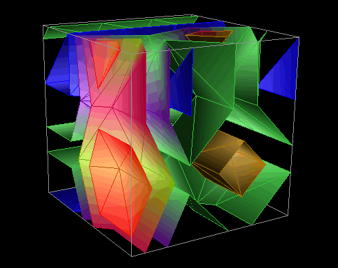 Figure 2.2
 Figure 2.3 Animation (176K)
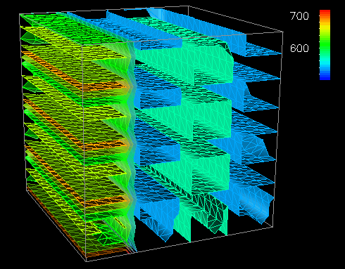 Figure 2.4
Scalability is achieved in these displays by filtering and reducing the displayed data. Isosurfaces perform an effective graphical reduction because several isovalues can be used (each figure contains five) to create multiple surfaces that span the range of the performance metric of interest and represent all elements of the structure, yet do not cause uninformative visual complexity.
3.3. Spatial arrangement
Our research has found that certain spatial arrangements of data elements can produce highly scalable visualizations. To illustrate this, we present three sets of figures. First, we return to the isosurface displays in Figures 2.1, 2.2, and 2.4. We discussed previously that the isosurfaces provide scalability by reducing and filtering the amount of data to be represented in the visualization. However, the spatial arrangement of the data structure provides another aspect of scalability. Figures 2.1 and 2.2 each represent 64 data elements organized in a 4x4x4 cube; Figure 2.4 represents 4,096 elements organized as a 16x16x16 cube. Whereas the problem size has scaled by a factor of 64, the axes of the cube have only scaled by a factor of 4. Clearly, the scalability of spatial dimensions is critical to the scalability of visualizations in general.
The next set of displays that demonstrates the use of spatial arrangement as a method of achieving scalability are in Figures 3.1a, 3.1b, and 3.2. These displays implement a type of three-dimensional scatter plot that relies on the perceptive abilities of the human visual system to detect clustering and distribution patterns [2,10,25]. For this reason, this visualization gains effectiveness for larger datasets. Thus, the spatial arrangement (i.e., distribution) of the data yields a technique that scales well. Figures 3.1a and 3.1b portray the quantity and location of accesses by each processor. Processors are identified by a glyph's color, with the vertical displacement from the reference grid indicating the number of accesses made to each of the 64 data elements (arranged in an 8x8 grid) during the last time interval of the pC++ application. Figure 3.2 offers a prototype of a scaled version of this display on a 32x32-element structure.
From these displays, the analyst can derive several observations that are helpful in evaluating the memory access patterns of an application as well as the data distribution currently being used. For example, by using the vertical displacement visualizations (Figures 1.1, 1.2, and 1.3) for this pC++ application, an analyst could easily learn about the distribution of local and remote data accesses. This is also seen in Figures 3.1a, 3.1b and 3.2 by noticing that the glyphs generally appear in two vertically separated clusters (particularly when viewed from the appropriate orientation, as in Figure 3.1b). The display reveals how the data was distributed among the 16 processors by the color distribution. However, a differentiation between local and remote references is not made. The analyst might notice such a division first, though, and then be motivated to determine local and remote distributions from the other displays. Alternatively, within the Data Explorer environment, the user could change the color mapping so that local and remote accesses are distinguished. This example shows how user interactions can play a significant role in scalable visualizations.
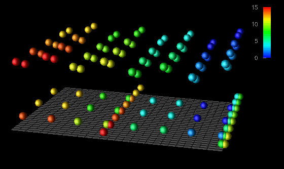 Figure 3.1a
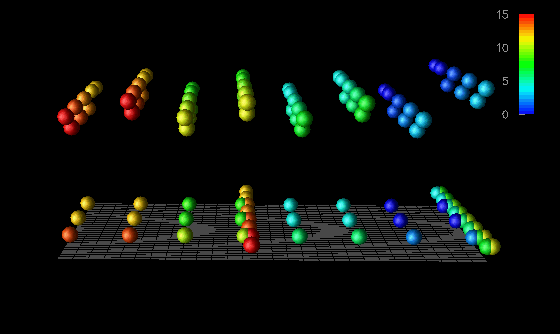 Figure 3.1b
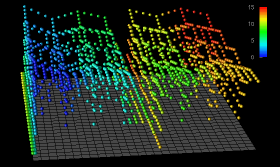 Figure 3.2
That such references are actually remote is confirmed not only by the small degree of vertical displacement (indicating the lower frequency associated with remote accesses in this application), but by the presence of glyphs having colors different than the corresponding glyphs above representing local accesses.
The last set of visualizations that illustrate scalability by spatial arrangement are in Figures 4.1, 4.2, 4.3, and 4.5. These displays are extensions of the popular Kiviat displays, as used in ParaGraph [6], and come from the same pC++ application described earlier. The construction of a single time slice of these displays is achieved by arranging the 64 data elements in a circle. The distance a given element is from the center of the circle is directly proportional to the accumulated number of local (Figures 4.1, 4.2, and 4.3) or remote (Figure 4.5) data accesses made to that element during the previous time interval. To construct the solid shown in Figure 4.1, adjacent elements in the same time slice and corresponding elements in successive time steps are connected to form quadrilateral surface patches. We call the net result a "Kiviat tube."
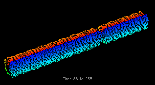 Figure 4.1
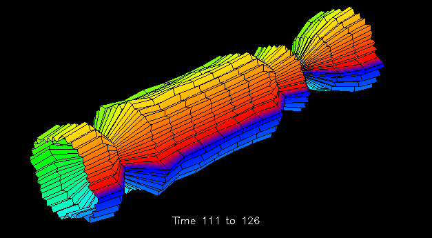 Figure 4.2
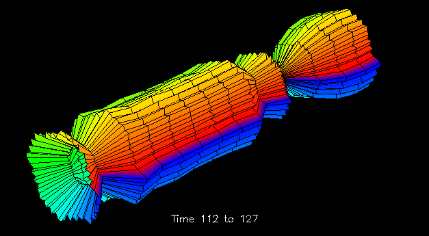 Figure 4.3
 Figure 4.4 Animation (632K)
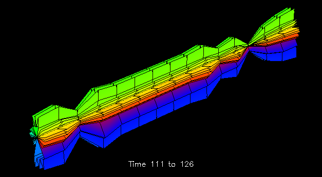 Figure 4.5
The arrangement of data elements in a circle provides a moderately scalable (two-dimensional) spatial arrangement. We will present some additional scalability issues for this series of displays in the next section, but first, we will discuss in more detail the construction of the Kiviat tube, an example of shape construction. The unique feature of shape constructive spatial arrangement over the spatial arrangement seen in the isosurface visualizations (Figures 2.1, 2.2, and 2.4) is that the former uses the shape itself to capture the characteristics of the performance data, while the latter simply provides a framework within which some other graphical technique (e.g., a set of isosurfaces) is employed to relate the performance data. Figure 4.1 depicts a single graphical object that captures the characteristics of an entire trace file, with time traveling along the length of the cylinder. (The initial 53 time slices have been removed because no memory accesses to the chosen data structure occurred during that time.) We feel that such three-dimensional representations can play an important role in providing global performance information. For example, in Figure 4.1 the reader may notice a very regular access pattern for the first part of the trace, as indicated by the symmetry and constant diameter of the tube. However, approximately two-thirds of the way through the displayed trace data, a significant decrease in the number of local memory accesses occurs. Such global observations guide the program analyst to potential trouble spots in the execution of the algorithm; such observations tend to be more perceptual rather than cognitive [23]. As we will see in the next section, the analyst can then examine that portion of the trace in more detail.
3.4. Generalized scrolling
Scrolling is an established technique used to create scalable visualizations by representing smaller localized views of the visualization as the quantity of data to be displayed increases. Traditional scrolling provides a spatially continuous view of the display by allowing the user to "move" around the structure. We generalized this notion to include temporal continuity and demonstrate animation as a generalized scrolling technique.
The Kiviat tubes of Figures 4.1, 4.2, 4.3, and 4.5 serve to illustrate both scrolling techniques. We have already discussed how Figure 4.1 could guide the analyst to a particular region of the trace file. Such a region is expanded in Figures 4.2, 4.3, and 4.5. The Kiviat tube displays we have developed allow the user to specify an animation width to display a smaller portion of the structure. Figures 4.2, 4.3, and 4.5 all have animation widths of 15 time steps. The ability to zoom in on local regions of the larger structure is an example of spatial scrolling. The display's use of scrolling is, in fact, somewhat more general than most uses of scrolling since it allows the user to view just the desired portion of the tube. In addition, the displayed portion may be stretched or compressed to the viewer's preference.
To extend the notion of scrolling further, animating the structures in Figures 4.2, 4.3, and 4.5 provides additional insight into the performance data's characteristics. Our implementation of this visualization allows the viewer to "slide" down the length of the Kiviat cylinder at a given animation width. Figure 4.3 represents the time step that follows Figure 4.2, and Figure 4.4 contains a 32-frame animation illustrating the concept. This section of the Kiviat tube reveals three intervals during which the number of local memory accesses decreased significantly. The analyst may then wish to examine the corresponding structure for remote memory accesses. Figure 4.5 shows such an alternate view that corresponds to Figure 4.2. One immediately notices the significant difference in the distribution of remote memory accesses made to the elements of the data structure. In particular, the elements located on the top and bottom sides of the tube experience larger numbers of remote data accesses than the other elements. One also immediately notices that remote accesses experience a decline similar to the local accesses during the same three intervals. All of this is potentially meaningful information for the analyst seeking to understand data distribution and performance characteristics of an application.
As we have demonstrated, generalized scrolling provides scalability by presenting a local view of the represented data, but allows global relationships to be observed by providing continuous transition from one representation of the data to another.
4. Conclusion
The increasing sophistication and complexity of parallel computing environments will continue to present new challenges to understanding the operation and performance behavior of parallel programs. Visualization has the inherent capacity to facilitate parallel program evaluation only if its graphical data presentation capabilities, routinely used for scientific data analysis, can be effectively applied to reveal important properties of parallel program execution data. We believe that the most productive approach to developing useful visualizations for inclusion in parallel programming tools is to experiment with different visualization techniques in specific application contexts [3,4]. Our research work has identified four categories of scalable visualization techniques for data-parallel program analysis that can be successfully applied to the Dataparallel C and pC++ languages. We are currently integrating these techniques into performance and debugging tools that are part of the pC++ parallel programming environment.
5. Acknowledgments
Supported in part by the National Science Foundation under grant NSF ASC92-13500, by ARPA under Rome Labs contract AF-30602-92-C-0135, by a grant from OACIS, and by IBM R&D contract MHVU3704.
6. References
[1] D. Socha, M. Bailey, and D. Notkin. Voyeur: Graphical Views of Parallel Programs. Proc. Workshop on Parallel and Distributed Debugging, ACM SIGPLAN Notices, 24, 1, Jan., 1989.
[2] A. Couch. Categories and Context in Scalable Execution Visualization. Jour. of Parallel and Distributed Computing, 18, 2, June, 1993, pp. 195-204.
[3] S. Hackstadt and A. Malony. Data Distribution Visualization for Performance Evaluation. Dept. of Computer and Information Science, Univ. of Oregon, Tech. Rep. CIS-TR-93-21, Oct., 1993.
[4] S. Hackstadt and A. Malony. Next-Generation Parallel Performance Visualization: A Prototyping Environment for Visualization Development. To appear Proc. Parallel Architectures and Languages Europe (PARLE), Athens, Greece, July, 1994; Also, Dept. of Computer and Information Science, Univ. of Oregon, Tech. Rep. CIS-TR-93-23, Oct., 1993.
[5] P. Hatcher and M. Quinn. Data-Parallel Programming on MIMD Computers. The MIT Press, Cambridge, MA, 1991.
[6] M. Heath and J. Etheridge. Visualizing the Performance of Parallel Programs. IEEE Software, Sept., 1991, pp. 29-39.
[7] A. Hough and J. Cuny. Perspective Views: A Technique for Enhancing Parallel Program Visualization. Proc. of 1991 Int'l. Conf. on Parallel Processing, Aug., 1991, pp. 124-132.
[8] J. Kohn and T. Casavant. Use of PARADISE: A Meta-Tool for Visualizing Parallel Systems. Proc. 5th Int'l. Parallel Processing Symposium, May, 1991, pp. 561-567.
[9] E. Kraemer and J. Stasko. The Visualization of Parallel Systems: An Overview. Jour. of Parallel and Distributed Computing, 18, 2, June, 1993, pp. 105-117.
[10] P. Keller and M. Keller. Visual Cues: Practical Data Visualization. IEEE Press, Piscataway, NJ, 1993.
[11] M. LaPolla, J. Sharnowski, and B. Cheng. Data Parallel Program Visualizations from Formal Specifications. Jour. of Parallel and Distributed Computing, 18, 2, June, 1993, pp. 252-257
[12] T. LeBlanc, J. Mellor-Crummey, and R. Fowler. Analyzing Parallel Program Executions Using Multiple Views. Jour. of Parallel and Distributed Computing, 9, 2, June, 1990, pp. 203-217.
[13] B. Lucas, G. Abram, N. Collins, D. Epstein, D. Gresh, K. McAuliffe. An Architecture for a Scientific Visualization System. Proc. Visualization 1992, IEEE, 1992, pp. 107-114.
[14] A. Malony and D. Reed. Visualizing Parallel Computer System Performance. In Instrumentation for Future Parallel Computer Systems, M. Simmons, R. Koskela, and I. Bucher (Eds.), ACM Press, New York, NY, 1989, pp. 59-90.
[15] A. Malony, D. Hammerslag, and D. Jablonowski. TraceView: A Trace Visualization Tool. IEEE Software, 8, 5, Sept., 1991, pp. 29-38.
[16] A. Malony, B. Mohr, P. Beckman, D. Gannon, S. Yang, and F. Bodin. Performance Analysis of pC++: A Portable Data-Parallel Programming System for Scalable Parallel Computers. to appear in Proc. Int'l. Parallel Processing Symposium, Apr., 1994.
[17] B. Miller. What to Draw? When to Draw? An Essay on Parallel Program Visualization. Jour. of Parallel and Distributed Computing, 18, 2, June, 1993, pp. 265-269.
[18] C. Pancake. Customizable Portrayals of Program Structure. Proc. ACM/ONR Workshop on Parallel and Distributed Debugging, San Diego, CA, May, 1993, pp. 64-74.
[19] D. Reed, R. Olson, R. Aydt, T. Madhyastha, T. Birkett, D. Jensen, B. Nazief, and B. Totty. Scalable Performance Environments for Parallel Systems. Proc. 6th Distributed Memory Computing Conf., Apr., 1991, pp. 562-569.
[20] D. Rover and C. Wright. Visualizing the Performance of SPMD and Data-Parallel Programs. Jour. of Parallel and Distributed Computing, 18, 2, June, 1993, pp. 129-146.
[21] S. Sarukkai and D. Gannon. SIEVE: A Performance Debugging Environment for Parallel Programs. Jour. of Parallel and Distributed Computing, 18, 2, June, 1993, pp. 147-168.
[22] S. Sarukkai, D. Kimelman, and L. Rudolph. A Performance Visualization Methodology for Loosely Synchronous Programs. Jour. of Parallel and Distributed Computing, 18, 2, June, 1993, pp. 242-251.
[23] J. Stasko. Three-Dimensional Computation Visualization. Tech. Rep. GIT-GVU-92-20, College of Computing, Georgia Inst. of Technology, 1992.
[24] J. Stasko and E. Kraemer. A Methodology for Building Application-Specific Visualizations of Parallel Programs. Jour. of Parallel and Distributed Computing, 18, 2, June, 1993, pp. 258-264.
[25] E. Tufte. The Visual Display of Quantitative Information. Graphics Press, Chesire, CT, 1990.