Next-Generation Parallel Performance Visualization:
A Prototyping Environment for Visualization Development
{hacks,malony}@cs.uoregon.edu
Department of Computer and Information Science
University of Oregon, Eugene, OR 97403
Ph: 503-346-4407 / FAX: 503-346-5373
October, 1993
Appearing in Proceedings of the Parallel Architectures and Languages Europe (PARLE) Conference, Athens, Greece, July, 1994.
Table of Contents
Figure Contact Sheet
Abstract
A new design process for the development of parallel performance visualizations that uses existing scientific data visualization software is presented. Scientific visualization tools are designed to handle large quantities of multi-dimensional data and create complex, three-dimensional, customizable displays which incorporate advanced rendering techniques, animation, and display interaction. Using a design process that leverages these tools to prototype new performance visualizations can lead to drastic reductions in the graphics and data manipulation programming overhead currently experienced by performance visualization developers. The process evolves from a formal methodology that relates performance abstractions to visual representations. Under this formalism, it is possible to describe performance visualizations as mappings from performance objects to view objects, independent of any graphical programming. Implementing this formalism in an existing data visualization system leads to a visualization prototype design process consisting of two components corresponding to the two high-level abstractions of the formalism: a trace transformation (i.e., performance abstraction) and a graphical transformation (i.e., visual abstraction). The trace transformation changes raw trace data to a format readable by the visualization software, and the graphical transformation specifies the graphical characteristics of the visualization. This prototyping environment also facilitates iterative design and evaluation of new and existing displays. Our work examines how an existing data visualization tool, IBM's Data Explorer in particular, can provide a robust prototyping environment for next-generation parallel performance visualization.
1 Introduction
Even though we navigate daily through a perceptual world of three spatial dimensions and reason occasionally about higher dimensional arenas with mathematical ease, the world portrayed on our information displays is caught up in the two-dimensionality of the endless flatlands of paper and video screen. All communication between the readers of an image and the makers of an image must now take place on a two-dimensional surface. Escaping this flatland is the essential task of envisioning information - for all the interesting worlds (physical, biological, imaginary, human) that we seek to understand are inevitably and happily multivariate in nature. Not flatlands.
- Edward Tufte, Envisioning Information.
Performance visualization is the use of graphical display techniques for the visual analysis of performance data to improve the understanding of complex performance phenomena. From the opening chapter of his book Envisioning Information [24], Edward Tufte foretells the future of performance visualizations. Tufte recognizes and demonstrates the necessity and effectiveness of multi-dimensional information displays. While the graphics of current performance visualizations are predominantly confined to the two-dimensional flatland described by Tufte, our work has as one of its primary goals the development of new methods for rapidly prototyping next-generation, multi-dimensional performance visualizations.
This paper proposes a design process for performance visualization development that greatly reduces programming overhead, facilitates rapid prototyping, and allows for effective iterative design and evaluation. By applying the tools of scientific visualization to performance visualization, we have found that next-generation displays for performance visualization can be prototyped, if not implemented, in existing data visualization software products using graphical techniques that physicists, oceanographers, and meteorologists have used for several years now.
We proceed by motivating this research in Section 2. Next, we summarize related research in Section 3 and offer a brief description of the visualization package, Data Explorer, in Section 4. This is followed by a detailed examination of the methodology (Section 5) and a description of the visualization development process that we have developed by applying the methodology to a particular implementation environment (Section 6). In Section 7, several examples of this process in action are followed by a discussion of the strengths and weaknesses of the model. Finally, Section 8 summarizes our results and offers directions for future research.
2 Motivation
By now, the importance of graphical visualization in parallel performance evaluation has been established by the success of tools such as ParaGraph [5, 6], Seive [21], Pablo [17], Voyeur [22], Seeplex [3], and Traceview [12]. These products offer the parallel programmer access to information and insights that might otherwise go unobserved. Whether a parallel program is executing on 4 or 4,000 processors, the ability to view performance data in an useful way often enables the programmer to identify anomalous behavior within a program. Subtle changes in the way a program performs its computation, for example, could offer substantial improvements in performance. Without visualization techniques to aid in the discovery of such problems, performance improvements might never be found [5].
Clearly, performance visualization is not a panacea to the performance issues facing parallel programmers. Visualizations have to be "useful" - as a way to elucidate performance behavior. However, "useful" is certainly a subjective term. For instance, in the domain of scientific visualization, a display that is "useful" to the scientist in a jet propulsion laboratory may be inappropriate to the researcher analyzing ocean currents. The notion of "useful" as it applies to scientific visualization applies to performance visualization as well. The important point is that if a visualization helps a single person do their work better, then the visualization should be considered "useful."
Currently, though, developers must decide beforehand (i.e., prior to implementation) what set of visualizations may be useful to the most people. Determining the effectiveness of visualizations is difficult without usability case studies (such as [5]) and a more formal evaluation framework (which might incorporate the ideas in [14]). While application-specific displays have their place in performance visualization, displays can be meaningful to large numbers of people. The success of the tools mentioned above is testimony to this fact. However, the degree to which a visualization can be considered general-purpose or application-specific is a difficult quantity to determine. Nonetheless, both theory and practice strongly suggest the need for a wide range of application-specific visualizations to augment the general-purpose set. To date, this need has been difficult to fulfill because of the considerable overhead in creating, evaluating, and formalizing performance visualizations, but its importance has been documented by Stasko and Kraemer [23]. Heath and Etheridge [6], creators of the general-purpose ParaGraph displays, even acknowledge the importance of application-specific displays when they state:
In general, this wide applicability is a virtue, but knowledge of the application often lets you design a special-purpose display that reveals greater detail or insight than generic displays would permit.
Unfortunately, such displays are not easily created in a tool like ParaGraph since they require special programming skills [6]. Clearly, a development process that requires little overhead and programming would enable developers to generate application-specific displays quickly in response to user needs, as well as create and evaluate general-purpose visualizations.
Computer animations of the ozone hole, a thunderstorm, or ocean currents - all appropriately described as application-specific displays - are commonplace in scientific visualization. How have other scientists been able to overcome the overheads involved in visualization development? Scientists use generalized data visualization software products that have most, or all, of the tedious graphics and data manipulation programming already done, although there is still a creative process involved in constructing scenarios for visualizing scientific data. Performance visualization developers, on the other hand, have heretofore chosen to develop dedicated graphics and data manipulation support from the ground up, inadvertantly reducing the type and variety of displays available to the user.
As parallel computing architectures, environments, languages, and applications continue to advance, performance visualization needs become more demanding. Most existing tools are limited to two-dimensional displays, offer little customization and display interaction, and have strict data formats. Three-dimensional visualization (plus advanced graphical techniques) applied in scientific fields has opened up entirely new possibilities for researchers, and it stands to do the same for performance visualization.
To determine whether the field of performance evaluation can benefit by such "next-generation visualizations" will require a means for rapidly prototyping and evaluating new displays. To apply the development process of existing performance visualization products to these new displays would be to start coding hundreds of three-dimensional graphics routines and interaction techniques, not to mention advanced data representation and manipulation capabilities. Many months later, the researcher might be in a position to begin prototyping and evaluating new visualizations.
The methodology we propose is based on a formal foundation in which performance abstractions are mapped to visual abstractions [13]. In general, the methodology we propose functions as an interface to existing visualization systems, programming libraries, and other graphics resources. In this manner, an existing visualization package is but a single means of implementing the formal, high-level abstractions. While our work has focused on the use of IBM's Data Explorer, any number of similar products could also be applied. At the very least, our methodology allows visualizations to be prototyped quickly with minimal overhead. Thus, displays are available for evaluation without committing months of programming to the project. Even if the scientific visualization package isn't suitable for the final implementation, researchers will at least be able to determine if their displays are useful before the final implementation begins.
This research hopes to address four primary questions:
- Why does the performance visualization development process need to be modified?
- Can existing data visualization software be used effectively to prototype performance visualizations?
- What overheads and costs are involved in using existing software to generate performance visualizations?
- What are the strengths and weaknesses of this design and development process?
The first question has been addressed in the previous paragraphs. We intend to address the second and third questions by documenting our experience with a particular visualization software package, Data Explorer (DX) by IBM. A description of the product and its capabilities is given later in the paper. Finally, in the discussion section of this paper we will attempt to illustrate some of the advantages and disadvantages of this technique.
We have used Data Explorer to prototype performance visualizations in three categories:
- Existing two-dimensional performance visualizations,
- Enhanced three-dimensional versions of existing visualizations, and
- New multi-dimensional performance visualizations that include advanced graphical rendering techniques.
Our experiences in each category offers insight to the advantages of this approach. As will be seen, we were successful in developing techniques for rapid prototyping of displays with minimal overhead and programming expense. The process avoids graphics programming completely, yet maintains access to numerous display styles and interaction techniques. In essence, developers are able to focus on the visualization design rather than the underlying implementation of data models and low-level graphical operations.
This research, while greatly facilitating the evaluation of new and existing visualizations, does not have evaluation as its goal. Many visualizations will be presented in the pages that follow. Our goal is not to evaluate these displays, but rather to develop tools and techniques for rapidly prototyping such new and existing visualizations so that evaluation could more easily take place. In most instances, appropriate interpretations of the displays are given, and we inevitably point out how a display might help an user or be better than some other display, but any "evaluation" that we do is ultimately aimed at the development techniques being explored, not the visualizations themselves.
3 Related Work
Tools such as ParaGraph [5, 6], Pablo [17], and Seeplex [3] have become popular because of their portability, scalable displays, and complete performance visualization environments. The displays offered by these products can be very effective for general parallel performance evaluation. Typically, however, the creation of application-specific displays either requires considerable programming (e.g., X Window programming) or is simply unavailable. With regard to ParaGraph, Heath and Etheridge [6] admit:
Unfortunately, writing the necessary routines to support an application-specific display is a decidedly nontrivial task that requires a general knowledge of X Windows programming.
A recent summary of current visualization tools for parallel systems can be found in [10] where Kraemer and Stasko summarize the current state-of-the-art in visualization development for parallel systems in general (i.e., parallel debugging, program visualization, and performance evaluation).
Many of the philosophies underlying our research are echoed in the work by Sarukkai and Gannon. In [21], they contend:
The lack of a generalized approach for the treatment of the performance data has lead to the use of ad-hoc means of developing performance visualization systems.
A truly programmable system should provide a means of easily obtaining the desired visualization and still not be tied to specific architectures or programs. To achieve this, the visualization mechanism should not be tied with the semantics of any event in the trace file. Instead it should provide a means of mapping subsets of all events in a trace file and different fields in these events to different axes of a figure and to different graphical objects such as circles, points, lines or 3-D objects.
Finally, a powerful visualization tool should provide some sophisticated graphical editing capabilities such as zooming into specific locations of windows, multiple color maps, overlaying of figures, etc.
Data Explorer coupled with the design process proposed herein provides some of the capabilities identified by Sarukkai and Gannon. In general, the separation of data transformation and graphics makes visualizations independent of the trace data's semantics. The flexible data models offered by most scientific visualization packages, including Data Explorer, simplify mappings between data and graphical rendering techniques, and sophisticated display interaction techniques are also supported.
Sarukkai and Gannon also make a case for the importance of application-specific displays and rapid prototyping for evaluation purposes:
While it is convenient to have predefined visualizations of programs, the problem with such tools is that it is not easy to rapidly test new visualizations....
Stasko [23] explains the dire need for application-specific displays in the context of parallel program debugging which he differentiates from performance evaluation by claiming that performance visualizations do not focus on the semantics of a particular program. As explained in the introduction, however, performance evaluation can be enhanced by creating visualizations which are linked to the semantics of an application. In this way, the visualization concerns of parallel program debugging and performance evaluation do intersect, and Stasko's reasons for application-specific displays become relevant to this work as well.
The use of prototyping tools has been established by systems such as Pablo [17] and Polka [23]. Pablo promotes itself as a performance tool prototyping environment that allows and supports end-user applications. That is, the prototyping environment is the same as the one used by the end-user, but Pablo provides little support for new visualization prototyping. Polka can be used more effectively for the rapid development of algorithmic animations but is primarily suited for sequential programs.
An essential feature of next-generation visualizations is customizability of the displays. Pancake covers this topic as it pertains to parallel debugging in [16]. As with Stasko's work, many of the concepts discussed are also relevant to parallel performance visualization. Pancake's point is that visualizations based on the user's conceptual model can be more meaningful than those which are not. Therefore, giving the user the ability to customize and/or control visualizations should result in more meaningful displays. Clearly, this notion is applicable to both debugging and performance visualizations. In [18], Roschelle argues that meaningful visualizations are not necessarily those that are consistent with an expert's mental model. Rather, users should be able to experiment with visualizations and develop their own understanding of the data. Clearly, both researchers support the importance of customizable displays.
In [19], Rover proposes a paradigm that treats performance data similar to any distributed data (i.e., program and system data) in the context of the data parallel programming model. Rover states:
Visualization displays this performance data for perusal, employing the same presentation techniques in place for data visualization, such as animation, image transformations, color manipulations, statistical analyses, etc.
In her conclusion, Rover states that existing scientific data visualization resources can be effectively applied to performance visualization. In a similar manner, our work treats performance data like scientific data, and we develop a methodology for applying scientific visualization tools which contain the presentation techniques identified by Rover to the problem of parallel performance visualization.
Finally, the literature shows at least one documented use existing visualization software products for performance evaluation. In [20], Rover utilizes AVS and Matlab to generate performance displays. Her approach is similar to the design process proposed in this paper in that performance data is collected, transformed into a format readable by the software, and then displayed using that software. The tools were used to generate simple two-dimensional displays. Our research both formalizes the approach and extends the use of such products into the development of new, more complex visualizations.
4 About Data Explorer
Before we go into the details of Data Explorer, it is important to emphasize that Data Explorer is not unique in its capability to create sophisticated visualizations and to be integrated into the formal methodology that we describe in Section 5. The high-level abstractions can manifest themselves practically in any number of ways, including other data visualization software. Data Explorer was available to us and seemed an appropriate test-bed for our research, though it is only one of many products that could fulfill the role defined by our methodology. The end of this section offers a list of several other similar products.
Data Explorer (DX) is an advanced data visualization software package produced by IBM which accommodates both developers and end-users of visualizations. Visualizations can be built by creating a visual program in the graphical user interface or by using a scripting language. The end-user can control many aspects of a visualization through the interface, while more advanced users can create new visualizations by adding, removing, or changing modules within the current visual program. DX also allows the creation of new, high-level data-processing or graphical modules.
The DX data model is extremely flexible, though it requires some time to understand and use. It can handle everything from rendering very regular, mesh-connected structures to completely arbitrary sets of polygons. At its heart, the DX data model utilizes sets of positions, connections, and data associated with one or both of these sets. This simple foundation offers tremendous flexibility in what the model can represent.
In addition, Data Explorer supports a high degree of data and software reusability. Because DX data is self-describing, visual programs retain significant generality and can consequently create a wide class of visualizations. (Section 6.2 and Figure 6.5(a, b, c, d) explore this aspect of DX in more detail.) Furthermore, a single DX data file can easily be processed by multiple visual programs. Several of the figures in this paper were generated from the same data file. (As will be discussed in Section 6.2.5, different visualizations are created by altering the trace transformation, the visual program, or both.)
The numerous graphical techniques available in DX can be combined in hundreds of ways, provided that the data satisfies the requirements of the given techniques. DX modules generally "do the right thing" for the data they receive; that is, the data is self-describing. For example, a module which renders glyphs at a set of locations based on some data value will choose the appropriate graphical technique depending on the dimension of the data (e.g., spheres for scalar values or vector arrows for three-dimensional data).
The Data Explorer software runs on several architectures, including IBM RS/6000s, Hewlett-Packard workstations, Silicon Graphics workstations, and Sun workstations. Additional information on Data Explorer can be found in [8] and [11]. Obviously, Data Explorer is not the only scientific visualization software available. Some other similar products include AVS by Advanced Visual Systems, Data Visualizer by Wavefront Technologies, IDL by Research Systems, IRIS Explorer by Silicon Graphics, and PV-Wave by Visual Numerics. In the public domain, there exists the Geometry Center's Geomview/OOGL and NCSA's Polyview products. Any of these packages could be integrated into our methodology equally as well.
5 Methodology
The work described in this paper exists in the context of a high-level abstract model that is currently guiding the performance visualization research being done at the University of Oregon [13]. At the heart of this model is the claim that if performance visualization is to play a key role in the evaluation of parallel computers and programs, then it must be established on a formal foundation that relates abstract performance behavior to visual representations (i.e., a "visual performance abstraction"). The binding of a performance abstraction to a view abstraction, mapping performance object outputs to view object inputs, represents a performance visualization [13].
A performance abstraction is the representation of how performance complexity is managed (i.e., desired performance data analysis) and the performance characteristics to be observed. A view abstraction is a representation of the desired visual form of the abstracted performance data, unconstrained by the limitations of the graphics environment. Together, these two descriptions can be used to produce performance visualization software by generating interfaces to available graphical programming libraries or existing data visualization systems. Using this methodology, new parallel performance visualization development environments can be developed and studied.
Figure 5.1 illustrates the methodology. Through a process of abstraction, performance data generates specifications for the performance analysis and the visual representation of the data. In practice, these abstractions would best be facilitated through a specification language which our research group is developing; our particular implementation environment, Data Explorer, does not currently offer support for this aspect of the methodology. Specifications are instantiated to implementable objects. (The term objects is intentionally general to accommodate the many realizations possible in different implementation environments.) Figure 5.1 indicates an overlap between performance and view objects suggesting an interdependence between their implementations. In the ideal implementation environment, performance and view objects would be totally independent, but our research has found that the degree to which these entities can be implemented independent of one another is determined by the environment in which the implementation is taking place. In Data Explorer, this overlap is present in varying degrees. Next, the instantiated objects are combined to create the visual representation of the performance data. Finally, the actual rendering of the visualization takes place through a toolkit which interfaces with the various graphics resources being utilized. The explicit existence of the toolkit is also dependent on the implementation environment (e.g., in Data Explorer, the "toolkit" interface is imbedded within the visualization system itself). For a more detailed description of this methodology, see [13].
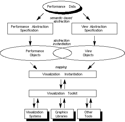
Figure 5.1 - A high-level, abstract view of performance visualization. Performance data feeds the creation of abstractions for both the performance analysis and the conceptual view. The representational abstractions are instantiated to objects which combine to form the visualization, which is then implemented by interacting with any number of supporting tools and software through the toolkit interface. The degree to which the implementation of performance and view objects is interdependent is determined by the implementation environment.
The research documented in this paper is concerned with the application of this methodology in a specific implementation environment - a scientific visualization system; in this case, that system is Data Explorer. As mentioned above, realizing this methodology in a specific environment is not always straightforward, and the correlation between abstraction and implementation is not always cleanly defined. It was mentioned above that Data Explorer does not offer support for the specification of abstractions, and consequently, this was not the focus of our research effort. On the other hand, we have been able to implement the concepts of performance and view objects in the context of an existing data visualization system. The process that has evolved implements performance objects by structuring raw trace data so that the visualization system can process it. View objects manifest themselves in the way a developer creates a visualization within Data Explorer. These correlations will be explained further in the next section.
6 Implementation Environment
This section discusses one way that the methods described in Section 5 realize themselves in a practical context. As mentioned before, Data Explorer represents a specific implementation environment to which our methodology has been applied. The visualization development process that has evolved from our work with Data Explorer is illustrated in Figure 6.1. Performance visualization starts with raw trace data or statistics. The fundamental steps of this process transform the trace data into a data object file and a visual program. While trace transformations manifest themselves physically (i.e., as some real program or function operating upon the trace data), graphical transformations in this environment are a mental process by which analysts merge the capabilities of the visualization environment, their knowledge of the performance data, and a visualization concept - or, more formally, a view abstraction (the specification of which is not supported in this environment) - to construct a visual program in DX that will drive the creation of the desired display. It is important to note that the specification of a visualization in Data Explorer (by a visual program) does not fulfill the role of the view abstraction specification of Figure 5.1; that aspect of the methodology is not explicitly defined in this environment, but is, instead, embodied in the mental transformation process. The trace transformation may perform several operations and reductions on the data, but it ultimately creates a data object file that can be interpreted by the data visualization software. The content of these DX data object files maps nicely to the concept of performance objects. In fact, that is exactly what DX data files contain - data objects that have been constructed by the transformation of performance data. From this specially formatted data file, a visualization prototype is created by executing the visual program. The resulting display can be manipulated in many ways, including rotating, zooming, and travelling through or around the objects in the image by capitalizing on the capabilities available in DX.
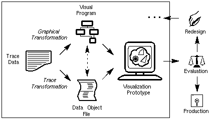
Figure 6.1 - The abstract methodology described in Section 5 is realized in the DX environment as shown. Through a process of transformations, trace data leads to the creation of a visual program and a trace data object file. These components are, ideally, the realizations of performance and view objects, respectively. In some cases, though, the abstraction implementation is not cleanly separated into independent components (as indicated here by the dashed arrow between the visual program and the data object file, and in Figure 5.1 by the overlap of the performance and the view objects) because of the underlying development environment.
Figure 6.1 also shows how this process of prototyping performance visualizations can be integrated into an iterative design and evaluation process. Though not explicitly shown in the figure, the redesign of a visualization is accomplished by modifying the trace transformation, the graphical transformation, or both. Eventually, the visualization will be ready for production. If the software package is an insufficient environment for the final implementation (e.g., because of cost or rendering speed), then actual coding of the visualization is appropriate at that point. Note that this occurs after the iterative design and evaluation process is complete. Ideally, though, the prototyping environment and implementation environment are the same, in which case the visualization prototype would be in its production version immediately after evaluation of the prototype is complete. A combined prototype and production environment can also be found in Pablo [17].
Figure 6.1 indicates the interdependence between the visual program and the data object file by a dashed arrow between them. In an ideal development environment, performance objects and view objects are implemented independently of one another. But we have found that dependencies between data objects and visual programs exist in some cases. For example, much of the trace processing required to create a visualization like Figure 7.3 is in representing the polygonal facets of the cylinder. Essentially, the data object file is a precise specification for the graphical structure. Ideally, though, the developer should be able to rely on the visualization environment to provide that transformation. In other words, this sort of processing should really be part of the graphical transformation (i.e., the creation of the visual program in DX). In an end-user visualization tool, such processing would be inherent in the visualization development environment, not programmed by the user. However, in a prototyping environment where new visualizations are created for evaluation and then modified, this sort of processing is more easily managed as part of the general trace processing. Switching from prototyping to production sees that type of trace processing ported to the implementation environment. In fact, DX can accommodate the creation of user-defined modules that accept more general, abstracted trace data and perform the necessary structural transformations. That is to say that a developer could program a DX module that performs a specific transformation on trace data and easily integrate it into the visualization environment. For example, in an end-user tool, the visual program for Figure 7.3 might contain a KiviatCylinder module that accepts general performance objects and builds the graphical representation of the data. The KiviatCylinder code would essentially be the same as part of the trace transformation code done in the prototyping environment. Making this transition would make our practical approach more consistent with our guiding methodology, but since we are concerned with prototyping visualizations for development and evaluation, this aspect of the implementation environment is not explored.
In this process, graphics programming is avoided prior to production, the developer is able to focus on the visualization rather than the code that generates it, and visualizations are quickly created for evaluation, modification, and redesign. This is possible because changes to visualizations are made more easily and have fewer implications in the prototyping environment than in current performance visualization tools.
Compared to existing performance visualization techniques, this method is different in that it separates the development phase from the production phase. As the area of visualization evaluation advances, a decoupled development process will be important so that modifications may be made quickly and easily. The application of our methodology creates a process that is a step toward that goal.
The following subsections will explore more deeply trace and graphical transformations. We will also offer a brief discussion of display interaction, a key component to next-generation performance visualizations.
6.1 Trace Transformation: Creating the Data Object File
By using an existing software product, part of the visualization problem becomes one of trace transformation. To take advantage of Data Explorer's rich data model the trace files or performance data must be transformed into a format that Data Explorer can process. A single trace file may take on several different representations within Data Explorer depending on the visualization desired. On one hand, a transformation may simply augment the existing trace data with the appropriate keywords and structures. Alternatively, it may perform extensive computations and/or reductions on the data set before it generates the Data Explorer file. It is important to note that the problem of trace analysis still exists. That is, in most cases the trace transformation is responsible for any analysis or reduction of the trace data. However, one of the advantages of the method being proposed here is that the transformation of trace data is done independently of any graphical representation of that data, a concept promoted by Reed et al. in [17], and a key characteristic of our high-level methodology. Thus, transformations are easily modified and can be used with several different graphical techniques. In an environment of creation, testing, and evaluation, the ability to make changes with minimal intrusion on the rest of the system will allow for more rapid prototyping of the displays.
Trace transformations can easily be implemented in traditional programming languages, and do not require any special programming skills. It is even possible that existing performance tools can be used for more involved trace analysis problems and then to generate data files suitable for input to Data Explorer. The underlying requirement, though, is an understanding of the data model for the product being used. In the case of DX, our experience suggests that it should take no more than a couple weeks of studying examples and experimenting for an individual to become comfortable with DX's data model. Once an understanding of the data model is achieved, trace transformation programming follows quickly and easily. Data Explorer's data model is rich enough for general scientific visualization and as a result, offers many alternatives for performance visualization. The flexibility gained by such a general model is advantageous and certainly worth the minimal investment in time.
6.2 Graphical Transformation: Creating the Visual Program
6.2.1 Overview of Visual Programs
Once a trace has been transformed into the DX data model, it can be imported using either DX's visual programming language or its scripting counterpart. The visual programs translate directly into a more general scripting language, which is best described as functional and data-driven. Since the DX programs we created were usually simple, the visual programming environment was adequate for our needs. We could have switched between the two programming styles at any time if it had become necessary. Programs generally consist of three phases: importing and selecting, processing, and then rendering the data. One of the main advantages to using a product such as Data Explorer is that all of the programming that is necessary to implement these three phases is already done for the developer.
Figure 6.2 contains a visual program created in Data Explorer. The graphical representation of a DX function is a module with sets of "tabs" on its top and bottom, corresponding to inputs and outputs, respectively. By connecting one module's output tab to another module's input tab, the user assembles a network of modules - a visual program - that specifies and controls the visualization. Connections between modules indicate the flow of data through the network.
Figure 6.2 - A simple visual program in Data Explorer that is capable of creating many different types of visualizations; see Figures 6.5(a, b, c, d).
6.2.2 Setting Module Parameters
The modules of a visual program usually have default values that "do the right thing" to the data. However, in certain cases, it is desirable (or required) to set certain parameters. For example, to import data, the user selects the Import module from the DX menus and places it on the programming canvas. (The visual program in Figure 6.2, like most DX programs, utilizes the Import module.) The Import module requires the user to tell it which data object file is to be read. To set the parameters of a module, the user begins by double-clicking on the module, which opens into a window like the one in Figure 6.3. Next, the user types the appropriate information into the desired fields (e.g., the "name" field in the Import module).
Figure 6.3 - Data Explorer's Import module reads a data file into a visual program. In most cases, the user need only specify the name of the data set. The default values for the other parameters are usually appropriate.
6.2.3 Visualization Control Panels
Data Explorer offers other techniques for controlling module parameters which allow the user to more easily interact and "tweak" the characteristics of a display. By connecting objects called "interactors" to input tabs, the user can create an adhoc "control panel" that allows for easy modification of any number of different parameters. An interactor appears in the visual program as a simple module (no inputs, one or more outputs) and in a control panel as a selector, a customizable field, or other interaction object. (Note that the visual program in Figure 6.2 does not contain any interactors.) Interactors are highly configurable yet easy to use, adding significant flexibility to the visualization development process. An example control panel appears in Figure 6.4. As can be seen, the control panel allows the user to select import data files, alter the graphical characteristics of the display, and even change the quantities being visualized.
Figure 6.4 - Data Explorer allows the visualization programmer to construct control panels capable of controlling many aspects of the visualization, including the name of the data set being visualized and any number of the display's graphical characteristics.
6.2.4 Self-describing Data
Data Explorer's data model offers significant advantages over traditional data representation schemes. Because Data Explorer data is "self-describing" and modules are designed with this in mind, a single DX visual program can generate many different displays depending on the data it processes. (The notion of self-describing data can also be found in Pablo's Self-Describing Data Format (SDDF) [17] and NCSA's Heirarchical Data Format (HDF) [15].) The data files imported by DX contain structural object information which determines a set of possible visualizations. It is up to the visual program to extract and process the desired information from the data file. Many visual programs are reusable, requiring only minimal changes, if any at all.
6.2.5 A Performance Visualization Example
The DX data model centers around sets of positions and connections. A simple DX program might create a visualization that annotates positions with spheres and the connections between positions with cylinders. Additional coloring might take place depending on the data being processed. Figure 6.2 contains a visual program that accomplishes these tasks for appropriately structured input data.
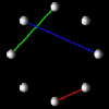
Performance visualizations that intend to illustrate interprocessor communication often manifest themselves in a visualization fitting the description given above. That is, processors can be represented by a set of spheres in space, while the communication between processors can be realized by links between the spheres. Such a display can be extended in many ways and is certainly not limited to interprocessor communication.
To emphasize the use of reusable visual programs, the images in Figures 6.5(a, b, c, d) were all generated by the visual program in Figure 6.2. The only program parameter that was changed was the name of the data file in the Import module. All the other modules have default parameters that will do the right thing for the data being visualized. The Data Explorer modules are able to figure out what to do with the data without the user explicitly describing it; the trace transformation process is responsible for augmenting the trace data with enough structural information so that Data Explorer modules can construct the visualization from the data. Thus, the structure and content of the data file - which is the result of a trace transformation - plays a key role in determining a visualization's appearance. In this way, a single visual program enables a set of displays to be generated. Practically, this is convenient, but it violates the desired independence between performance and view objects, as described by the high-level methodology.
 (a)
(a)
 (b)
(b)
 (c)
(c)
 (d)
(d)
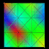
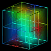
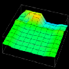
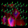
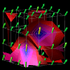
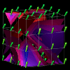
Figure 6.5(a-d) - Several different visualizations created by the same visual program (see Figure 6.2) reading different data files. (a) represents communication between processors in a ring topology. (b) can represent up to three different quantities on a mesh of processors or a distributed two-dimensional data structure. (c) extends the idea in (b) to three dimensions. (d) is a novel visualization in which the orientation of the "sails" emanating from the processors and the height of the sail's two upper points is determined by a three-dimensional metric such as the percentages of time processors spends in the states busy, idle, and overhead.
Each of these displays could be used in a parallel performance setting. For instance, Figure 6.5(a) could represent interprocessor communication in a ring topology. Similarly, Figure 6.5(b) could be applied to a mesh architecture where glyph size represents communication overhead, link color represents the communication load on a particular interconnection between processors, and the mesh background shows a continuous interpolation of the discrete node data, potentially useful to observe scalability characteristics. Figure 6.5(c) extends the previous example into three dimensions. The interior of the solid is now volume-rendered to create a "cloud" of colors which can offer insight into the possible results of a scaled-up version of the application. Finally, Figure 6.5(d) offers a novel visualization where processors exist in a two-dimensional grid with "sails" emanating from the glyphs. For each processor, the orientation of the sail and the height of the sail's two upper points could be controlled by a three-dimensional metric (e.g., busy, idle, and overhead percentages). While these displays are significantly different graphically, they were all created by a single, simple visual program processing different data files. In terms of our methodology, we are combining the same view objects with different performance objects.
Alternatively, the same dataset can be processed by different visual programs to generate different displays, an approach common to scientific visualization. For example, a developer can apply different realization techniques to the same data by using different DX programs. One visual program may volume-render a three-dimensional structure while another creates contour surfaces within the volume. The data is the same, but the different visual programs enable different types of displays to be created. In this paper alone, Figures 6.5(d), 7.1, 7.3, 7.4, 7.5, and 7.9(a, b, c, d) were all generated from essentially the same data file. In other words, the same performance objects can be combined with a variety of view objects.
Thus, in this implementation the developer is presented with two levels at which visualization development and modification can take place: the data object file (performance objects) and the visual program (view objects). Both can be used to control certain aspects of the visualization process, but we have found that one may be more appropriate than the other depending on the user's goals. If the goal is to investigate performance characteristics within a single set of performance data, then fixing the data set and changing the visual program tends to work best. On the other hand, if the goal is to compare and contrast several sets of performance data, then using a single visual program and changing the structure of the imported data can be effective. Of course, in many situations, changing both the data and the visual program generates the best results.
The strength and flexibility of a product like Data Explorer comes from both the programming behind the modules and the powerful data model it uses. The result, in terms of prototyping performance visualizations, is that displays can be created very easily and quickly. For the visualizations in this paper, less than 100 lines of standard C code was necessary to implement the trace transformation. We have found that the Data Explorer visual programs required to import and process the data files vary minimally across a wide range of visualizations - a testimony to the self-describing capabilities of the data model and the high degree of software reusability supported by DX. In all, a new visualization - trace transformation, graphical transformation, debugging, experimentation, etc. - can be developed in less than a day. Modifications to existing displays require a few minutes or less. Given that a single DX visual program may serve to create many visualizations, and of course, a single DX data file can be used in many different visual programs, the overall result is a very flexible, easy-to-use environment for creating and redesigning performance visualizations.
To illustrate how this may benefit performance visualization developers, consider the following scenario. Suppose a certain performance visualization tool was limited to two-dimensional displays in the spirit of Figure 6.8(a). (Note that this supposition applies to almost all of the performance visualization tools mentioned in the introduction.) To extend such displays into three dimensions would require substantial work on the part of the tool designers and implementers. New graphic routines would have to be written, additional methods of interacting with the display would probably be necessary, and perhaps the data model would need to be extended. Using a tool such as Data Explorer, which supports three-dimensional visualizations by default, the jump from 2-D to 3-D is simply a matter of changing the data!
6.3 Display Interaction
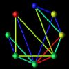
Next-generation performance visualizations are bound to take advantage of three-dimensional displays. The additional information made available by this technique will be invaluable to programmers using next-generation parallel languages. However, moving to three-dimensional visualizations will necessitate additional functionality in visualization control and interaction. For instance, consider the three-dimensional display in Figure 6.6, a different view of the visualization appearing in Figure 6.5(d). As it appears, most of the useful information is obscured. However, if the object is rotated slightly, a new image results (see Figure 6.5(d)) - an image that could potentially reveal needed information.
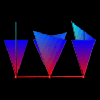
Figure 6.6 - An example of how a poor 3-D orientation limits a display's effectiveness. Tools offering 3-D displays clearly require methods for rotation and zooming.
Adding a third dimension to a visualization increases the representation potential for the data associated with a given display. Three-dimensional rendering techniques allow the viewer to see more of that data, and display interactions increase the access to and control of visual details and display attributes. However, extending existing performance visualization tools to three-dimensional displays will require more than just adding a 3-D projection routine. Because three-dimensional displays are so dependent on the angle from which they are viewed and the rendering techniques being used, tools offering 3-D will need ways for the user to interact with the objects in the display. At a minimum, this would seem to include the ability to zoom in/out on any part of an object, to rotate the object arbitrarily, and to control graphical attributes such as color and transparency. More advanced tools would include control over lighting models and the surface properties of display objects (e.g., specularity and reflectance). As an example of the additional features provided by scientific visualization tools, we consider Data Explorer's color map editor, shown in Figure 6.7. This tool allows the visualization developer to customize a visualization's color map. In fact, multiple color maps can be used for different objects in the display. The importance of these capabilities is documented in the work by Donna Cox at NCSA [2]. She explains that visualizations can be given completely new meaning simply by changing the color map(s) associated with the display. Such features are not trivially incorporated into existing performance visualization tools but are standard in many visualization packages.
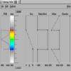
Figure 6.7 - Data Explorer's Colormap Editor allows the visualization developer to create a wide range of color maps that can be used to highlight different features of the data being visualized. Tools such as this will play an important role in the development of next-generation visualizations, but they are difficult and time-consuming for the visualization developer to program.
Another display characteristic that is extremely important to performance visualization is animation. Most of the visualization packages offer this functionality. Data Explorer's animation technique is similar to that of a cartoon. The DX data file often contains time series data. Visualizations for each member of the time series are displayed rapidly in succession, and an animation results. This is not as flexible as the animation techniques found in some performance visualization tools (e.g., ParaGraph [6] and Polka [23]) where, for example, a connection between two nodes may appear and disappear without ever having to change the surrounding image. However, once displays become three-dimensional, this becomes a much larger problem since connections may pass through, in front of, or behind other objects in the scene, requiring complex hidden line and surface analysis algorithms for a correct visualization.
For instance, Figure 6.8(a) shows a display from the popular ParaGraph [5, 6] visualization tool. Figure 6.8(b) is a prototype of the ParaGraph display generated by Data Explorer. Both displays show communication between processors. ParaGraph's display is two-dimensional while Data Explorer's is three-dimensional. In rendering the two-dimensional display, it is known that a connection between two nodes will not interfere with any other objects in the scene (except other connections which are safely ignored since they are pixel-wide lines) since the nodes are arranged in a circle. However, in the three-dimensional visualization, the visibility of a given connection is dependent on the orientation of the structure as well as the components making it up, which includes the other connections. As a result, a much richer display can be developed with a true three-dimensional feel to it. Connections between nodes are not simply lines which lack perspective and depth, but rather, they are "tubes" which clearly allow the user to see where the connections reside in the structure. But this added graphical complexity has its consequences. Such complexities necessitate a stricter method for animation in the generalized data visualization software products.
 (a)
(a)
 (b)
(b)
Figure 6.8(a,b) - (a) is a two-dimensional display generated by the ParaGraph visualization tool showing interprocessor communication. (b) is a three-dimensional prototype of the same display created with Data Explorer. Moving to an inherently 3-D model introduces graphical complexities which require stricter methods for animation. Nonetheless, 3-D displays have more depth and can be extended in ways that 2-D displays cannot.
In general, though, visualizing in three dimensions overcomes certain limitations inherent in two dimensions. For example, in 3D there is more flexibility in layout than in 2D, making the creation of scalable displays potentially less intractable. Advanced graphics rendering also offers more options for combining global and detailed performance visualization in a single display. While the display in Figure 6.8(b) may be perfectly acceptable, three-dimensional representations offer greater possibilities to the developer and will play an integral part in the next generation of parallel performance visualization tools.
7 Application
7.1 The Design Process in Action
This section will examine several examples of how the design process has been applied to the performance visualization research being done at the University of Oregon. Three primary categories of visualizations to which we have been able to apply this design process will be discussed in what follows. Each will offer insight into this new performance visualization development model. To reiterate, it was useful to categorize the prototypes as one of the following:
- Existing two-dimensional performance visualizations,
- Enhanced three-dimensional versions of existing visualizations, and
- New multi-dimensional performance visualizations that include advanced graphical rendering techniques.
7.1.1 Existing Visualizations
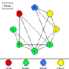
By protoyping existing displays, we establish that the proposed design process can accomplish many of the same tasks as existing visualization tools. As an example of this, consider the popular Kiviat diagram [9]. The traditional form of this two-dimensional display has several spokes extending from a center point whose lengths change as time passes. A spoke corresponds to a single member of an object set over which a scalar parameter (or a set of parameters) is being measured. As it has been applied in ParaGraph [6], a spoke represents a processor in a parallel computer, and the measured quantity is the percentage of computation for that processor. Then, when the ends of adjacent spokes are connected, triangular regions result. If the quantity being represented by the length of the spokes is, say, computation, then processor utilization would be "good" when the spokes are longest. (Spoke-length is typically mapped onto the interval [0,1]. Thus, with a large number of spokes at maximum length, the Kiviat diagram approximates a unit circle, which is sometimes used as a backdrop.)
Given the concept of a Kiviat diagram, the next step is to develop some method of representing it in the Data Explorer data model of positions and connections. The minimal amount of information necessary to create the visualization is a time series of data. Each time step contains a scalar value for each processor in the system. It was mentioned above that triangular regions result when the end-points of adjacent spokes are connected with one another. Thus, a Kiviat diagram can be decomposed into a set of triangles. In Data Explorer, a triangle is represented as three points and three connections. All triangles have the center point in common, and adjacent triangles share the end-point of a common spoke. If there are n processors in the system, then for each time step in the animation, n+1 positions (the center point is also necessary) must be specified, followed by a list of connections, which is given by referencing the positions list. In essence, the representation is a "connect-the-dots" puzzle.
Conceptually, a Kiviat diagram is easily represented within the Data Explorer data model, and consequently, coding and debugging the trace transformation took less than two hours. Similarly, the DX program necessary to render the data is only slightly more complicated than the examples discussed earlier (Figure 6.2). Thus, in roughly half a day, a fully animated Kiviat diagram prototype was developed from a raw trace file. Figure 7.1 shows a single frame of the animated visualization.
Figure 7.1 - A prototype of the traditional two-dimensional Kiviat diagram is easily reproduced with Data Explorer. Processors are represented as spokes arranged in a circle. A spoke's length is controlled by a performance metric such as percentage of time spent working.
Animation (55K)
After completing this task, the importance of this approach became more evident. The ability to go from visualization concept to visualization prototype in just a few hours opens up entirely new possibilities for visualization developers and evaluators.
7.1.2 Enhancing Existing Visualizations
Having successfully prototyped an existing display, the next step is to see how Data Explorer and its data model allow us to extend or enhance visualizations. In this section, we continue to pursue the Kiviat display.
Our visualization group has experimented with three-dimensional representations of existing two-dimensional displays, among other parallel performance visualizations [13]. One of the potential problems with a standard Kiviat animation is that the viewer sees only step at a time and can easily lose track of how the performance at that step compares to the performance during the rest of the animation. Thus, by removing the animation of the display and letting time run along the third axis, a Kiviat "tube" results. Figure 7.2 illustrates this process.
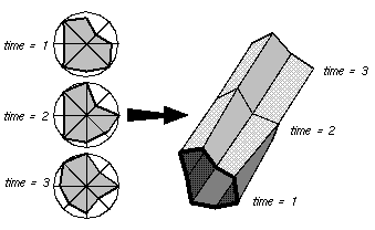
Figure 7.2 - By allowing time to travel along a third axis, the traditional Kiviat diagram can be extended to three dimensions, creating a Kiviat "tube." Data Explorer and similar tools can greatly simplify this transformation.
This representation of the original Kiviat diagram is important because it gives the viewer a very global view of the performance data, as opposed to the standard two-dimensional version which limits the viewer's ability to compare the relative performance of the application at different times during the trace. However, the three-dimensional representation tends to obscure more detailed information about individual processors at specific times, whereas the standard Kiviat display shows that information more clearly.
It is interesting to note that the representation within the DX data model now changes considerably. To render a tube with a solid exterior shell, the quadrilateral surface patches between time steps are now rendered instead of the triangular sections emanating from a slice's center. Still, the transformation is only slightly more complicated than the standard Kiviat transformation. Figure 7.3 shows a Kiviat tube generated by Data Explorer.
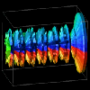
Figure 7.3 - A three-dimensional Kiviat tube generated by Data Explorer gives the viewer a more global perspective of the performance data, but at the same time obscures detailed information about certain processors or time steps.
Some of Data Explorer's true power is revealed in the following example. It is possible that individually, neither of the Kiviat displays generated thus far (Figures 7.1 and 7.3) totally fulfills the viewer's needs. The two-dimensional display allows the viewer to assess how processors relate to each other during a given time slice, but makes it difficult to see how performance in one time step relates to other parts of the animation. The three-dimensional display tends to do just the reverse; that is, seeing trends over the life of the trace is easier, but it is difficult to see how processors relate to each other during a given time step. It may be that by combining the two displays, both needs could be met. Thus, the idea for an enhanced display is to let the two-dimensional Kiviat "slice" pass through the Kiviat tube, which can be made partially transparent. The slice highlights the interprocessor relationships for a given time step while the rest of the tube still reveals how a particular step relates to the rest of the data. The display is animated by letting the slice slide through the tube. Alternatively, the viewer can directly specify the time step at which to place the slice.
This is a complex visualization that combines several graphical techniques. However, having previously specified the two pieces of the display individually, Data Explorer allows the developer to combine the two trivially. In what literally took just minutes, the composite visualization in Figure 7.4 was created.
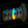
Figure 7.4 - A visualization which combines the Kiviat displays shown in Figures 7.1 and 7.3. The visualization utilizes several advanced graphical techniques, but by reusing the two simpler displays, Data Explorer allows the user to combine them effortlessly.
Animation (71K)
7.1.3 New Visualizations
New visualizations represent the last category of displays prototyped with Data Explorer. The reader should note that the presentation of these new displays is meant to illustrate the usefulness of this particular design method as opposed to that of the visualizations themselves. This category is further broken down into two methods for developing visualizations. The first approach is analogous to the method presented in the examples above - that is, start with a concept for a visualization and then translate that into Data Explorer's capabilities. By definition, this is the only method applicable to prototyping displays which have already been established. However, in prototyping new visualizations, many scientific visualization packages offer another, potentially more powerful, method. Essentially, the second method works in the opposite direction as the first - start with some feature or graphical technique available in the software, and then develop a concept for a performance visualization that uses that technique. Traditionally, visualizations have been developed out of a dire need to see data presented in a certain way, but our earlier motivation of providing visualization techniques that can better accommodate the rapid generation of new displays clearly supports this alternative approach. At first, the thought of letting something other than need motivate a visualization may seem blasphemous or, at least, odd. However, this technique can stimulate creative ideas that might not otherwise be conceived. For the developer looking to create new and novel visualizations, this technique may be helpful. Of course, the value of any new visualization is unknown until it is thoroughly evaluated, and this is true regardless of how the visualization was created.
7.1.3.1 Working from Visualization Concept to Visualization Technique
In most cases, visualizations are created by starting with an idea for a display and then figuring out how that could be accomplished using the visualization tool. Thus, the design process is the same as the previous examples.
The first example is a three-dimensional visualization which reflects the state of a processor with three commonly traced metrics: percentages of computation, overhead, and idle times. The concept behind the visualization is to represent each processor as a sphere (or glyph) in space. The location of each sphere is determined by the values of the three metrics corresponding to each processor. Thus, the axes correspond to computation, overhead, and idle. As time passes, the spheres move around the space [23].
The raw data represents a time series, and each time step contains values for the three metrics for every processor in the system. In Data Explorer, the visualization can be modelled trivially. As discussed before, Data Explorer works with sets of positions and connections. Consequently, this visualization just degenerates to a set of positions that change over time. From a set of positions, the corresponding spheres are created with the AutoGlyph module, as in the example earlier in this paper. So that processors may be distinguished from one another, the spheres are colored, also easily handled by Data Explorer. Figure 7.5 contains an example of this visualization.
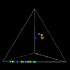
Figure 7.5 - Processors are represented by spheres whose locations in space are determined by the percentages of time spent in each of the three states, busy, idle, and overhead.
Animation (59K)
As with the other examples, it took less than a day to develop the basic prototype for this display. After that, Data Explorer's flexibility allows the user to customize and "tweak" the display to no end. The user has simple control over the size of the glyphs, animation speed and granularity, colors, and other features that are typically fixed in most performance visualization tools. These types of interactions are available directly from the DX program and do not require new transformations of the data.
The second new visualization was developed as part of an ongoing research project to develop visualizations for new parallel languages that incorporate data distribution semantics, such as High Performance Fortan (HPF) [7] and the parallel C++ language, pC++ [1]. The goal of these visualizations is to provide performance information for programmers specifying data distributions. In particular, the visualizations intend to (1) reveal patterns in how programs access data structures, and (2) give information about whether the distribution of data is effective for that program. An upper bound of three-dimensional matrices was placed on the problem.
To accomplish these goals, it is necessary to represent both the data structure and processor structure. (In HPF, programmers declare sets of virtual processors which are the targets of data distributions. See Data Distribution Visualizations for Performance Evaluation [4] and the HPF Language Specification [7] for more detailed information.) The idea is to track the number of remote and local accesses for reads and writes in terms of the data structure and the processor structure. Furthermore, it is desirable to have access to both the average and accumulation of those quantities up to a particular time step. These quantities are then mapped onto graphical representations of the data and processor structures in a variety of ways.
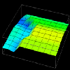
This concept lends itself well to representation in Data Explorer, which offers concise methods for creating regularly structured meshes and interconnections. Thus, positions correspond to nodes in the data or processor structure. By annotating the positions with spheres, quantities could be visually presented by altering both the size and color of the spheres. For two-dimensional structures, it was possible to color the entire grid "behind" the spheres to represent another quantity. Data Explorer can automatically interpolate data values (by using the connections) to create a solid sheet of color that shows "hot" and "cool" spots in the respective structure. For example, the cumulative number of remote reads and writes could be mapped to the glyphs while the average number of remote reads and writes could be mapped to the solid sheet behind the glyphs. Figure 7.6 illustrates such a display.
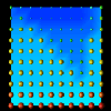
Figure 7.6 - This data distribution visualization, where distributed data elements are represented by spheres whose size and color are controlled by the number and type of references made to the particular element, was created with DX. The interpolated background coloring offers a highly scalable technique for larger data structures.
Animation (95K)
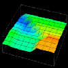
When moving to three dimensions, such coloring becomes more difficult because the third dimension is already being used. Thus, in many cases only a single quantity was represented, as in Figure 7.7. (Note that a glyph's size and color could be controlled by different quantities if so desired.) Also, as in Figure 6.5(c), the volume of the structure in Figure 7.7 could be rendered, creating a "cloud" which interpolates the data values at the nodes. This could potentially offer insight into the scalability of the program under examination.
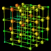
Figure 7.7 - Two-dimensional data distribution displays are easily extended to three dimensions. While Data Explorer can interpolate colors within the volume (creating a "cloud" within the structure), it is not shown in this display for clarity. Again, for larger structures, volume rendering may offer a more scalable technique.
Out of this work on developing visualizations for data distributions evolved an experimental environment where the user could control numerous aspects of the display beyond its appearance. Data Explorer includes simple tools for constructing graphical interface-level interactors that can allow even novice users to perform complex modifications to the display. For instance, a simple interactor allows the viewer to map a completely different data quantity (e.g., cumulative number of local reads, average number of all reads and writes, etc.) onto the graphical display of the data or processor structure. In addition, certain graphical characteristics could be toggled or controlled (e.g., whether to color the background grid, whether to draw glyphs, etc.). Figure 6.4 earlier in this paper shows a control panel that was built within Data Explorer, allowing the user to control and change many aspects of the visualization. Allowing a high-degree of control over the display is yet another strength which results from using a product like Data Explorer.
7.1.3.2 Working from Visualization Technique to Visualization Concept
After using Data Explorer for a while, we were impressed by its flexibility, yet we knew that we had only touched the surface of its graphical features. We gradually began to reverse the visualization development process and started using Data Explorer not only as a tool to display a preconceived visualization concept, but as an aid in generating that concept in the first place. This section will offer an example of two such visualizations.
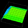
Data Explorer has the capability to realize data using a technique called a "rubber sheet." The concept is simple: a grid of positions and connections is interpolated to form a continuous "sheet"; the data values associated with each position are then used to displace (and color) that position on the sheet a distance proportional to the value in a direction perpendicular to the sheet. The result is a grid that is distorted (and colored) to reflect the data values of the grid positions.
Thus, in examining this graphical realization technique, the idea for a visualization evolved. The visualization's goal was to extend the work on data distribution visualizations described in the previous section. Using a rubber sheet, it would be possible to graphically represent the difference between local and remote accesses made by processors. Having constructed the visualization's concept from a Data Explorer technique, all that remained was to create the trace transformation necessary to realize the visualization. Figures 7.8(a, b, c, d, e, f) contain several frames of the animation of this visualization.
 (a) time=15
 (b) time=30
 (c) time=45
 (d) time=60
 (e) time=75
 (f) time=90
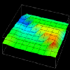
Figure 7.8(a-d) - This sequence of images partially illustrates Data Explorer's animation capabilities. These data distribution displays show the difference between local and remote accesses made to distributed data elements over the course of a Gaussian elimination algorithm. The higher the point , the more local accesses it has received.
Animation (272K)
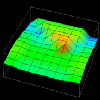
In a manner similar to the example above, the visualization in Figures 7.9(a, b, c, d) was developed using a Data Explorer realization technique called an isosurface. Isosurfaces manifest themselves as contour lines for two-dimensional data (like elevation lines on a topographic map) and contour surfaces for three-dimensional data. In DX, an isosurface represents a set of data points (actual and interpolated) of constant value (called an isovalue). Such a technique provides an interesting view of larger quantities of performance data that are represented in a three-dimensional, volumetric structure such as a cube. Using this visualization technique as a starting point, we designed the visualization seen in Figures 7.9(a, b, c, d). It consists of a set of 64 processors arranged in a 4x4x4 cube. At each processor location is an arrow which points in the direction determined by the three-dimensional performance metric (busy, idle, overhead) mentioned earlier. From these three quantities, the "busy" component was used to color the arrows and create the isosurfaces. Each frame of Figures 7.9(a, b, c, d) contains a set of isosurfaces for five isovalues distributed between 0 and 1 (the range of values covered by the "busy" metric). The surfaces are colored by the same scale as the arrows. These surfaces give the viewer an interesting perspective on the performance of the parallel application. In addition to revealing the global level of performance, the visualization potentially offers insight to the scalability characteristics of the application.
 (a) time=65
 (b) time=66
 (c) time=67
 (d) time=68
Figure 7.9(a-d) - This sequence of images uses isosurfaces to explore the relationships between 64 processors arranged in a cube. This visualization was motivated by the availability of an Isosurface module in Data Explorer. The presence of a rich set of graphical realization tools may give rise to new and useful visualizations that might not be developed under traditional design processes.
Animation (456K)
In this section, sample visualizations falling into three categories have been presented. First, Data Explorer was used to implement well-known visualizations like Kiviat diagrams. Next, two-dimensional displays were enhanced, typically by adding a third dimension to the display. Finally, Data Explorer was used to create new types of performance displays. Clearly, performance visualization developers gain access to significant power and flexibility when using scientific visualization software.
7.2 Evaluation
Having documented several examples, we now turn to a discussion of the possible benefits and detriments of the proposed design process.
The most obvious benefits come from the minimal overhead that developers incur by using existing software products. The primary overheads involved in the process are limited to the initial cost of the software and learning the visualization environment and underlying data model. Traditional development processes have a single, overwhelming overhead: programming. But evaluating this new process must go beyond just the overheads that are encountered. In fact, if this type of implementation environment is used for prototyping, but the final implementation is to be built from scratch, then both overheads are incurred. Even in this worst case scenario, we feel that there are advantages to be gained by using the proposed methods.
It was mentioned earlier that our design process fosters iterative design and evaluation by minimizing the impact that modifications to either the data or graphical aspects of the visualization have on other parts of the visualization process. This is perhaps the most important and relevant aspect of this project to the field of performance visualization in general. Studies of performance visualizations have been few because of the effort required just to create the display. Developers are forced to devote a majority of their time to building the visualization tool rather than testing visualization usability [13, 21]. Formal evaluation is apparently sacrificed for two primary reasons. First, once a tool is completed, so much time has already gone into the project that developers can't afford to extend their work to include evaluation. Second, even if evaluations were done, modifications could impose additional significant programming costs on the project. Even those tools which market themselves with buzzwords like "modular" and "extensible" usually require considerable programming expertise [6]. Using software like Data Explorer stands to refine the field of performance visualization by enabling researchers to more easily conduct usability studies and perform formal evaluations of visualizations - to determine what displays are indeed useful.
Scientific visualization packages by nature offer a high degree of user control. Thus, the ability to customize displays is built into the package. Other features like display interaction, animation, and modularity are also present. In particular, the ability to interact with what is shown on the screen will become an absolutely necessary component of next-generation visualization tools as displays become more complex and take advantage of multiple dimensions. In summary, these packages have many of the more difficult-to-program features already established and allow visualization developers to focus on the quality of their displays rather than the code needed to generate them.
On the other hand, it is conceivable that generalized data visualization packages contain too much functionality, resulting in "environment overkill." In other words, the software may be too general, resulting in slower performance and unnecessary complexity. Our experience supports this to a limited degree. Our work with Data Explorer was done on an IBM RS/6000 Model 730 which required additional graphics hardware assistance and greater than 64 megabytes of memory to be acceptable; all of our renderings were software generated. Tools built specifically for performance visualization generally do not have such stressing requirements on the computing system.
Of particular concern to performance visualization developers is the capability of a tool to handle animation (real-time or post-mortem) and dynamic display interaction. Our experience suggests that without costly hardware, such usability requirements are not adequately met by simply applying scientific visualization software. It is our opinion that certain of the limitations of the DX approach will be overcome by technology, but for the time being, these limitations make practical use of this technique more difficult. The hardware requirements made by scientific visualization packages are not without reason, though. These systems offer extremely flexible and powerful graphical techniques. For example, performance visualization developers would undoubtedly find the capability to compose a new display from two or more simpler displays advantageous, as was done in the Kiviat diagram examples discussed earlier. Furthermore, these products offer flexible and general data models that can be used to generate a wide range of visualizations and are designed to handle large, multi-dimensional data sets. Finally, they are usually portable across many architectures.
8 Conclusion
This paper has proposed a design process by which performance visualization developers can drastically reduce the costly and time-consuming overhead of programming, yet gain significant power and flexibility in the displays they can generate. The application of a high-level visualization methodology to general data visualization software, like IBM's Data Explorer, leads to a design technology that improves the visualization development process by increasing both the quality of the displays and the speed with which they are created. The process lends itself to iterative design and evaluation which is required to validate a display's usability - techniques that up until now have not been widely applied to the arena of performance visualization. Furthermore, the work being done at the University of Oregon and other research sites strongly suggests that users will demand interaction with and customization of next-generation performance displays. Existing data visualization software products are designed with these very capabilities in mind.
The work presented in this paper can be extended in several ways. In terms of the high-level methodology developed in Section 5, techniques that enable the specification of performance and view abstractions and their subsequent instantiations to performance and view objects are needed. This would entail automating the creation of trace and graphical transformations (i.e., the creation of data object files and visual programs) from more abstract specifications. We also intend to develop modules within Data Explorer that are dedicated to certain performance visualization techniques (e.g., Kiviat diagrams and tubes, interprocessor communication displays, etc.). This extension would make the trace and graphical transformations more independent, as well as improve the implementation's consistentency with the high-level methodology. In terms of the visualizations themselves, we are interested in examining how other traditionally scientific visualization techniques may assist in the development of scalable performance visualizations. This would include additional work with graphical representations like isosurfaces and contour lines, for example. Also, for large data sets, we are interested in representing the data in a continuous (i.e., interpolated) fashion rather than trying to visualize thousands of discrete entities or values. Another area of interest is to exploit more of the graphical capabilities of Data Explorer and to see what other types of visualizations are possible. Finally, additional work is required to refine a methodology for evaluating visualizations in this environment.
9 Acknowledgments
This work was supported by an IBM Research and Development contract (MHVU3704) from the IBM Highly Parallel Supercomputing Systems Laboratory and a grant (ASC9213500) from the National Science Foundation, Advanced Scientific Computing Program. The authors would like to thank John Conery and Evan Tick for helpful comment on early versions of this paper, and Tom May for his creative insights.
10 References
[1] F. Bodin, P. Beckman, D. Gannon, S. Narayana, S. Yang. Distributed pC++: Basic Ideas for an Object Parallel Language. University of Rennes. (pC++/Sage++ home page)
[2] M. Brown. ICARE: Interactive Computer-Aided RGB Editor, (A report on the work of Donna Cox, NCSA). Access (NCSA newsletter), University of Illinois at Urbana-Champaign, National Center for Supercomputing Applications, 1.3.10, September-October, 1987, pages 10-12.
[3] A. Couch. Categories and Context in Scalable Execution Visualization. Journal of Parallel and Distributed Computing, 18, 1, June, 1993, pages 195-204.
[4] S. Hackstadt and A. Malony. Data Distribution Visualization for Performance Evaluation. University of Oregon, Technical Report TR-CIS-93-21, October, 1993.
[5] M. Heath and J. Etheridge. Recent Developments and Case Studies in Performance Visualization using ParaGraph. Proceedings from the Workshop on Performance Measurement and Visualization of Parallel Systems, Moravany, Czechoslovakia, October, 1992.
[6] M. Heath and J. Etheridge. Visualizing the Performance of Parallel Programs. IEEE Software, September, 1991, pages 29-39.
[7] High Performance Fortran Forum. High Performance Fortran Language Specification, Version 1.0. Rice University, May, 1993.
[8] International Business Machines Corporation. IBM Visualization Data Explorer, User's Guide, 2nd ed. August, 1992.
[9] K. Kolence and P. Kiviat. Software Unit Profiles and Kiviat Figures. ACM SIGMETRICS, Performance Evaluation Review, September, 1973, pages 2-12.
[10] E. Kraemer and J. Stasko. The Visualization of Parallel Systems: An Overview. Journal of Parallel and Distributed Computing, 18, 1, June, 1993, pages 105-117.
[11] B. Lucas, G. Abram, N. Collins, D. Epstein, D. Gresh, and K. McAuliffe. An Architecture for a Scientific Visualization System. Proceedings from Visualization '92, Boston, MA, October, 1992, pages 107-114.
[12] A. Malony, D. Hammerslag, and D. Jablonowski. Traceview: A Trace Visualization Tool. IEEE Software, September, 1991, pages 29-38
[13] A. Malony and E. Tick, Parallel Performance Visualization. Proposal to the National Science Foundation, CISE/ASC, Grant No. ASC 9213500, February, 1992.
[14] B. Miller. What to Draw? When to Draw? An Essay on Parallel Program Visualization. Journal of Parallel and Distributed Computing, 18, 1, June, 1993, pages 265-269.
[15] NCSA. NCSA HDF, Version 2.0. University of Illinois at Urbana-Champaign, National Center for Supercomputing Applications, February, 1989.
[16] C. Pancake. Customizable Portrayals of Program Structure. Proceedings from the ACM/ONR Workshop on Parallel and Distributed Debugging, San Diego, CA, May, 1993, pages 64-74.
[17] D. Reed, R. Aydt, T. Madhyastha, R. Noe, K. Shields, and B. Schwartz. An Overview of the Pablo Performance Analysis Environment. University of Illinois Board of Trustees, November, 1992.
[18] J. Roschelle. Designing for conversations. Paper presented at the AAAI Symposium on Knowledge-Based Environments for Learning and Teaching, Stanford, CA, 1990.
[19] D. Rover. A Performance Visualization Paradigm for Data Parallel Computing. Proceedings of the 25th Hawaii International Conference on System Sciences, 1992 (mini-conference on Parallel Programming Technology, Software Technology Track).
[20] D. Rover and A. Waheed. Multiple-Domain Analysis Methods. Proceedings from the ACM/ONR Workshop on Parallel and Distributed Debugging, San Diego, CA, May, 1993, pages 53-63.
[21] S. Sarukkai and D. Gannon. Performance Visualization of Parallel Programs Using SIEVE.1. Proceedings of the 1992 ACM International Conference on Supercomputing, Washington, D.C., July, 1992, pages 157-166.
[22] D. Socha, M. Bailey, and D. Notkin. Voyeur: Graphical Views of Parallel Programs. SIGPLAN Notices 24, 1, January, 1989. Also, Proceedings of the Workshop on Parallel and Distributed Debugging, Madison, WI, May, 1988, pages 206-215.
[23] J. Stasko and E. Kraemer. A Methodology for Building Application-specific Visualizations of Parallel Programs. Journal of Parallel and Distributed Computing, 18, 1, June, 1993, pages 258-264
[24] E. Tufte. Envisioning Information. Graphics Press, Chesire, CT, April, 1991.
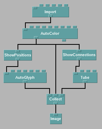
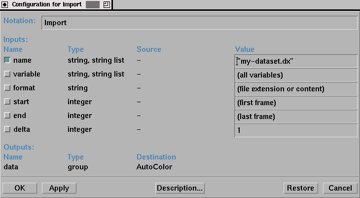
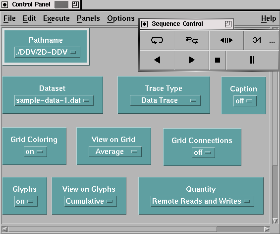
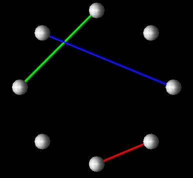 (a)
(a)
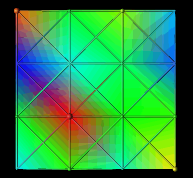 (b)
(b)
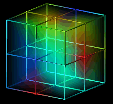 (c)
(c)
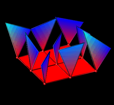 (d)
(d)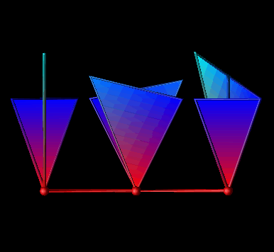
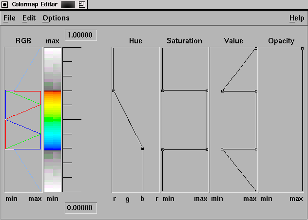
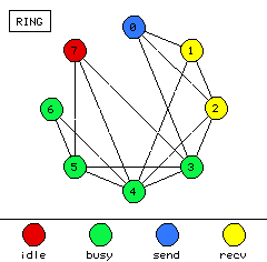 (a)
(a)
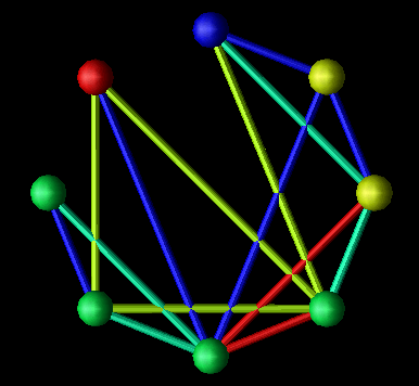 (b)
(b)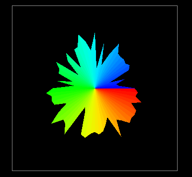
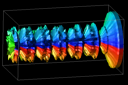
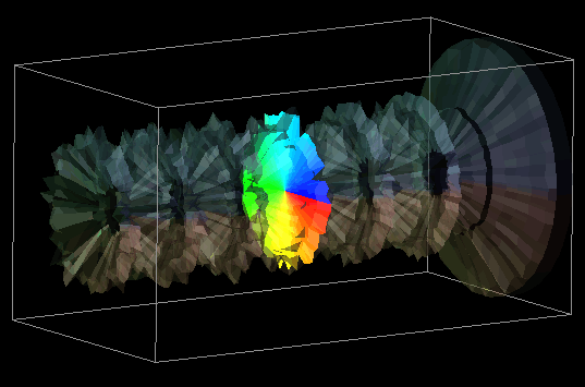
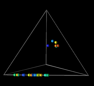
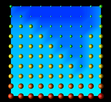
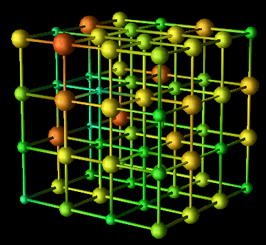
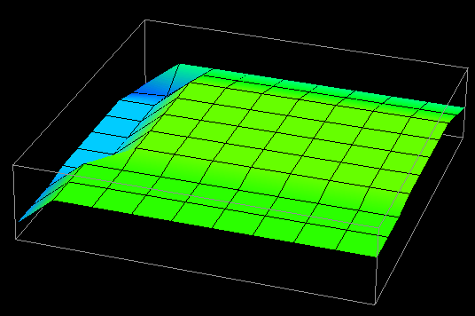 (a) time=15
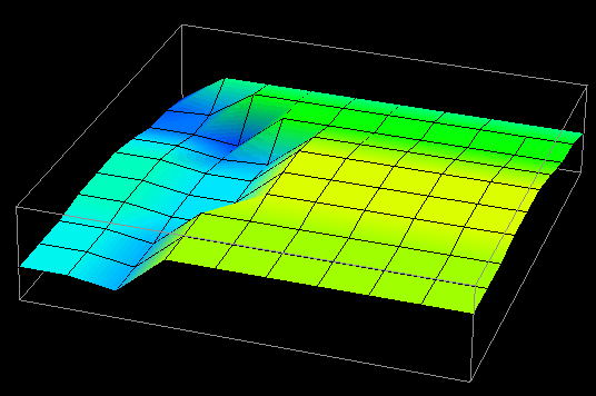 (b) time=30
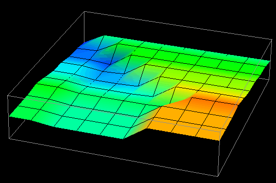 (c) time=45
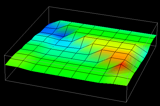 (d) time=60
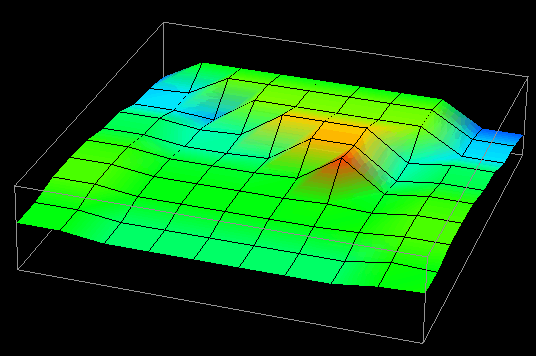 (e) time=75
 (f) time=90
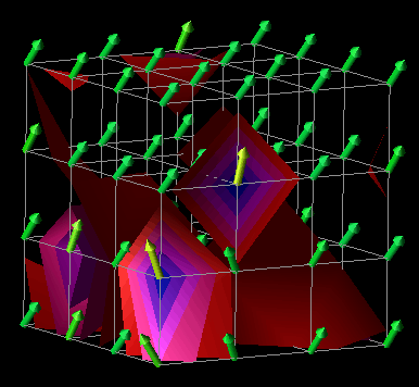 (a) time=65
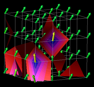 (b) time=66
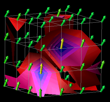 (c) time=67
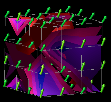 (d) time=68