TAU now provides the ability to break down profiles with respect to phases of execution. One such application would be to collect separate statistics for each timestep, or group of timesteps. In order to visualize the variance between the phases of execution, a number of phase-based charts are available.
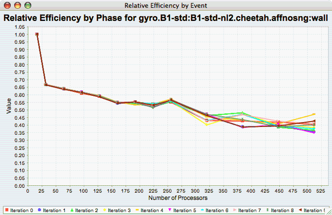
The Relative Efficiency Per Phase chart shows the relative efficiency for each phase, as the number of processors increases. If there is more than one metric to choose from, you may be prompted to select the metric of interest (see Section 22.1.2, “Metric of Interest”). To request this chart, select one experiment or view, and select this chart item under the "Charts" main menu item.
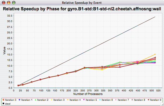
The Relative Speedup Per Phase chart shows the relative speedup for each phase, as the number of processors increases. If there is more than one metric to choose from, you may be prompted to select the metric of interest (see Section 22.1.2, “Metric of Interest”). To request this chart, select one experiment or view, and select this chart item under the "Charts" main menu item.
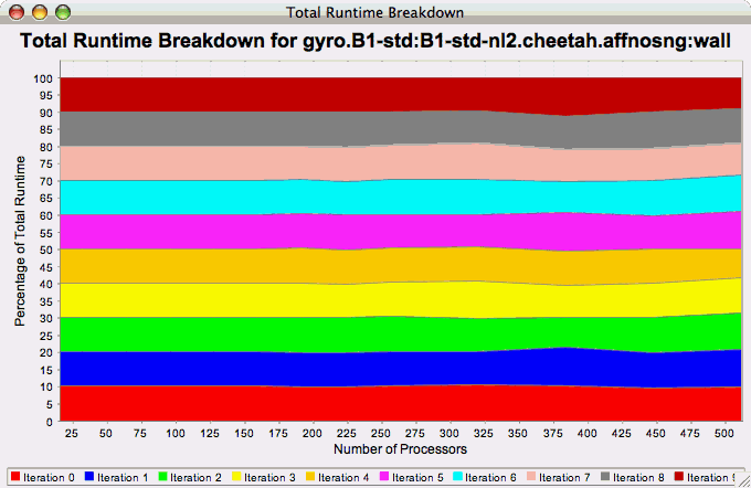
The Phase Fraction of Total Runtime chart shows the breakdown of the execution by phases, and shows how that breakdown changes as the number of processors increases. If there is more than one metric to choose from, you may be prompted to select the metric of interest (see Section 22.1.2, “Metric of Interest”). To request this chart, select one experiment or view, and select this chart item under the "Charts" main menu item.