Table of Contents
Under the "Visualization" main menu item, there are five types of raw data visualization. The five items are "3D Visualization", "Data Summary", "Create Boxchart", "Create Histogram" and "Create Normal Probability Chart". For the Boxchart, Histogram and Normal Probability Charts, you can either select one metric in the trial (which selects all events by default), or expand the metric and select events of interest.
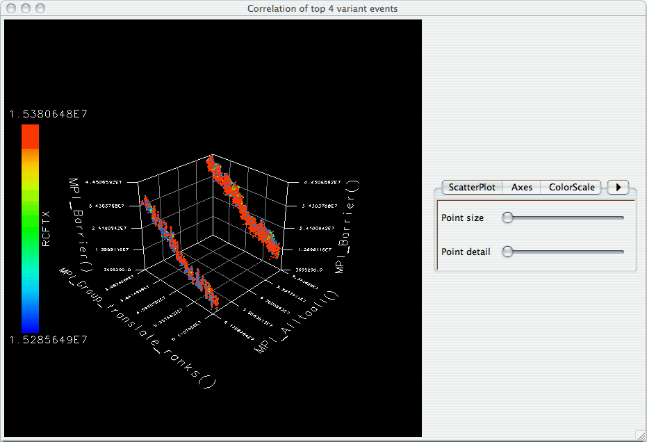
When the "3D Visualization" is requested, PerfExplorer examines the data to try to determine the most interesting events in the trial. That is, for the selected metric in the selected trial, the database will calculate the weighted relative variance for each event across all threads of execution, in order to find the top four "significant" events. These events are selected by calculating: stddev(exclusive) / (max(exclusive) - min(exclusive)) * exclusive_percentage. After selecting the top four events, they are graphed in an OpenGL window.