Conceptually, a Kiviat diagram is easily represented within the Data Explorer data model, and the DX program necessary to render the data is only slightly more complicated than the examples discussed earlier (Figure 3). Thus, in roughly half a day, a fully animated Kiviat diagram prototype was developed from a raw trace file. Figure 10 shows a single frame of the animated visualization.
Introduction
Extending Existing Visualizations
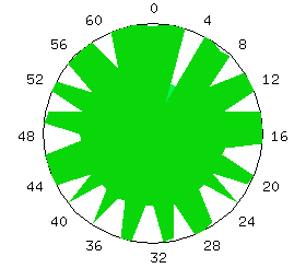
Figure 9. ParaGraph uses a Kiviat diagram visualization to show processor utilization.
Given the concept of a Kiviat diagram, one can easily represent such a structure within the positions and connections of the Data Explorer data model. The minimal amount of information necessary to create the visualization is a time series of data. Each time step contains a scalar value for each processor in the system. It was mentioned above that triangular regions result when the end-points of adjacent spokes are connected with one another. Thus, a Kiviat diagram can be decomposed into a set of triangles. In Data Explorer, a triangle is represented as three points and three connections. All triangles in a Kiviat diagram have the center point in common, and adjacent triangles share the end-point of a common spoke. If there are n processors in the system, then for each time step in the animation, n+1 positions must be specified, followed by a list of connections, which is given by referencing the positions list. In essence, the representation is similar to a "connect-the-dots" puzzle.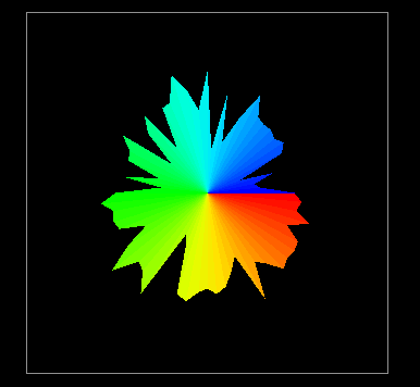
Animation (55K)
Figure 10. The traditional two-dimensional Kiviat diagram is easily implemented using data visualization software.
The ability to go from visualization concept to visualization prototype in just a few hours opens up entirely new possibilities for visualization developers and evaluators. However, implementing a two-dimensional visualization within an advanced visualization environment doesn't offer any additional insight to the performance data. Thus, as was suggested in Chapter VI, the next step is to see how the standard Kiviat diagram can be extended to take advantage of some of the graphical capabilities present in the data visualization software.
One of the potential problems with a standard Kiviat animation is that the viewer sees only one step at a time and can easily lose track of how the performance at a given step compares to the performance during the rest of the animation. Thus, by removing the animation of the display and letting time run along the newly available third axis, a Kiviat "tube" results. Figure 11 illustrates how this visualization is constructed.
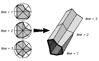
Figure 11. The two-dimensional Kiviat diagram can be extended to three dimensions by allowing time to travel along a third axis.It is interesting to note that now the representation within the DX data model changes considerably. To render a tube with a solid exterior shell, the quadrilateral surface patches between time steps are rendered instead of the triangular sections emanating from the center of each slice. Still, the transformation is only slightly more complicated than the standard Kiviat transformation. Figure 12 shows a Kiviat tube generated by Data Explorer.
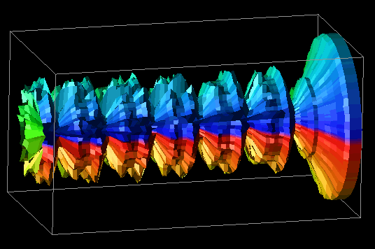
Figure 12. A three-dimensional Kiviat tube reveals global trends in the performance data.This representation of the original Kiviat diagram is important because it gives the viewer a global view of the performance data, as opposed to the standard two-dimensional version which limits the viewer's ability to compare the performance of the application at different times during the trace. However, the three-dimensional representation tends to obscure more detailed information about individual processors at specific times, whereas the standard Kiviat display shows that information more clearly.
Some of Data Explorer's true power is revealed in the following example. It is possible that individually, neither of the Kiviat displays generated thus far (Figure 10 and Figure 12) totally fulfills the viewer's needs. The two-dimensional display allows the viewer to assess how processors relate to each other during a given time slice, but makes it difficult to see how performance in one time step relates to other parts of the animation. The three-dimensional display tends to do just the reverse; that is, seeing trends over the life of the trace is easier, but it is difficult to see how processors relate to each other during a given time step. It may be that by combining the two displays, both needs could be met. Thus, the idea for a still more enhanced display is to let the two-dimensional Kiviat slice "pass through" a partially transparent Kiviat tube. The slice highlights the interprocessor relationships for a given time step while the rest of the tube still reveals how a particular step relates to the rest of the data. The display is animated by letting the slice slide through the tube. Alternatively, the viewer can directly specify the time step at which to place the slice.
This is a complex, advanced visualization that combines several graphical techniques. However, having previously specified the two pieces of the display individually, Data Explorer allows the developer to combine the two trivially. In what literally took just minutes, the composite visualization in Figure 13 was created.
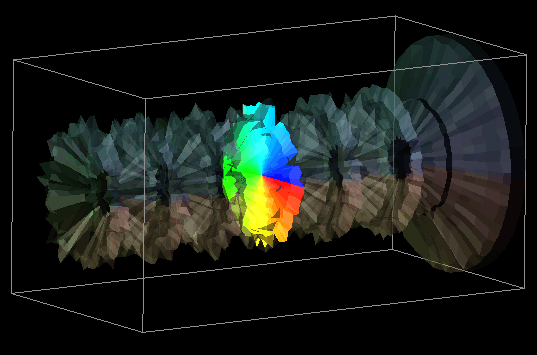
Figure 13. By combining the two-dimensional and three-dimensional Kiviat displays, a potentially more useful visualization results.
Essentially, the second method works in the opposite direction as the first - start with some feature or graphical technique available in the software, and then develop a concept for a performance visualization that uses that technique. Traditionally, visualizations have been developed out of a dire need to see data presented in a certain way, but the earlier motivation of providing visualization techniques that can better accommodate the rapid generation of new displays clearly supports this alternative approach. At first, the thought of letting something other than need motivate a visualization may seem blasphemous or, at least, odd. However, this technique can stimulate creative ideas that might not otherwise be conceived. For the developer looking to create new and novel displays, this technique may be helpful. Of course, the value of any new visualization is unknown until it is thoroughly evaluated, and this is true regardless of how the visualization was created.
In the introduction to this thesis, a visualization scenario was posed in which the visualization of molecules interacting within a three-dimensional space was compared to visualization scenarios for the processors in a parallel computer. It was claimed that there was an inherent physical model on which the molecular visualization could be based, but such a concrete model was less obvious for the parallel computer. In particular, it was suggested that molecules could be represented as spheres that moved around a well-defined three-dimensional space. This section explores the use of that same visualization concept, but in the context of the parallel architecture.
Three commonly traced metrics of parallel processor performance are the percentages of computation, overhead, and idle times. As percentages, these three metrics create a well-defined space in which the processors of a parallel computer exist. The concept behind the visualization, then, is to represent each processor as a sphere within that space. The location of each sphere is determined by the values of the three metrics corresponding to each processor. Thus, the axes represent computation, overhead, and idle. As time passes, the spheres, like molecules, move around the "performance space" [46].
The raw data represents a time series, and each time step contains values for the three metrics for every processor in the system. In Data Explorer, the visualization can be modelled trivially. As discussed before, Data Explorer works with sets of positions and connections. Consequently, this visualization just degenerates to a set of positions that change over time. From a set of positions, the corresponding spheres are created with the AutoGlyph module, as in the example earlier in this paper (Figure 3). So that processors may be distinguished from one another, the spheres are colored, also easily handled by Data Explorer. Figure 14 contains an example of this visualization.
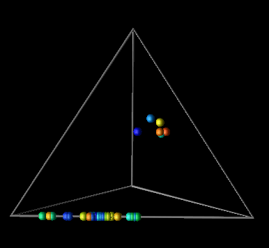
Figure 14. A three-dimensional processor performance metric determines the location of processors within the "performance space."As with the other examples, it took less than a day to develop the basic prototype for this display. After that, Data Explorer's flexibility allows the user to customize and "tweak" the display to no end. The user has simple control over the size of the glyphs, animation speed and granularity, colors, and other features that are fixed in many performance visualization tools. These types of interactions are available directly from the visualization environment and do not require new transformations of the data.
Data Explorer has the capability to realize data using a technique called a "rubber sheet." The concept is simple: a grid of positions and connections is interpolated to form a continuous "sheet"; the data values associated with each position are then used to displace (and color) that position on the sheet a distance proportional to the value in a direction perpendicular to the sheet. The result is a grid that is distorted (and colored) to reflect the data values of the grid positions.
Thus, in examining this graphical realization technique, the idea for a visualization evolved. The visualization's goal was to provide program and performance visualization information for distributed data structures. In distributed memory multiprocessor computers, processors can read data from either their local memory or from the memory of other processors. Remote data accesses typically involve some form of relatively expensive communication, and can lead to poor performance. For a given algorithm, the distribution of a data structure affects the number of remote accesses that a processor has to make. Using a rubber sheet, it would be possible to graphically represent the difference between local and remote accesses made by processors to the elements of a distributed data structure. Such information is valuable in determining the effectiveness of a particular data distribution. (Chapter VIII contains additional information on the topic of evaluating data distributions with visualization.) Having constructed the visualization's concept from a graphical technique available in the visualization software, all that remained was to create the trace transformation necessary to realize the visualization. Figure 15 contains several frames of the animation of this visualization.
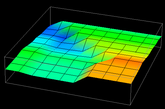
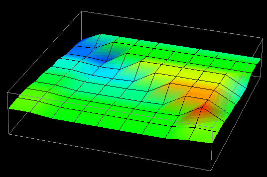
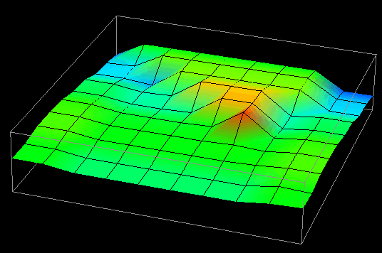
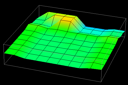
Figure 15. Vertical displacement and coloring reveal remote and local data access patterns to a distributed data structure.