The visualization development process that has evolved from working with Data Explorer is illustrated in Figure 2. Performance visualization starts with raw trace data or statistics. The fundamental steps of this process transform the trace data into a data object file and a visual program. While trace transformations manifest themselves physically (i.e., as some real program or function operating upon the trace data), graphical transformations in this implementation environment are a mental process by which analysts merge the capabilities of the visualization environment, their knowledge of the performance data, and a visualization concept - or, more formally, a view abstraction - to construct a visual program in DX that drives the creation of the desired display. It is important to note that the specification of a visualization in Data Explorer (by a visual program) does not fulfill the role of the view abstraction specification of Figure 1; that aspect of the methodology is not explicitly defined in this environment, but is, instead, embodied in the mental transformation process. In an alternative implementation environment, or as an extension to this work, abstraction specification could play an important role in developing the mapping from performance data to graphical representation.
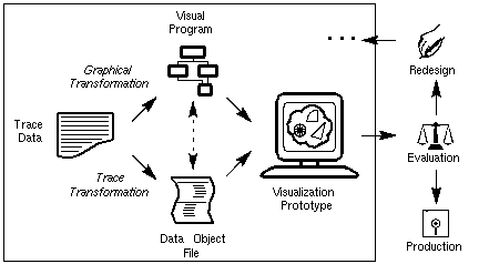
Figure 2. A development process based on the abstract performance visualization methodology can be realized using existing data visualization software.The trace transformation may perform several operations and reductions on the data, but it ultimately creates a data object file that can be interpreted by the data visualization software. The content of these DX data object files maps nicely to the concept of performance objects. In fact, that is exactly what DX data files contain - data objects that have been constructed by the transformation of performance data. From this specially formatted data file, a visualization prototype is created by executing the visual program. The resulting display can be manipulated in many ways, including rotating, zooming, and travelling through or around the objects in the image by capitalizing on the capabilities available in the software.
Figure 2 also shows how the performance visualization prototyping environment can be integrated into an iterative design and evaluation process. Though not explicitly shown in the figure, the redesign of a visualization is accomplished by modifying the trace transformation, the graphical transformation, or both. Eventually, the visualization will be ready for production. If the software package is an insufficient environment for the final implementation (e.g., because of cost or performance), then a graphics-level implementation of the visualization is appropriate at that point. Note that this occurs after the iterative design and evaluation process is complete. Ideally, though, the prototyping environment and implementation environment are the same, in which case the visualization prototype would be in its production version immediately after evaluation of the prototype is complete.
Figure 2 indicates the interdependence between the visual program and the data object file by a dashed arrow between them. In an ideal development environment, performance objects and view objects are implemented independently of one another. However, dependencies between data objects and visual programs exist in some cases. For example, much of the trace processing required to create a visualization like Figure 12 (p. 42) is in representing the polygonal facets of the cylinder. Essentially, the data object file is a precise specification for the graphical structure. Ideally, though, the developer should be able to rely on the visualization environment to provide that transformation. In other words, this sort of processing should really be part of the graphical transformation (i.e., the creation of the visual program in DX). In an end-user visualization tool, such processing would be inherent in the visualization development environment, not programmed externally by the user. However, in a prototyping environment where new visualizations are created for evaluation and then modified, this sort of processing is more easily managed as part of the external trace processing. The switch from prototyping to production sees this additional trace processing ported into the implementation environment.
In fact, DX can accommodate the creation of user-defined modules that accept more general, abstracted trace data and perform the necessary structural transformations. A developer could write a DX module that performs a specific transformation on trace data and easily integrate it into the visualization environment. This transition would make the implementation environment more consistent with the methodology from which it came, but since prototyping visualizations enables development and evaluation, this aspect of the implementation environment has not yet been explored.
In this process, graphics programming is avoided prior to production, the developer is able to focus on the visualization rather than the code that generates it, and visualizations are quickly created for evaluation, modification, and redesign. This is possible because changes to visualizations are made more easily and have fewer implications in the prototyping environment than in current performance visualization tools. Compared to existing performance visualization techniques, this method is different in that it separates the development phase from the production phase. As the area of visualization evaluation advances, a decoupled development process will be important so that modifications may be made quickly and easily. The application of this methodology creates a process that is a step toward that goal. The following sections will explore trace and graphical transformations more deeply.
Trace Transformation: Creating the Data Object File
Trace Analysis
Figure 3 contains a visual program created in Data Explorer. The graphical representation of a DX function is a module with sets of "tabs" on its top and bottom, corresponding to inputs and outputs, respectively. By connecting one module's output tab to another module's input tab, the user assembles a network of modules - a visual program - that specifies and controls the visualization. Connections between modules indicate the flow of data through the network.
Graphical Transformation: Creating the Visual Program
Visual Programs
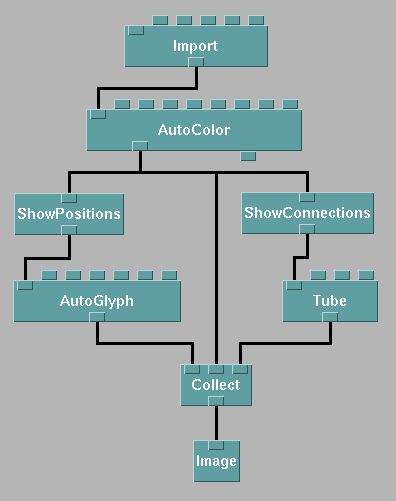
Figure 3. A simple visual program in Data Explorer is capable of creating many different types of visualizations, as seen in Figure 8.
Customization
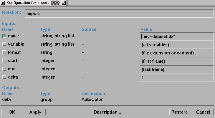
Figure 4. The Import module reads a data file into the visualization environment.Data Explorer offers other techniques for controlling module parameters which allow the user to more easily interact with and "tweak" the characteristics of a display. By connecting objects called "interactors" to input tabs, the user can create a "control panel" that allows for easy modification of any number of different parameters. An interactor appears in the visual program as a simple module (no inputs, one or more outputs) and in a control panel as a selector, a dial or slider, a text field, or some other interaction object. (Note that the visual program in Figure 3 does not contain any interactors.) Interactors are highly configurable yet easy to use, adding significant flexibility to the visualization development process. An example control panel appears in Figure 5. As can be seen, the control panel allows the user to select import data files, alter the graphical characteristics of the display, and even change the quantities being visualized. Such a flexible environment fosters the development of customizable displays and a high-degree of user-interaction, important properties for next-generation parallel program and performance displays.
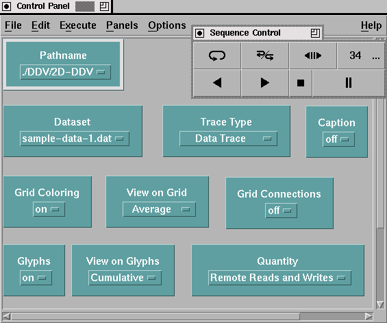
Figure 5. Control panels are used to create simple interfaces that can manipulate many characteristics of a visualization.
Adding a third dimension to a visualization increases the representation potential for the data associated with a given display. Three-dimensional rendering techniques allow the viewer to see more of that data, and display interactions increase the access to and control of visual details and display attributes. However, extending existing performance visualization tools to three-dimensional displays requires more than just adding a projection routine. Because three-dimensional displays are so dependent on the angle from which they are viewed and the rendering techniques being used, tools offering three-dimensional displays need ways for the user to interact with the objects in the display. At a minimum, this would seem to require the ability to zoom in/out on any part of an object, to rotate the object arbitrarily, and to control graphical attributes such as color and transparency. More advanced tools include control over lighting models and the surface properties of display objects (e.g., specularity and reflectance).
As an example of the additional features provided by scientific visualization tools, Data Explorer's color map editor, shown in Figure 6, allows the visualization developer to customize a visualization's color map. In fact, multiple color maps can be used for different objects in the display. The importance of flexible color mapping has been documented [3,35]. Visualizations can be given completely new meaning simply by changing the color map(s) associated with the display. Such features are not trivially incorporated into existing performance visualization tools but are standard in many visualization packages.
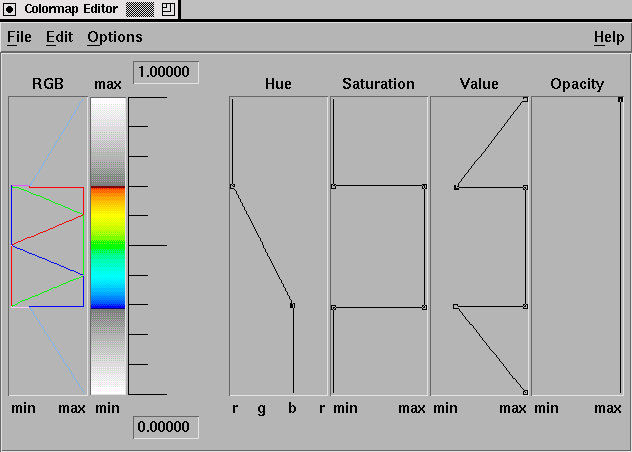
Figure 6. A colormap editor can create arbitrary colormaps for a visualization, enabling the analyst to explore and highlight different features of the represented data.
For instance, Figure 7(a) shows a display from the popular ParaGraph visualization tool, while Figure 7(b) is a prototype of the ParaGraph display generated by Data Explorer. Both displays show communication between processors. ParaGraph's display is two-dimensional while Data Explorer's is (inherently) three-dimensional, though not yet to any representational advantage. In rendering the two-dimensional display, it is known that a connection between two nodes will not interfere with any other objects in the scene (except other connections which are safely ignored since they are just pixel-wide lines) since the nodes are arranged in a circle. However, in the three-dimensional visualization, the visibility of a given connection is dependent on the orientation of the structure as well as the components making it up, which includes the other connections. The situation is worse when a truly three-dimensional display is generated. The benefit of using a tool like Data Explorer is that this display can be extended beyond the "flat" prototype into a real three-dimensional display, resulting in a much richer, information-dense display. But this added graphical complexity has its consequences as it necessitates a stricter method for animation in the generalized data visualization software products. An example of extending an existing, two-dimensional visualization is presented in Chapter VII.
In general, visualizing in three dimensions overcomes certain limitations inherent in two dimensions. For example, in 3-D there is more flexibility in layout than in 2-D, making the creation of scalable displays potentially less intractable (see the case study in Chapter IX). Advanced graphics rendering also offers more options for combining global and detailed performance visualization in a single display (as in Chapter VII). While the display in Figure 7(b) may be perfectly acceptable, three-dimensional representations offer greater possibilities to the developer and must play an integral part in the next generation of parallel performance visualization tools.
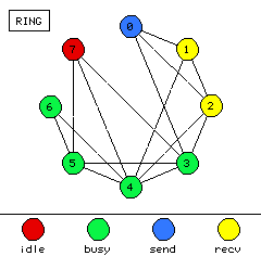
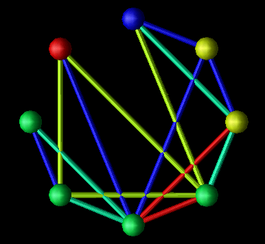
Figure 7. Displays from (a) existing performance visualization tools can be prototyped, and subsequently extended, using (b) three-dimensional data visualization packages.
The DX data model centers around sets of positions and connections. A simple DX program might create a visualization that annotates positions with spheres and connections between positions with cylinders. Additional coloring might take place depending on the data being processed. Figure 3 contains a visual program that accomplishes these tasks for appropriately structured input data.
Performance visualizations that intend to illustrate interprocessor communication often manifest themselves in a visualization fitting the description given above. That is, processors can be represented by a set of spheres in space, while the communication between processors can be realized by links between the spheres (e.g., Figure 7(b)). Such a display can be extended in many ways and is certainly not limited to interprocessor communication.
To emphasize the use of reusable visual programs, the images in Figure 8 were all generated by the visual program in Figure 3. The only program parameter that was changed was the name of the data file in the Import module. All the other modules have default parameters that do the right thing for the data being visualized. The Data Explorer modules are able to figure out what to do with the data without the user explicitly describing it; the trace transformation process is responsible for augmenting the trace data with enough structural information so that Data Explorer modules can construct the visualization from the data. Thus, the structure and content of the data file - which is the result of a trace transformation - plays a key role in determining a visualization's appearance. In this way, a single visual program enables a set of displays to be generated. Practically, this is convenient, but theoretically, it violates the desired independence between performance and view objects, as described by the high-level methodology. Again, this is a result of the specific implementation environment and represents a design decision made so that prototyping could be better supported.
Each of the displays in Figure 8 could be used in a parallel performance setting. For instance, Figure 8(a) could represent interprocessor communication in a ring topology. Similarly, Figure 8(b) could be applied to a mesh architecture where glyph size represents communication overhead, link color represents the communication load on a particular interconnection between processors, and the mesh background shows a continuous interpolation of the discrete node data, potentially useful to observe scalability characteristics. Figure 8(c) extends the previous example into three dimensions. The interior of the solid is volume-rendered to create a "cloud" of colors which can offer insight into the possible results of a scaled-up version of the application. Finally, Figure 8(d) offers a novel visualization where processors exist in a two-dimensional grid with "sails" emanating from the glyphs. For each processor, the orientation of the sail and the height of the sail's two upper points could be controlled by a three-dimensional metric (e.g., busy, idle, and overhead percentages). While these displays are significantly different graphically, they were all created by a single, simple visual program processing different data files. In terms of the methodology, the same view objects are being combined with different performance objects.
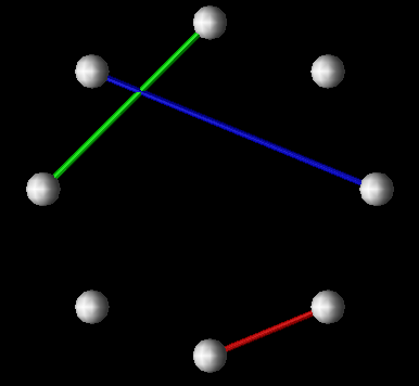
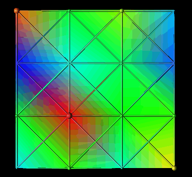
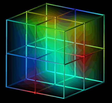
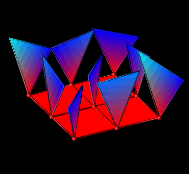
Figure 8. The visual program in Figure 3 can create a wide range of performance visualizations depending on the structure of the underlying data.Alternatively, the same dataset can be processed by different visual programs to generate different displays, an approach common to scientific visualization. For example, a developer can apply different realization techniques to the same data by using different DX programs. One visual program may volume-render a three-dimensional structure while another creates contour surfaces within the volume. The data is the same, but the different visual programs enable different types of displays to be created.
Thus, in this methodology the developer is presented with two levels at which visualization development and modification can take place: the data object file (performance objects) and the visual program (view objects). Both can be used to control certain aspects of the visualization process, but typically one may be more appropriate than the other depending on the user's goals. If the goal is to investigate performance characteristics within a single set of performance data, then fixing the data set and changing the visual program tends to work best. On the other hand, if the goal is to compare and contrast several sets of performance data, then using a single visual program and changing the structure of the imported data can be effective. Of course, in many situations, changing both the data and the visual program generates the best results.
The strength and flexibility of a product like Data Explorer comes from both the programming behind the modules and the powerful data model it uses. The result, in terms of prototyping performance visualizations, is that displays can be created very easily and quickly. For the visualizations in this thesis, less than 100 lines of standard C code was necessary to implement the trace transformations. Also, the Data Explorer visual programs required to import and process the data files vary minimally across a wide range of visualizations - a testimony to the self-describing capabilities of the data model and the high degree of software reusability supported by DX. In all, a new visualization - trace transformation, graphical transformation, debugging, experimentation, etc. - can be developed in less than a day. Modifications to existing displays require a few minutes or less. Given that a single DX visual program may serve to create many visualizations, and of course, a single DX data file can be used in many different visual programs, the overall result is a very versatile environment for creating and redesigning performance visualizations.
To illustrate how this may benefit performance visualization developers, consider the following scenario. Suppose a certain performance visualization tool was limited to two-dimensional displays in the spirit of Figure 7(a). (Note that this supposition applies to almost all of the existing performance visualization tools mentioned throughout this thesis.) To extend such displays into three dimensions would require substantial work on the part of the tool designers and implementers. New graphic routines would have to be written, additional methods of interacting with the display would probably be necessary, and perhaps the data model would need to be extended. Using a tool such as Data Explorer, which supports three-dimensional visualizations by default, the jump from 2-D to 3-D is simply a matter of changing the data!