In many ways, the case study in this chapter is an integration of the two previous studies. At the end of Chapter VIII, the notion of visualization scalability was briefly discussed in the context of the DDV displays. For this study, scalability is a primary concern in that it explores how advanced graphical techniques can be used to create scalable performance visualizations for data-parallel programs. In many cases, the same type of performance data and visualization concepts used in Chapter VII will be used here.
Introduction
Scalable Visualization Methods
Through this study, four general methods that can be used to achieve visual scalability have been observed. Some have been introduced by other researchers, while others are new visualization techniques. In either case, the integration of these methods with sophisticated graphics represents a significant advance in parallel performance visualization, in particular as it applies to data-parallel program analysis. The following four categories represent a diverse set of visualization techniques that have been used to create scalable visualizations:
This classification is certainly not exhaustive. Rather, this list represents a set of generalizations that have been deduced from several displays developed during the course of this research effort. These methods are best illustrated by the examples in the following sections, however, general descriptions of each will be given here.
Given a fixed level of detail that is to be portrayed in a visualization, a view of a visualization should (1) reveal as large a quantity of the detail to be represented in the display as possible, and (2) prevent visual complexity from interfering with the perception of that detail.
Thus, a visualization is developed around a concept that can be represented by several different graphical representations. An appropriate technique is chosen that is consistent with the visualization concept and the two properties above. It is important to note that these criteria oppose one another since level of detail and visual complexity are directly related in many displays. That is to say that the revelation of more detail generally leads to a higher degree of visual complexity, and less visual complexity usually implies that less detail can be shown. The balance between the two is subjective and dependent on many factors such as the visualization concept being used and the viewer's preference.
Applications
Adaptive Graphical Representation
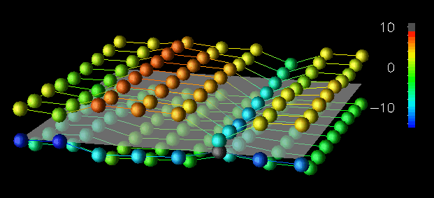
Figure 30. A small data structure (8x9) is effectively portrayed by using discrete spherical glyphs.
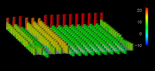
Figure 31. A medium-sized data structure (16x17) requires the vertically-displaced tops of the cylinders be connected to the plane to provide reference information.
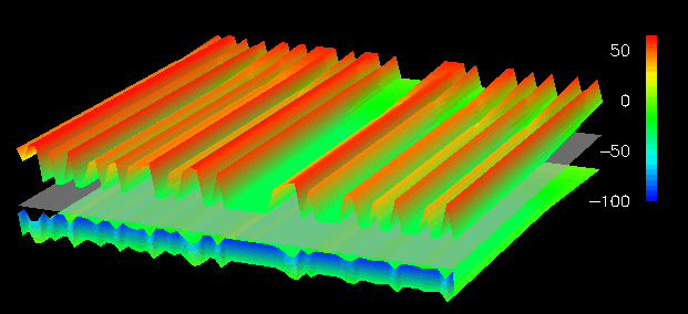
Figure 32. A continuous displacement grid minimizes visual complexity for a large data structure (64x65).For the small 8x9 dataset in Figure 30, discrete, colored spheres floating above the reference plane minimize the obstruction of other objects in the view, while effectively representing the performance information because of the small size of the dataset. For example, elements in row 2 have encountered more remote read accesses than those in other rows. Figure 31 shows a 16x17 dataset. Spherical glyphs lack "connection" to the reference plane, and when the number of elements increases sufficiently it becomes difficult to determine which glyph corresponds to which element. The towers used in Figure 31 provide such reference information by linking the vertically displaced top of the tower with the reference plane. Finally, for the larger 64x65 dataset (Figure 32), a continuous displacement grid minimizes the visual complexity that would be caused by 4,096 discrete glyphs or towers, but it does so at the expense of the quantity of detail that is visible from a given view. (That is, with the small dataset you could simultaneously see both sets of glyphs, whereas with the large dataset this isn't possible.)
From these visualizations, the user can interpret the access frequency among local and remote reads and writes. However, detailed views are obscured as the dataset increases in size. The sequence illustrates one method of achieving scalability by adapting the graphical technique in relation to the size of the dataset. Such adaptation often manifests itself as a transition from a discrete, detail-revealing method to a continuous, complexity-reducing technique, echoing the two criteria set out in the premise for this technique. With respect to the data-parallel program, the discrete-to-continuous transition approximates the increasing detail of the parallel data structure.
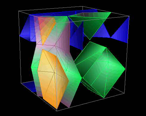
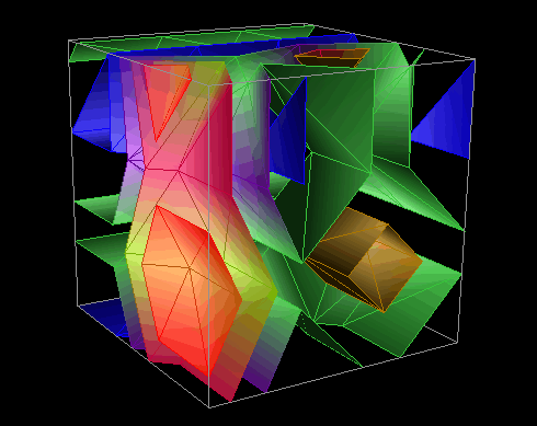
The visualizations in Figure 33 and Figure 34 illustrate this technique by using isosurfaces within a three-dimensional structure. Isosurfaces, the three-dimensional analog of (two-dimensional) contour lines, represent surfaces of constant value (called the "isovalue") within the structure. In these visualizations, local and remote access information from a pC++ implementation of the random sparse conjugate gradient computation in the NAS benchmark suite is portrayed. The elements of a BLOCK-distributed data structure have been arranged in a three-dimensional cube. Each element has an associated number of local and remote data accesses made to it during the last time interval. The isosurfaces within the structure reveal areas of the data structure experiencing similar levels of remote (or local) accesses. By animating the visualization, the evolution of data access patterns during the program's execution is effectively revealed, allowing regions of more intense access to be identified. Figure 33 shows two time slices from a 4x4x4 cube showing remote accesses. Figure 34 is a scaled version of this display, using a 16x16x16 structure showing local accesses.
time 156
Animation (171K)
Figure 33. Isosurfaces are used to portray remote data accesses to 64 data elements arranged in a 4x4x4 grid at two different times during the application.
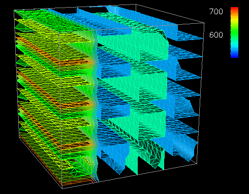
Figure 34. A scaled visualization shows local data accesses to 4,096 elements arranged in a 16x16x16 grid.Scalability is achieved in these displays by filtering and reducing the displayed data. Isosurfaces perform an effective graphical reduction because several isovalues can be used (each figure contains five) to create multiple surfaces that span the range of the performance metric of interest and represent all elements of the structure, yet do not cause uninformative visual complexity.
The next set of displays that demonstrates the use of spatial arrangement as a method of achieving scalability are in Figure 35 and Figure 36. These displays implement a type of three-dimensional scatter plot that relies on the perceptive abilities of the human visual system to detect clustering and distribution patterns [4,16,48]. For this reason, this visualization gains effectiveness for larger datasets. Thus, the spatial arrangement (i.e., distribution) of the data yields a technique that scales well. Figure 35 portrays the quantity and location of accesses by each processor. Processors are identified by a glyph's color, with the vertical displacement from the reference grid indicating the number of accesses made to each of the 64 data elements (arranged in an 8x8 grid) during the last time interval of the pC++ application. Figure 36 offers a prototype of a scaled version of this display on a 32x32-element structure.
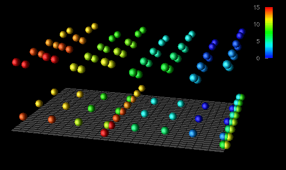
Figure 35. A three-dimensional scatter plot shows which and how often processors are accessing the elements of the data structure.
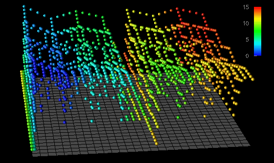
Figure 36. A prototype of a scaled scatter plot exposes global data access patterns.From these displays, the analyst can derive several observations that are helpful in evaluating the memory access patterns of an application as well as the data distribution currently being used. For example, by using the vertical displacement visualizations (Figure 30, Figure 31, and Figure 32) for this pC++ application, an analyst could easily learn about the distribution of local and remote data accesses. This is also seen in Figure 35 and Figure 36 by noticing that the glyphs generally appear in two vertically separated clusters (particularly when viewed from the appropriate orientation). The display reveals how the data was distributed among the 16 processors by the color distribution. However, a differentiation between local and remote references is not made. The analyst might notice such a division first, though, and then be motivated to determine local and remote distributions from the other displays. Alternatively, within the Data Explorer environment, the user could change the color mapping so that local and remote accesses are distinguished. This example shows how user interactions can play a significant role in scalable visualizations.
That such references are actually remote is confirmed not only by the small degree of vertical displacement (indicating the lower frequency associated with remote accesses in this application), but by the presence of glyphs having colors different than the corresponding glyphs above representing local accesses.
The last set of visualizations that illustrate scalability by spatial arrangement are in Figure 37, Figure 38, and Figure 39. These displays are reincarnations of the popular Kiviat displays, as used in ParaGraph [10] and introduced in Chapter VII to show processor utilization. They use the same pC++ application described earlier. The construction of a single time slice of these displays is achieved by arranging the 64 data elements (as opposed to processors which was done before) in a circle. The distance a given element is from the center of the circle is directly proportional to the accumulated number of local (Figure 37 and Figure 38) or remote (Figure 39) data accesses made to that element during the previous time interval. To construct the solid shown in Figure 37, adjacent elements in the same time slice and corresponding elements in successive time steps are connected to form quadrilateral surface patches. A Kiviat tube showing data distribution and access patterns results.
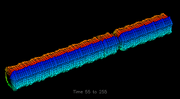
Figure 37. A Kiviat tube can be used to portray data element accesses instead of processor utilization.The arrangement of data elements in a circle provides a moderately scalable (two-dimensional) spatial arrangement. Some additional scalability issues for this series of displays will be presented in the next section, but first, the construction of the Kiviat tube, an example of shape construction, will be discussed in more detail. The unique feature of shape constructive spatial arrangement over the spatial arrangement seen in the isosurface visualizations (Figure 33 and Figure 34) is that the former uses the shape itself to capture the characteristics of the performance data, while the latter simply provides a framework within which some other graphical technique (e.g., a set of isosurfaces) is employed to relate the performance data. Figure 37 depicts a single graphical object that captures the characteristics of an entire trace file, with time traveling along the length of the cylinder. (The initial 53 time slices have been removed because no memory accesses to the chosen data structure occurred during that time.) Such three-dimensional representations can play an important role in providing global performance information. For example, in Figure 37 one may notice a very regular access pattern for the first part of the trace, as indicated by the symmetry and constant diameter of the tube. However, approximately two-thirds of the way through the displayed trace data, a significant decrease in the number of local memory accesses occurs. Such global observations guide the program analyst to potential trouble spots in the execution of the algorithm and tend to be more perceptual rather than cognitive tasks [47]. As will be seen in the next section, the analyst can then examine that portion of the trace in more detail.
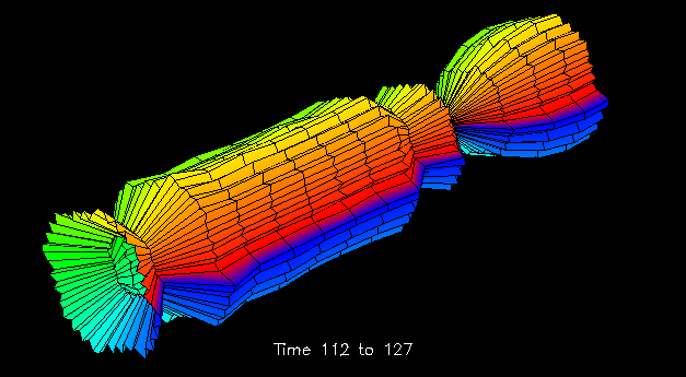
The Kiviat tubes of Figure 37, Figure 38, and Figure 39 illustrate both scrolling techniques. It has already been discussed how Figure 37 could guide the analyst to a particular region of the trace file. Such a region is expanded in Figure 38 and Figure 39. The Kiviat tube visualizations allow the user to specify an animation width to display a smaller portion of the structure. Figure 38 and Figure 39 each have animation widths of 15 time steps. The ability to zoom in on local regions of the larger structure is an example of spatial scrolling. The display's use of scrolling is, in fact, somewhat more general than most uses of scrolling since it allows the user to view just the desired section of the tube. In addition, the displayed portion may be stretched or compressed to the viewer's preference. Again, these are examples of the significant customizability attained by using the data visualization software.
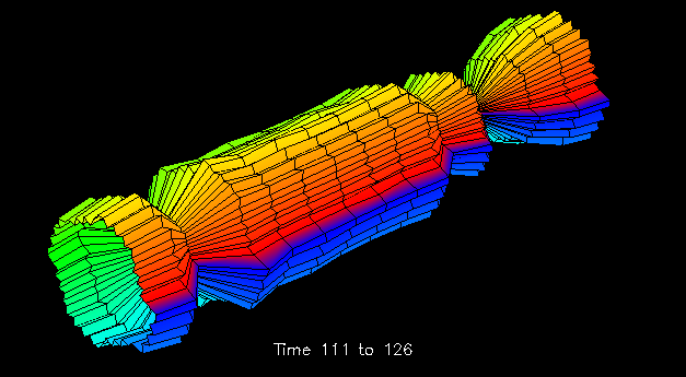
time 112 to 127
Animation (638K)
Figure 38. A blown-up region of the Kiviat tube reveals three significant decreases in local data accesses.
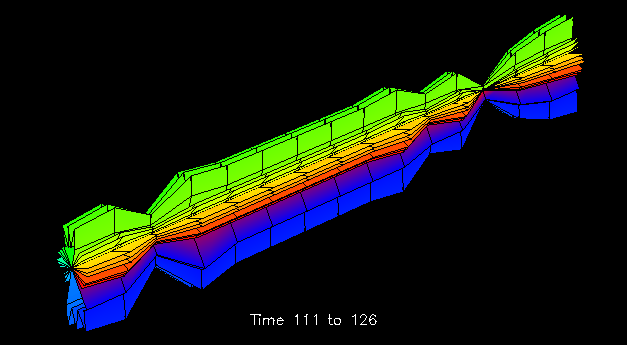
Figure 39. The corresponding Kiviat tube section showing remote accesses indicates similar decreases.To extend the notion of scrolling further, animating the structures in Figure 38 and Figure 39 provides additional insight into the performance data's characteristics. This implementation of the visualization allows the viewer to "slide" down the length of the Kiviat cylinder at a given animation width. Figure 38 shows two successive time slices of the Kiviat tube section. This section of the Kiviat tube reveals three intervals during which the number of local memory accesses decreased significantly. Upon noticing this, the analyst may subsequently wish to examine the corresponding structure for remote memory accesses. Figure 39 shows such an alternate view that corresponds to the upper display in Figure 38. One immediately notices the significant difference in the distribution of remote memory accesses made to the elements of the data structure. In particular, the elements located on the top and bottom sides of the tube experience larger numbers of remote data accesses than the other elements. One also notices that remote accesses experience a decline similar to the local accesses during the same three intervals. All of this is potentially meaningful information for the analyst seeking to understand data distribution and performance characteristics of an application.
As has been demonstrated, generalized scrolling provides scalability by presenting a local view of the represented data, but allows global relationships to be observed by providing spatially or temporally continuous transitions from one representation of the data to another.
Summary
Last modified: Wed Jan 20 15:14:35 PST 1999
Steven Hackstadt /
hacks@cs.uoregon.edu