Charts
Setting Parameters
There are a few parameters which need to be set when doing comparisons between trials in the database. If any necessary setting is not configured before requesting a chart, you will be prompted to set the value. The following settings may be necessary for the various charts available:
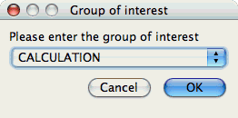
Group of Interest
TAU events are often associated with common groups, such as "MPI", "TRANSPOSE", etc. This value is used for showing what fraction of runtime that this group of events contributed to the total runtime.
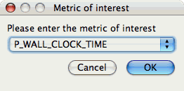
Metric of Interest
Profiles may contain many metrics gathered for a single trial. This selects which of the available metrics the user is interested in.
Standard Chart Types
Timesteps Per
Second
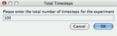
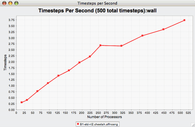
The Timesteps Per Second chart shows how an application scales as it relates to time-to-solution. If the timesteps are not already set, you will be prompted to enter the total number of timesteps in the trial (see Total Number of ). If there is more than one metric to choose from, you may be prompted to select the metric of interest (see Metric of Interest ). To request this chart, select one or more experiments or one view, and select this chart item under the "Charts" main menu item.
Relative
Efficiency
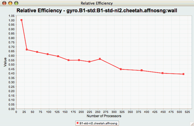
The Relative Efficiency chart shows how an application scales with respect to relative efficiency. That is, as the number of processors increases by a factor, the time to solution is expected to decrease by the same factor (with ideal scaling). The fraction between the expected scaling and the actual scaling is the relative efficiency. If there is more than one metric to choose from, you may be prompted to select the metric of interest (see Metric of Interest ). To request this chart, select one experiment or view, and select this chart item under the "Charts" main menu item.
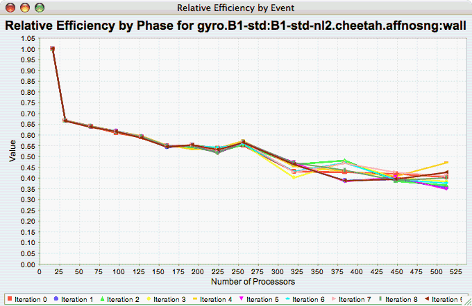
Relative Efficiency by
Event
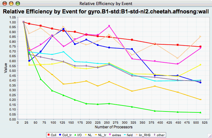
The Relative Efficiency By Event chart shows how each event in an application scales with respect to relative efficiency. That is, as the number of processors increases by a factor, the time to solution is expected to decrease by the same factor (with ideal scaling). The fraction between the expected scaling and the actual scaling is the relative efficiency. If there is more than one metric to choose from, you may be prompted to select the metric of interest (see Metric of Interest ). To request this chart, select one or more experiments or one view, and select this chart item under the "Charts" main menu item.
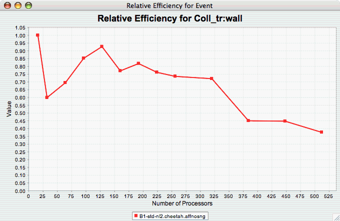
Relative Efficiency for
One Event
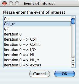
The Relative Efficiency for One Event chart shows how one event from an application scales with respect to relative efficiency. That is, as the number of processors increases by a factor, the time to solution is expected to decrease by the same factor (with ideal scaling). The fraction between the expected scaling and the actual scaling is the relative efficiency. If there is more than one event to choose from, and you have not yet selected an event of interest, you may be prompted to select the event of interest (see Event of Interest ). If there is more than one metric to choose from, you may be prompted to select the metric of interest (see Metric of Interest ). To request this chart, select one or more experiments or one view, and select this chart item under the "Charts" main menu item.
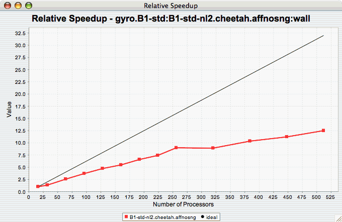
Relative
Speedup
The Relative Speedup chart shows how an application scales with respect to relative speedup. That is, as the number of processors increases by a factor, the speedup is expected to increase by the same factor (with ideal scaling). The ideal speedup is charted, along with the actual speedup for the application. If there is more than one metric to choose from, you may be prompted to select the metric of interest (see Metric of Interest ). To request this chart, select one or more experiments or one view, and select this chart item under the "Charts" main menu item.
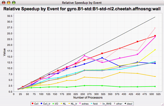
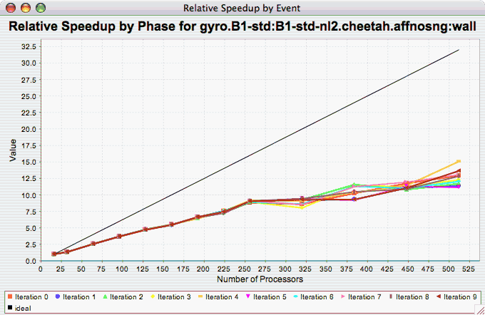
Relative Speedup by
Event
The Relative Speedup By Event chart shows how the events in an application scale with respect to relative speedup. That is, as the number of processors increases by a factor, the speedup is expected to increase by the same factor (with ideal scaling). The ideal speedup is charted, along with the actual speedup for the application. If there is more than one metric to choose from, you may be prompted to select the metric of interest (see Metric of Interest ). To request this chart, select one experiment or view, and select this chart item under the "Charts" main menu item.
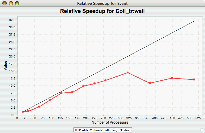
Relative Speedup for One
Event
The Relative Speedup for One Event chart shows how one event in an application scales with respect to relative speedup. That is, as the number of processors increases by a factor, the speedup is expected to increase by the same factor (with ideal scaling). The ideal speedup is charted, along with the actual speedup for the application. If there is more than one event to choose from, and you have not yet selected an event of interest, you may be prompted to select the event of interest (see Event of Interest ). If there is more than one metric to choose from, you may be prompted to select the metric of interest (see Metric of Interest ). To request this chart, select one or more experiments or one view, and select this chart item under the "Charts" main menu item.
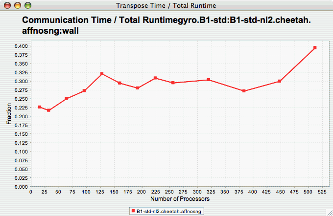
Group % of Total
Runtime
The Group % of Total Runtime chart shows how the fraction of the total runtime for one group of events changes as the number of processors increases. If there is more than one group to choose from, and you have not yet selected a group of interest, you may be prompted to select the group of interest (see Group of Interest ). If there is more than one metric to choose from, you may be prompted to select the metric of interest (see Metric of Interest ). To request this chart, select one or more experiments or one view, and select this chart item under the "Charts" main menu item.
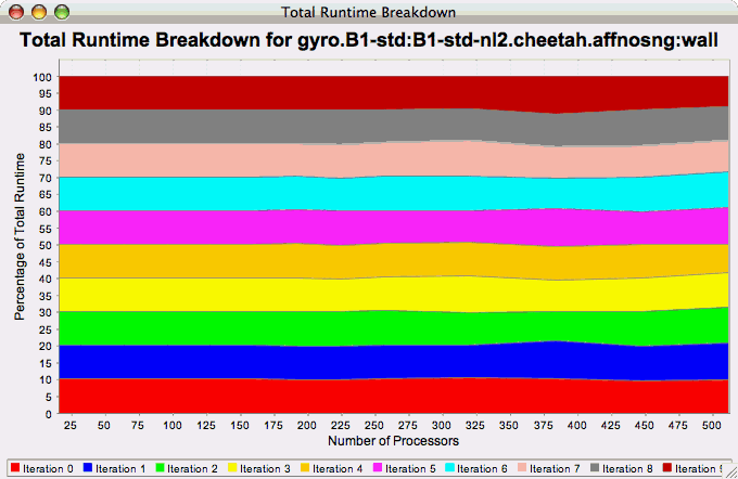
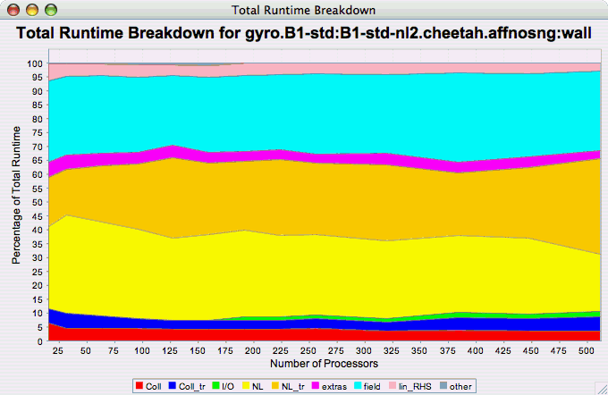
Runtime
Breakdown
The Runtime Breakdown chart shows the fraction of the total runtime for all events in the application, and how the fraction changes as the number of processors increases. If there is more than one metric to choose from, you may be prompted to select the metric of interest (see Metric of Interest ). To request this chart, select one experiment or view, and select this chart item under the "Charts" main menu item.
Phase Chart Types
TAU now provides the ability to break down profiles with respect to phases of execution. One such application would be to collect separate statistics for each timestep, or group of timesteps. In order to visualize the variance between the phases of execution, a number of phase-based charts are available.
Relative Efficiency per Phase
The Relative Efficiency Per Phase chart shows the relative efficiency for each phase, as the number of processors increases. If there is more than one metric to choose from, you may be prompted to select the metric of interest (see Metric of Interest ). To request this chart, select one experiment or view, and select this chart item under the "Charts" main menu item.
Relative Speedup per Phase
The Relative Speedup Per Phase chart shows the relative speedup for each phase, as the number of processors increases. If there is more than one metric to choose from, you may be prompted to select the metric of interest (see Metric of Interest ). To request this chart, select one experiment or view, and select this chart item under the "Charts" main menu item.
Phase Fraction of Total
Runtime
The Phase Fraction of Total Runtime chart shows the breakdown of the execution by phases, and shows how that breakdown changes as the number of processors increases. If there is more than one metric to choose from, you may be prompted to select the metric of interest (see Metric of Interest ). To request this chart, select one experiment or view, and select this chart item under the "Charts" main menu item.