PerfExplorer - User’s Manual
Introduction
PerfExplorer is a framework for parallel performance data mining and knowledge discovery. The framework architecture enables the development and integration of data mining operations that will be applied to large-scale parallel performance profiles.
The overall goal of the PerfExplorer project is to create a software to integrate sophisticated data mining techniques in the analysis of large-scale parallel performance data.
PerfExplorer supports clustering, summarization, association, regression, and correlation. Cluster analysis is the process of organizing data points into logically similar groupings, called clusters. Summarization is the process of describing the similarities within, and dissimilarities between, the discovered clusters. Association is the process of finding relationships in the data. One such method of association is regression analysis, the process of finding independent and dependent correlated variables in the data. In addition, comparative analysis extends these operations to compare results from different experiments, for instance, as part of a parametric study.
In addition to the data mining operations available, the user may optionally choose to perform comparative analysis. The types of charts available include time-steps per second, relative efficiency and speedup of the entire application, relative efficiency and speedup of one event, relative efficiency and speedup for all events, relative efficiency and speedup for all phases and runtime breakdown of the application by event or by phase. In addition, when the events are grouped together, such as in the case of communication routines, yet another chart shows the percentage of total runtime spent in that group of events. These analyses can be conducted across different combinations of parallel profiles and across phases within an execution.
Installation and Configuration
PerfExplorer uses TAUdb and PerfDMF databases so if you have not already you will need to install TAUdb, see [taudb.intro] . After installing and configuring TAU the perfexplorer executable should be available in your [path to tau]/tau2/[arch]/bin directory. You will need to run perfexplorer_configure , installed at the same location as perfexplorer, to set up your database for use with perfexplorer and to download additional 3rd party jar files perfexplorer requires. When prompted by perfexplorer_configure give the name of your PerfDMF or TAUdb database and press Y to agree to download the jar files.
Running PerfExplorer
To run PerfExplorer type:
%>perfexplorer


        When PerfExplorer loads you will see on the left window all the
        experiments that where loaded into PerfDMF. You can select which
        performance data you are interested by navigating the tree structure.
        PerfExplorer will allow you to
        run analysis operations on these experiments. Also the cluster analysis
        results are visible on the right side of the window.  Various types of
        comparative analysis are available from the drop down menu
        selected.
When PerfExplorer loads you will see on the left window all the experiments that where loaded into PerfDMF. You can select which performance data you are interested by navigating the tree structure. PerfExplorer will allow you to run analysis operations on these experiments. Also the cluster analysis results are visible on the right side of the window. Various types of comparative analysis are available from the drop down menu selected.
To run an analysis operation, first select the metric of interest form the experiments on the left. Then perform the operation by selecting it from the Analysis menu. If you would like you can set the clustering method, dimension reduction, normalization method and the number of clusters from the same menu.
The options under the Charts menu provide analysis over one or more applications, experiments, views or trials. To view these charts first choose a metric of interest by selecting a trial form the tree on the left. Then optionally choose the Set Metric of Interest or Set Event of Interest form the Charts menu (if you don’t, and you need to, you will be prompted). Now you can view a chart by selecting it from the Charts menu.
Cluster Analysis
Cluster analysis is a valuable tool for reducing large parallel profiles down to representative groups for investigation. Currently, there are two types of clustering analysis implemented in PerfExplorer. Both hierarchical and k-means analysis are used to group parallel profiles into common clusters, and then the clusters are summarized. Initially, we used similarity measures computed on a single parallel profile as input to the clustering algorithms, although other forms of input are possible. Here, the performance data is organized into multi-dimensional vectors for analysis. Each vector represents one parallel thread (or process) of execution in the profile. Each dimension in the vector represents an event that was profiled in the application. Events can be any sub-region of code, including libraries, functions, loops, basic blocks or even individual lines of code. In simple clustering examples, each vector represents only one metric of measurement. For our purposes, some dissimilarity value, such as Euclidean or Manhattan distance, is computed on the vectors. As discussed later, we have tested hierarchical and $k$-means cluster analysis in PerfExplorer on profiles with over 32K threads of execution with few difficulties.
Dimension Reduction
Often, many hundreds of events are instrumented when profile data is collected. Clustering works best with dimensions less than 10, so dimension reduction is often necessary to get meaningful results. Currently, there is only one type of dimension reduction available in PerfExplorer. To reduce dimensions, the user specifies a minimum exclusive percentage for an event to be considered "significant".
To reduce dimensions, select the "Select Dimension Reduction" item under the "Analysis" main menu bar item. The following dialog will appear:
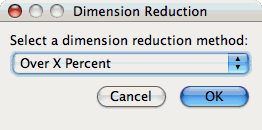
Select "Over X Percent". The following dialog will appear:
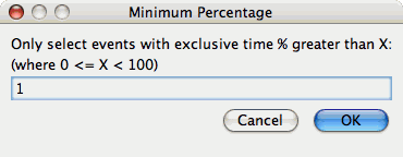
Enter a value, for example "1".
Max Number of Clusters
By default, PerfExplorer will attempt k-means clustering with values of k from 2 to 10. To change the maximum number of clusters, select the "Set Maximum Number of Clusters" item under the "Analysis" main menu item. The following dialog will appear:

Performing Cluster Analysis
To perform cluster analysis, you first need to select a metric. To select a metric, navigate through the tree of applications, experiments and trials, and expand the trial of interest, showing the available metrics, as shown in the figure below:
	Metric to Cluster
image::clusteringselection.png[Selecting a
	Metric to Cluster,width="6in",align="center"]
After selecting the metric of interest, select the "Do Clustering" item under the "Analysis" main menu bar item. The following dialog will appear:
	Clustering Options
image::confirmclustering.png[Confirm
	Clustering Options,width="2in",align="center"]
After confirming the clustering, the clustering will begin. When the clustering results are available, you can view them in the "Cluster Results" tab.
	Results
image::clusterresults.png[Cluster
	Results,width="6in",align="center"]
There are a number of images in the "Cluster Results" window. From left to right, the windows indicate the cluster membership histogram, a PCA scatterplot showing the cluster memberships, a virtual topology of the parallel machine, the minimum values for each event in each cluster, the average values for each event in each cluster, and the maximum values for each event in each cluster. Clicking on a thumbnail image in the main window will bring up the images, as shown below:
	Membership Histogram
image::histogram.png[Cluster
	Membership Histogram,width="4in",align="center"]
	Membership Scatterplot
image::scatterplot.png[Cluster
	Membership Scatterplot,width="4in",align="center"]
	Virtual Topology
image::topology.png[Cluster
	Virtual Topology,width="4in",align="center"]
	Average Behavior
image::averages.png[Cluster
	Average Behavior,width="4in",align="center"]
Correlation Analysis
Correlation analysis in PerfExplorer is used to explore relationships between events in a profile. Each event is pairwise plotted with the other events, and a correlation coefficient is calcuated for the relationship. When the events are highly positively correlated (coefficient of close to 1.0) or highly negatively correlated (coefficient close to -1.0), then the relationships will show up as linear groupings in the results. Clusters may also be apparent.
Dimension Reduction
Often, many hundreds of events are instrumented when profile data is collected. Clustering works best with dimensions less than 10, so dimension reduction is often necessary to get meaningful results. Currently, there is only one type of dimension reduction available in PerfExplorer. To reduce dimensions, the user specifies a minimum exclusive percentage for an event to be considered "significant".
To reduce dimensions, select the "Select Dimension Reduction" item under the "Analysis" main menu bar item. The following dialog will appear:
Select "Over X Percent". The following dialog will appear:
Enter a value, for example "1".
Performing Correlation Analysis
To perform correlation analysis, you first need to select a metric. To select a metric, navigate through the tree of applications, experiments and trials, and expand the trial of interest, showing the available metrics, as shown in the figure below:
	Metric to Cluster
image::clusteringselection.png[Selecting a
	Metric to Cluster,width="6in",align="center"]
After selecting the metric of interest, select the "Do Correlation Analysis" item under the "Analysis" main menu bar item. A confirmation dialog will appear, and you can either confirm the correlation request or cancel it. After confirming the correlation, the analysis will begin. When the analysis results are available, you can view them in the "Correlation Results" tab.
	Results
image::correlationresults.png[Correlation
	Results,width="6in",align="center"]
There are a number of images in the "Correlation Results" window. Each thumbnail represents a pairwise correlation plot of two events. Clicking on a thumbnail image in the main window will bring up the images, as shown below:
	Example
image::correlationexample.png[Correlation
	Example,width="6in",align="center"]
Charts
Setting Parameters
There are a few parameters which need to be set when doing comparisons between trials in the database. If any necessary setting is not configured before requesting a chart, you will be prompted to set the value. The following settings may be necessary for the various charts available:
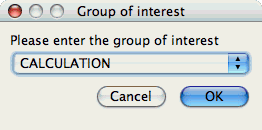
Group of Interest
TAU events are often associated with common groups, such as "MPI", "TRANSPOSE", etc. This value is used for showing what fraction of runtime that this group of events contributed to the total runtime.
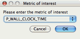
Metric of Interest
Profiles may contain many metrics gathered for a single trial. This selects which of the available metrics the user is interested in.
Standard Chart Types
Timesteps Per
Second
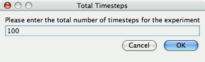
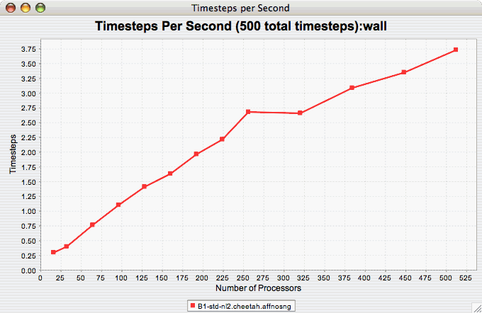
The Timesteps Per Second chart shows how an application scales as it relates to time-to-solution. If the timesteps are not already set, you will be prompted to enter the total number of timesteps in the trial (see Total Number of ). If there is more than one metric to choose from, you may be prompted to select the metric of interest (see Metric of Interest ). To request this chart, select one or more experiments or one view, and select this chart item under the "Charts" main menu item.
Relative
Efficiency
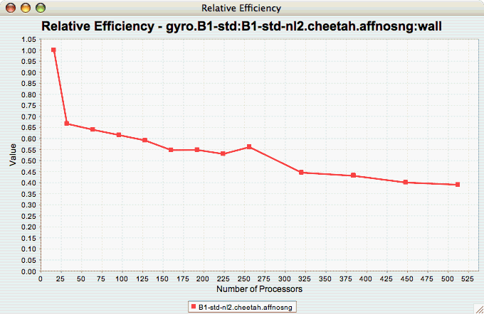
The Relative Efficiency chart shows how an application scales with respect to relative efficiency. That is, as the number of processors increases by a factor, the time to solution is expected to decrease by the same factor (with ideal scaling). The fraction between the expected scaling and the actual scaling is the relative efficiency. If there is more than one metric to choose from, you may be prompted to select the metric of interest (see Metric of Interest ). To request this chart, select one experiment or view, and select this chart item under the "Charts" main menu item.
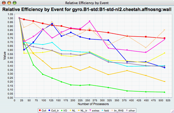
Relative Efficiency by
Event
The Relative Efficiency By Event chart shows how each event in an application scales with respect to relative efficiency. That is, as the number of processors increases by a factor, the time to solution is expected to decrease by the same factor (with ideal scaling). The fraction between the expected scaling and the actual scaling is the relative efficiency. If there is more than one metric to choose from, you may be prompted to select the metric of interest (see Metric of Interest ). To request this chart, select one or more experiments or one view, and select this chart item under the "Charts" main menu item.
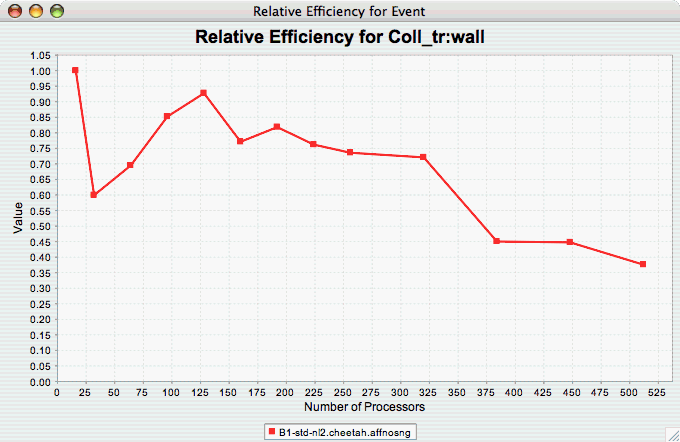
Relative Efficiency for
One Event
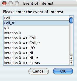
The Relative Efficiency for One Event chart shows how one event from an application scales with respect to relative efficiency. That is, as the number of processors increases by a factor, the time to solution is expected to decrease by the same factor (with ideal scaling). The fraction between the expected scaling and the actual scaling is the relative efficiency. If there is more than one event to choose from, and you have not yet selected an event of interest, you may be prompted to select the event of interest (see Event of Interest ). If there is more than one metric to choose from, you may be prompted to select the metric of interest (see Metric of Interest ). To request this chart, select one or more experiments or one view, and select this chart item under the "Charts" main menu item.
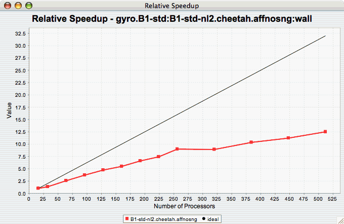
Relative
Speedup
The Relative Speedup chart shows how an application scales with respect to relative speedup. That is, as the number of processors increases by a factor, the speedup is expected to increase by the same factor (with ideal scaling). The ideal speedup is charted, along with the actual speedup for the application. If there is more than one metric to choose from, you may be prompted to select the metric of interest (see Metric of Interest ). To request this chart, select one or more experiments or one view, and select this chart item under the "Charts" main menu item.
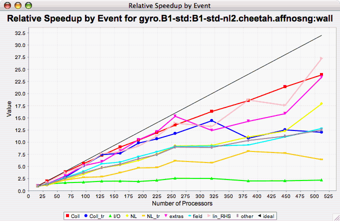
Relative Speedup by
Event
The Relative Speedup By Event chart shows how the events in an application scale with respect to relative speedup. That is, as the number of processors increases by a factor, the speedup is expected to increase by the same factor (with ideal scaling). The ideal speedup is charted, along with the actual speedup for the application. If there is more than one metric to choose from, you may be prompted to select the metric of interest (see Metric of Interest ). To request this chart, select one experiment or view, and select this chart item under the "Charts" main menu item.
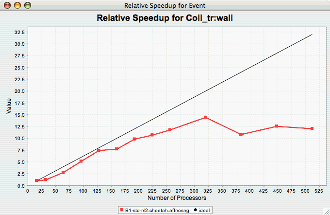
Relative Speedup for One
Event
The Relative Speedup for One Event chart shows how one event in an application scales with respect to relative speedup. That is, as the number of processors increases by a factor, the speedup is expected to increase by the same factor (with ideal scaling). The ideal speedup is charted, along with the actual speedup for the application. If there is more than one event to choose from, and you have not yet selected an event of interest, you may be prompted to select the event of interest (see Event of Interest ). If there is more than one metric to choose from, you may be prompted to select the metric of interest (see Metric of Interest ). To request this chart, select one or more experiments or one view, and select this chart item under the "Charts" main menu item.
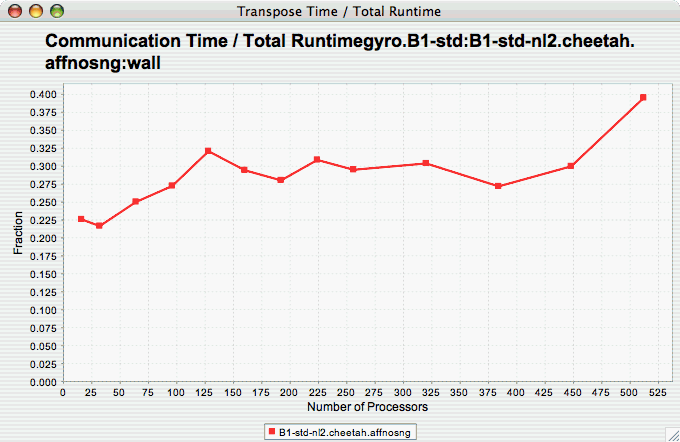
Group % of Total
Runtime
The Group % of Total Runtime chart shows how the fraction of the total runtime for one group of events changes as the number of processors increases. If there is more than one group to choose from, and you have not yet selected a group of interest, you may be prompted to select the group of interest (see Group of Interest ). If there is more than one metric to choose from, you may be prompted to select the metric of interest (see Metric of Interest ). To request this chart, select one or more experiments or one view, and select this chart item under the "Charts" main menu item.
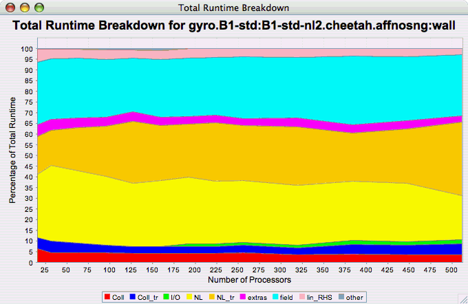
Runtime
Breakdown
The Runtime Breakdown chart shows the fraction of the total runtime for all events in the application, and how the fraction changes as the number of processors increases. If there is more than one metric to choose from, you may be prompted to select the metric of interest (see Metric of Interest ). To request this chart, select one experiment or view, and select this chart item under the "Charts" main menu item.
Phase Chart Types
TAU now provides the ability to break down profiles with respect to phases of execution. One such application would be to collect separate statistics for each timestep, or group of timesteps. In order to visualize the variance between the phases of execution, a number of phase-based charts are available.
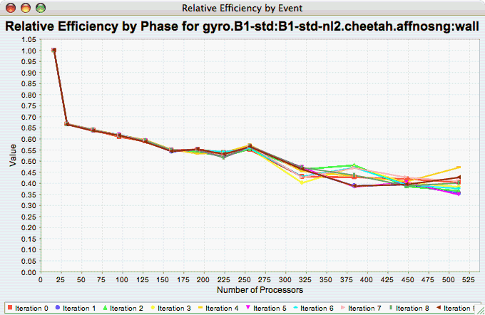
Relative Efficiency per Phase
The Relative Efficiency Per Phase chart shows the relative efficiency for each phase, as the number of processors increases. If there is more than one metric to choose from, you may be prompted to select the metric of interest (see Metric of Interest ). To request this chart, select one experiment or view, and select this chart item under the "Charts" main menu item.
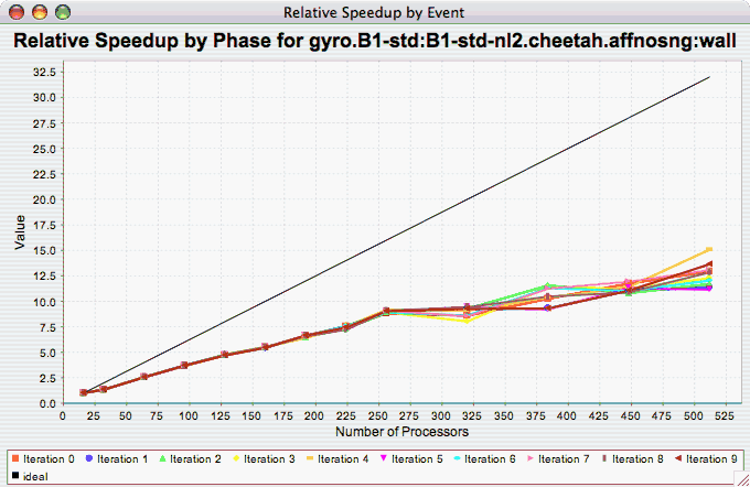
Relative Speedup per Phase
The Relative Speedup Per Phase chart shows the relative speedup for each phase, as the number of processors increases. If there is more than one metric to choose from, you may be prompted to select the metric of interest (see Metric of Interest ). To request this chart, select one experiment or view, and select this chart item under the "Charts" main menu item.
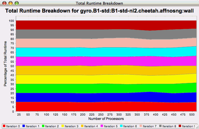
Phase Fraction of Total
Runtime
The Phase Fraction of Total Runtime chart shows the breakdown of the execution by phases, and shows how that breakdown changes as the number of processors increases. If there is more than one metric to choose from, you may be prompted to select the metric of interest (see Metric of Interest ). To request this chart, select one experiment or view, and select this chart item under the "Charts" main menu item.
Custom Charts
In addition to the default charts available in the charts menu, there are is a custom chart interface. To access the interface, select the "Custom Charts" tab on in the results pane of the main window, as shown:
	Interface
image::customcharts.png[The Custom Charts
	Interface,width="6in",align="center"]
There are a number of controls for the cusotom charts. They are:
-
Main Only - When selected, only the main event (the event with the highest inclusive value) will be selected. When deselected, the "Events" control (see below) is activated, and one or all events can be selected.
-
Call Paths - When selected, callpath events will be available in the "Events" control (see below).
-
Log Y - When selected, the Y axis will be the log of the true value.
-
Scalability - When selected, the chart will be interpreted as a speedup chart. The trial with the fewest number of threads of execution will be considered the baseline trial.
-
Efficiency - When selected, the chart will be interpreted as a relative efficiency chart. The trial with the fewest number of threads of execution will be considered the baseline trial.
-
Strong Scaling - When deselected, the speedup or efficiency chart will be interpreted as a strong scaling study (the workload is the same for all trials). When selected, the button will change to "Weak Scaling", and the chart will be interpreted as a weak scaling study (the workload is proportional to the total number of threads in each trial).
-
Horizontal - when selected, the chart X and Y axes will be swapped.
-
Show Y-Axis Zero - when selected, the chart will include the value 0. When deselected, the chart will only show the relevant values for all data points.
-
Chart Title - value to use for the chart title
-
Series Name/Value - the field to be used to group the data points as a series.
-
X Axis Value - the field to use as the X axis value.
-
X Axis Name - the name to put in the chart for the value along the X axis.
-
Y Axis Value - the field to use as the Y axis value
-
Y Axis Name - the name to put in the chart for the value along the X axis.
-
Dimension Reduction - whether or not to use dimension reduction. This is only applicable when "Main Only" is disabled.
-
Cutoff - when the "Dimension Reduction" is enabled, the cutoff value for selecting "All Events".
-
Metric - The metric of interest for the Y axis.
-
Units - The unit to be selected for the Y axis.
-
Event - The event of interest, or "All Events".
-
XML Field - When the X or Y axis is selected to be an XML field, this is the field of interest.
-
Apply - build the chart.
-
Reset - restore the options back to the default values.
When the chart is generated, it can be saved as a vector image by selecting "File → Save As Vector Image". The chart can also be saved as a PNG by right clicking on the chart, and selecting "Save As…".
Visualization
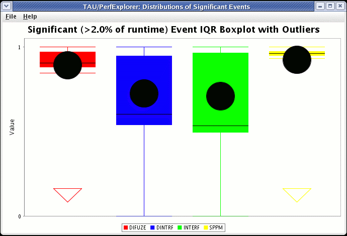
Under the "Visualization" main menu item, there are five types of raw data visualization. The five items are "3D Visualization", "Data Summary", "Create Boxchart", "Create Histogram" and "Create Normal Probability Chart". For the Boxchart, Histogram and Normal Probability Charts, you can either select one metric in the trial (which selects all events by default), or expand the metric and select events of interest.
3D Visualization
When the "3D Visualization" is requested, PerfExplorer examines the data to try to determine the most interesting events in the trial. That is, for the selected metric in the selected trial, the database will calculate the weighted relative variance for each event across all threads of execution, in order to find the top four "significant" events. These events are selected by calculating: stddev(exclusive) / (max(exclusive) - min(exclusive)) * exclusive_percentage. After selecting the top four events, they are graphed in an OpenGL window.
		Visualization of multivariate data
image::3dvisualization.png[3D
		Visualization of multivariate data,width="6in",align="center"]
Data Summary
In order to see a summary of the performance data in the database, select the "Show Data Summary" item under the "Visualization" main menu item.
		Summary Window
image::datasummary.png[Data
		Summary Window,width="6in",align="center"]
Creating a Boxchart
In order to see a boxchart summary of the performance data in the database, select the "Create Boxchart" item under the "Visualization" main menu item.
Creating a Histogram
In order to see a histogram summary of the performance data in the database, select the "Create Histogram" item under the "Visualization" main menu item.

Creating a Normal Probability Chart
In order to see a normal probability summary of the performance data in the database, select the "Create NormalProbability" item under the "Visualization" main menu item.
		Probability
image::normalprobability.png[Normal
		Probability,width="6in",align="center"]
Views
Often times, data is loaded into the database with multiple parametric cross-sections. For example, the charts available in PerfExplorer are primarily designed for scalability analysis, however data might be loaded as a parametric study. For example, in the following example, the data has been loaded with three problem sizes, MIN, HALF and FULL.
	scalability data organized as a parametric study
image::parametricdata.png[Potential
	scalability data organized as a parametric study,width="6in",align="center"]
In order to examine this data in a scalability study, it is necessary to reorganize the data. However, it is not necessary to re-load the data. Using views in PerfExplorer, you can re-organize the data based on values in the database.
Creating Views
To create a view, select the "Create New View" item under the "Views" main menu item. The first step is to select the table which will form the basis of the view. The three possible values are Application, Experiment and Trial:

After selecting the table, you need to select the column on which to filter:
	column
image::viewscolumn.png[Selecting a
	column,width="2in",align="center"]
After selecting the column, you need to select the operator for comparing to that column:
	operator
image::viewsoperator.png[Selecting an
	operator,width="2in",align="center"]
After selecting the operator, you need to select the value for comparing to the column:
After selecting the value, you need to select a name for the view:
	for the view
image::viewsname.png[Entering a name
	for the view,width="2in",align="center"]
After creating the view, you will need to exit PerfExplorer and re-start it to see the view. This is a known problem with the application, and will be fixed in a future release.
	view
image::completedview.png[The completed
	view,width="6in",align="center"]
Creating Subviews
In order to create sub-views, you first need to select the "Create New Sub-View" item from the "Views" main menu item. The first dialog box will prompt you to select the view (or sub-view) to base the new sub-view on:
	view
image::subview.png[Selecting the base
	view,width="2in",align="center"]
After selecting the base view or sub-view, the options for creating the new sub-view are the same as creating a new view. After creating the sub-view, you will need to exit PerfExplorer and re-start it to see the sub-view. This is a known problem with the application, and will be fixed in a future release.
	sub-views
image::completedsubview.png[Completed
	sub-views,width="6in",align="center"]
Running PerfExplorer Scripts
As of version 2.0, PerfExplorer has officially supported a scripting interface. The scripting interface is useful for adding automation to PerfExplorer. For example, a user can load a trial, perform data reduction, extract out key phases, derive metrics, and plot the result.
Analysis Components
There are many operations available, including:
-
BasicStatisticsOperation
-
CopyOperation
-
CorrelateEventsWithMetadata
-
CorrelationOperation
-
DeriveMetricOperation
-
DifferenceMetadataOperation
-
DifferenceOperation
-
DrawBoxChartGraph
-
DrawGraph
-
DrawMMMGraph
-
ExtractCallpathEventOperation
-
ExtractEventOperation
-
ExtractMetricOperation
-
ExtractNonCallpathEventOperation
-
ExtractPhasesOperation
-
ExtractRankOperation
-
KMeansOperation
-
LinearRegressionOperation
-
LogarithmicOperation
-
MergeTrialsOperation
-
MetadataClusterOperation
-
PCAOperation
-
RatioOperation
-
ScalabilityOperation
-
TopXEvents
-
TopXPercentEvents
Scripting Interface
The scripting interface is in Python, and scripts can be used to build analysis workflows. The Python scripts control the Java classes in the application through the Jython interpreter (http://www.jython.org/). There are two types of components which are useful in building analysis scripts. The first type is the PerformanceResult interface, and the second is the PerformanceAnalysisComponent interface. For documentation on how to use the Java classes, see the javadoc in the perfexplorer source distribution, and the example scripts below. To build the perfexplorer javadoc, type
%>./make javadoc
	in the perfexplorer source directory.
in the perfexplorer source directory.
Example Script
from glue import PerformanceResult
from glue import PerformanceAnalysisOperation
from glue import ExtractEventOperation
from glue import Utilities
from glue import BasicStatisticsOperation
from glue import DeriveMetricOperation
from glue import MergeTrialsOperation
from glue import TrialResult
from glue import AbstractResult
from glue import DrawMMMGraph
from edu.uoregon.tau.perfdmf import Trial
from java.util import HashSet
from java.util import ArrayList

True = 1
False = 0

def glue():
	print "doing phase test for gtc on jaguar"
	# load the trial
	Utilities.setSession("perfdmf.demo")
	trial1 = Utilities.getTrial("gtc_bench", "Jaguar Compiler Options", "fastsse")
	result1 = TrialResult(trial1)

	print "got the data"

	# get the iteration inclusive totals

	events = ArrayList()
	for event in result1.getEvents():
		#if event.find("Iteration") >= 0 and result1.getEventGroupName(event).find("TAU_PHASE") < 0:
		if event.find("Iteration") >= 0 and event.find("=>") < 0:
			events.add(event)

	extractor = ExtractEventOperation(result1, events)
	extracted = extractor.processData().get(0)

	print "extracted phases"

	# derive metrics

	derivor = DeriveMetricOperation(extracted, "PAPI_L1_TCA", "PAPI_L1_TCM", DeriveMetricOperation.SUBTRACT)
	derived = derivor.processData().get(0)
	merger = MergeTrialsOperation(extracted)
	merger.addInput(derived)
	extracted = merger.processData().get(0)
	derivor = DeriveMetricOperation(extracted, "PAPI_L1_TCA-PAPI_L1_TCM", "PAPI_L1_TCA", DeriveMetricOperation.DIVIDE)
	derived = derivor.processData().get(0)
	merger = MergeTrialsOperation(extracted)
	merger.addInput(derived)
	extracted = merger.processData().get(0)
	derivor = DeriveMetricOperation(extracted, "PAPI_L1_TCM", "PAPI_L2_TCM", DeriveMetricOperation.SUBTRACT)
	derived = derivor.processData().get(0)
	merger = MergeTrialsOperation(extracted)
	merger.addInput(derived)
	extracted = merger.processData().get(0)
	derivor = DeriveMetricOperation(extracted, "PAPI_L1_TCM-PAPI_L2_TCM", "PAPI_L1_TCM", DeriveMetricOperation.DIVIDE)
	derived = derivor.processData().get(0)
	merger = MergeTrialsOperation(extracted)
	merger.addInput(derived)
	extracted = merger.processData().get(0)
	derivor = DeriveMetricOperation(extracted, "PAPI_FP_INS", "P_WALL_CLOCK_TIME", DeriveMetricOperation.DIVIDE)
	derived = derivor.processData().get(0)
	merger = MergeTrialsOperation(extracted)
	merger.addInput(derived)
	extracted = merger.processData().get(0)
	derivor = DeriveMetricOperation(extracted, "PAPI_FP_INS", "PAPI_TOT_INS", DeriveMetricOperation.DIVIDE)
	derived = derivor.processData().get(0)
	merger = MergeTrialsOperation(extracted)
	merger.addInput(derived)
	extracted = merger.processData().get(0)

	print "derived metrics..."

	# get the Statistics
	dostats = BasicStatisticsOperation(extracted, False)
	stats = dostats.processData()

	print "got stats..."

	return

	for metric in stats.get(0).getMetrics():
		grapher = DrawMMMGraph(stats)
		metrics = HashSet()
		metrics.add(metric)
		grapher.set_metrics(metrics)
		grapher.setTitle("GTC Phase Breakdown: " + metric)
		grapher.setSeriesType(DrawMMMGraph.TRIALNAME);
		grapher.setCategoryType(DrawMMMGraph.EVENTNAME)
		grapher.setValueType(AbstractResult.INCLUSIVE)
		grapher.setXAxisLabel("Iteration")
		grapher.setYAxisLabel("Inclusive " + metric);
		# grapher.setLogYAxis(True)
		grapher.processData()

	# graph the significant events in the iteration

	subsetevents = ArrayList()
	subsetevents.add("CHARGEI")
	subsetevents.add("PUSHI")
	subsetevents.add("SHIFTI")

	print "got data..."

	for subsetevent in subsetevents:
		events = ArrayList()
		for event in result1.getEvents():
			if event.find("Iteration") >= 0 and event.rfind(subsetevent) >= 0:
				events.add(event)

		extractor = ExtractEventOperation(result1, events)
		extracted = extractor.processData().get(0)

		print "extracted phases..."

		# get the Statistics
		dostats = BasicStatisticsOperation(extracted, False)
		stats = dostats.processData()

		print "got stats..."

		for metric in stats.get(0).getMetrics():
			grapher = DrawMMMGraph(stats)
			metrics = HashSet()
			metrics.add(metric)
			grapher.set_metrics(metrics)
			grapher.setTitle(subsetevent + ", " + metric)
			grapher.setSeriesType(DrawMMMGraph.TRIALNAME);
			grapher.setCategoryType(DrawMMMGraph.EVENTNAME)
			grapher.setValueType(AbstractResult.INCLUSIVE)
			# grapher.setLogYAxis(True)
			grapher.processData()
	return

print "--------------- JPython test script start ------------"
glue()
print "---------------- JPython test script end -------------"
Derived Metrics
Sometimes metrics in a profile need to be combined to create a derived metric. PerfExplorer allows the user to create these using the derived metric expression tab.
CreatingExpressions
The text box at the top of the tab allows the user to enter an expression. Double clicking on a metric in the "Performance Data" tree will copy that metrics name into the box. If a metric contains any operands, the whole metric must be surrounded by quotes. If the you would like of the metric to be renamed, then you should start the expression with the new name and and equals sign.
If this is the only metric you wish to derive, then select the trial, expression or application where the metric should be derived and then click apply. If you wish to derive many metrics, then click Add to List and create more expressions.